
Your landing page’s weakest score is CTA.
How Fleetio ranks
CTA
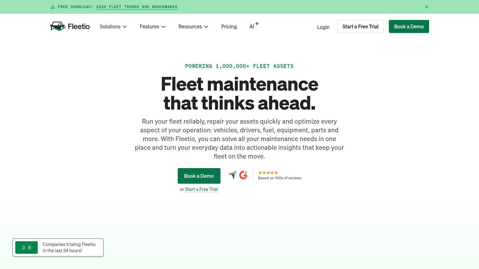
68FairCopy, size, verb, cost-feel — does the primary CTA earn the click?
Problems
- demo feels costly vs free trial
- free offer buried as text link
- hero/nav CTA hierarchy flipped
Mobile web
70FairThe phone experience as a first-class citizen.
 1234
- Book a Demo button — Pushed below the first viewport and sized for desktop, not a full-width thumb target.
- Hero body paragraph — Nine lines of desktop copy stacked in the phone column shove the CTA off-screen.
- Five-line headline — Desktop headline scales down too little and wraps into five cramped lines.
- Free download banner — Promo bar wraps onto two lines and eats the top of the first viewport.
Information hierarchy
72FairDoes the design help or inhibit what the page is trying to say?
What works
What to improve
Value props
76FairTitle, subtitle, hero — do they sell the product's true value?
Fleetio’s headline
Fleet maintenance that thinks ahead.
Run your fleet reliably, repair your assets quickly and optimize every aspect of your operation: vehicles, drivers, fuel, equipment, parts and more. With Fleetio, you can solve all your maintenance needs in one place and turn your everyday
Working
Could improve
Trust
76FairProof that the product is real, competent, and safe to try.
How Fleetio compares
Trust read