
Your landing page’s weakest score is Information hierarchy.
How Exirio ranks
62Growth scoreupdated
category scores
category scoresShowHide
Information hierarchy
58FairDoes the design help or inhibit what the page is trying to say?
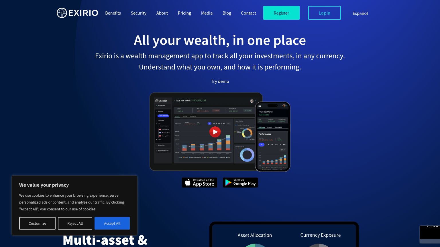 1234
- Try demo text link — The only hero action is an unstyled text link — invisible next to the headline it should convert.
- Register button in nav — The primary conversion button hides in the top-right corner, outside the centered scan path of headline and screenshot.
- Eight-link navigation row — Benefits through Contact plus Español create a dozen equal-weight exits before any conversion action.
- Cookie consent banner — Three same-size buttons add a competing decision block that covers the lower-left fold on desktop and half the mobile screen.
CTA
58FairCopy, size, verb, cost-feel — does the primary CTA earn the click?
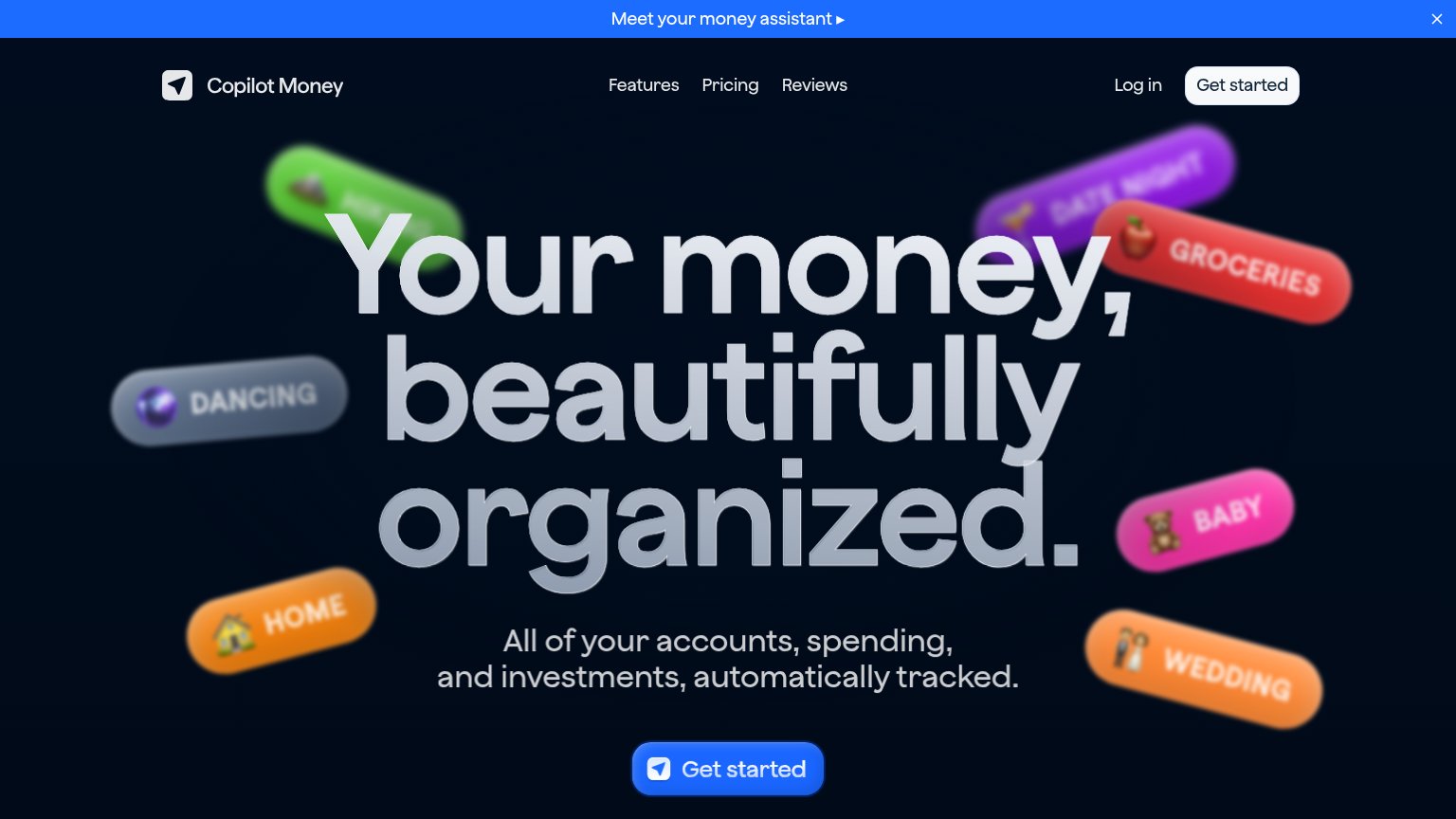
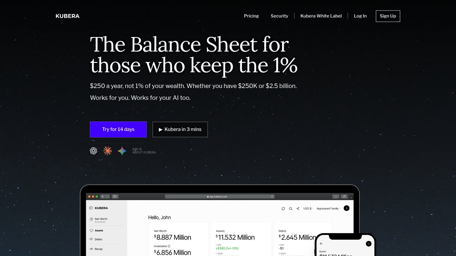
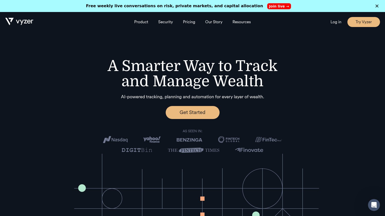
Problems
- 'Register' feels like paperwork
- no styled CTA button in desktop hero
- 'Try demo' is a bare text link
- competes with Log in / app badges
Trust
58FairProof that the product is real, competent, and safe to try.
How Exirio compares
Trust read
Mobile web
62FairThe phone experience as a first-class citizen.

What works
What to improve
Value props
72FairTitle, subtitle, hero — do they sell the product's true value?
Exirio’s headline
All your wealth, in one place
Exirio is a wealth management app to track all your investments, in any currency. Understand what you own, and how it is performing.
Working
Could improve