
Your landing page’s weakest score is Trust.
How Edge Impulse ranks
Trust
44PoorProof that the product is real, competent, and safe to try.
| Trust read | |
|---|---|
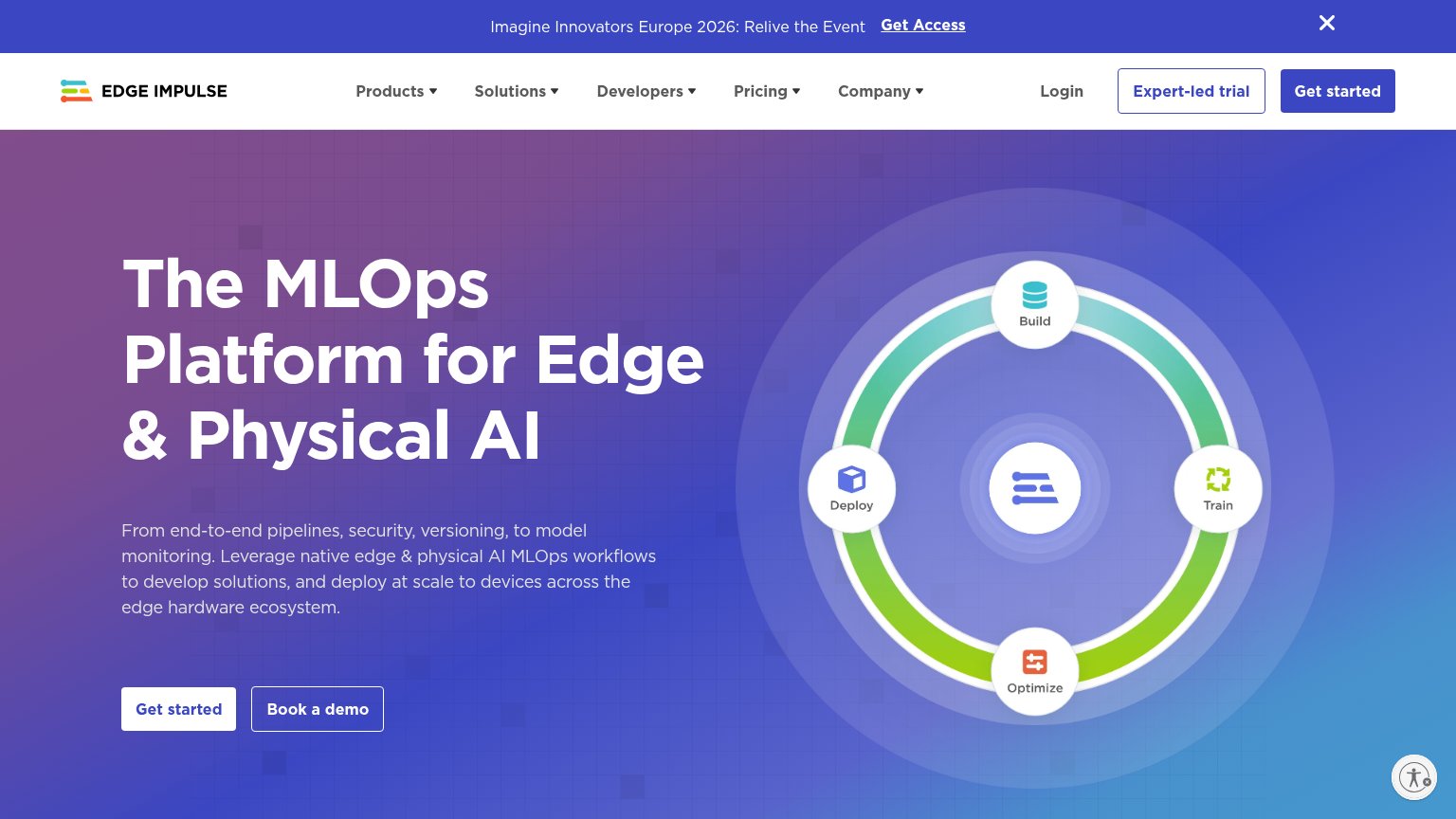
| Edge Impulse | "Imagine Innovators Europe 2026: Relive the Event" banner implying a real hosted conference |
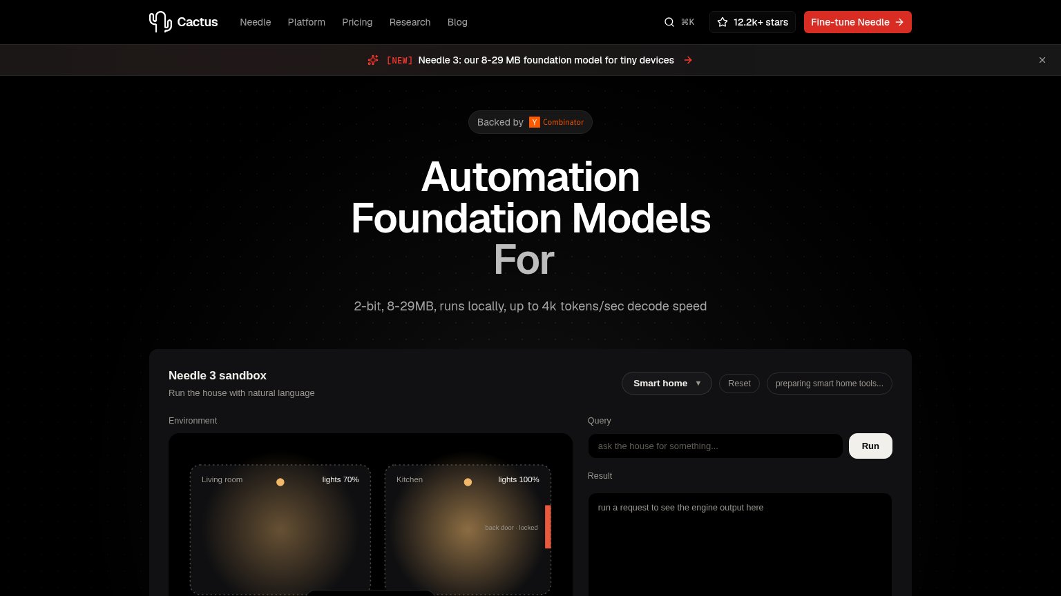
| "Backed by Y Combinator" badge above the hero headline | |
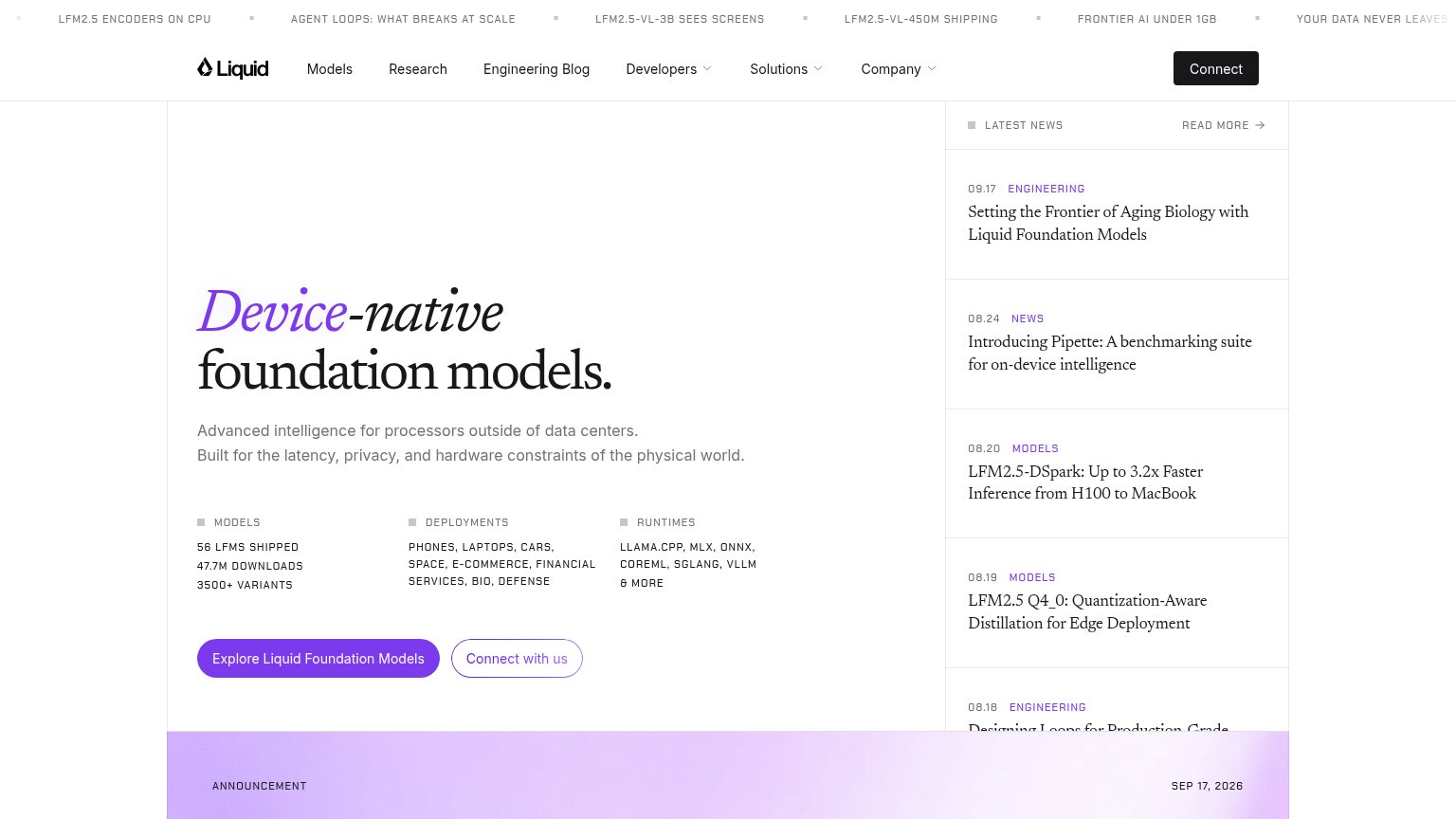
| "56 LFMS SHIPPED / 47.7M DOWNLOADS / 3500+ VARIANTS" stat block above the primary CTA | |
| implicit context Nexa AI may benefit from pre-existing familiarity among its target audience. | |
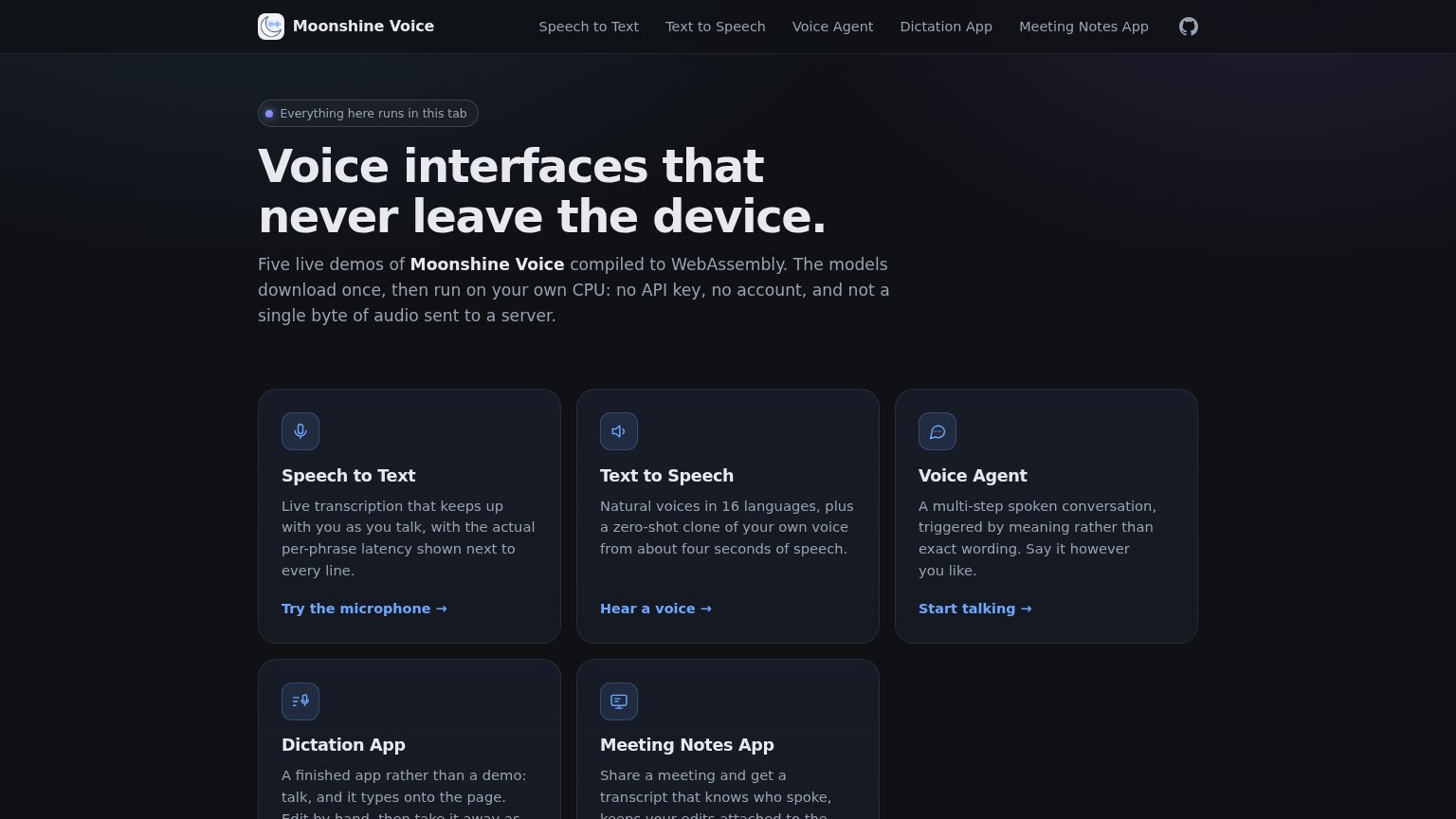
| "Five live demos of Moonshine Voice compiled to WebAssembly. The models download once, then run on your own CPU: no API |
Mobile web
62FairThe phone experience as a first-class citizen.
 1234
- Three-line promo banner — Event banner wraps to three lines and consumes the top slice of the fold before the hero starts.
- Get started button — Primary CTA is desktop-proportioned, not full-width, and sits at the very bottom edge of the viewport.
- Six-line body paragraph — Desktop-length paragraph stacks six cramped lines, pushing both CTAs to the fold's edge.
- Clipped Book a demo — Secondary CTA is half cut off and partially overlapped by the accessibility bubble.
Value props
68FairTitle, subtitle, hero — do they sell the product's true value?
Edge Impulse’s headline
The MLOps Platform for Edge & Physical AI
From end-to-end pipelines, security, versioning, to model monitoring. Leverage native edge & physical AI MLOps workflows to develop solutions, and deploy at scale to devices across the edge hardware ecosystem.
Working
Could improve
Information hierarchy
70FairDoes the design help or inhibit what the page is trying to say?
What works
What to improve
CTA
72FairCopy, size, verb, cost-feel — does the primary CTA earn the click?
How Edge Impulse compares
Recommended rewrites