
Your landing page’s weakest score is Value props.
How DISCUS Software ranks
51Growth scoreupdated
category scores
category scoresShowHide
Value props
34PoorTitle, subtitle, hero — do they sell the product's true value?
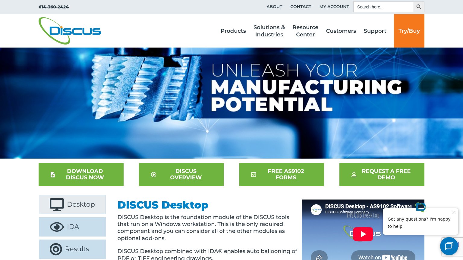
DISCUS Software’s headline vague
UNLEASH YOUR MANUFACTURING POTENTIAL
Working
- FREE AS9102 FORMS button signals real niche value
- Action CTAs (download, demo) are visible in fold
- Body copy below names auto ballooning concretely
Could improve
- Headline is a generic abstraction stack
- No subhead adds any specifics
- Hero image is stock decoration, not the product
Mobile web
48PoorThe phone experience as a first-class citizen.
 1234
- Chat pop-up overlay — The chat prompt and bubble overlap the 'REQUEST A FREE DEMO' CTA, blocking the tap target with a dead blocker.
- Triple-decker header — Phone number, ABOUT/CONTACT/MY ACCOUNT links, and a search bar stack before the logo, eating roughly a quarter of the first viewport.
- Oversized logo block — The logo row spans nearly 200px of vertical space, pushing the hero and all CTAs further down the page.
- Four stacked CTAs — Four equal-weight green buttons compete with no visual hierarchy, and all sit below the first viewport.
Trust
52FairProof that the product is real, competent, and safe to try.
How DISCUS Software compares
Trust read
Information hierarchy
54FairDoes the design help or inhibit what the page is trying to say?
What works
What to improve
CTA
66FairCopy, size, verb, cost-feel — does the primary CTA earn the click?
How DISCUS Software compares
Recommended rewrites