
Your landing page’s weakest score is CTA.
How Discovered Materials ranks
- 1.
Mat3ra66
- 2.
Discovered Materials59
- 3.
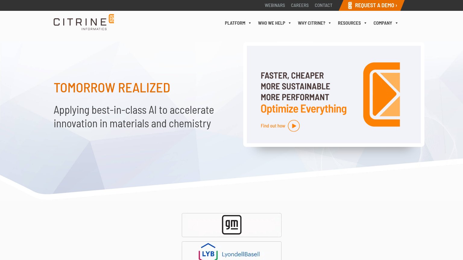
Citrine Informatics58
- 4.
CuspAI52
- 5.
Radical AI49
- 6.
Orbital Materials45
59Growth scoreupdated
category scores
category scoresShowHide
CTA
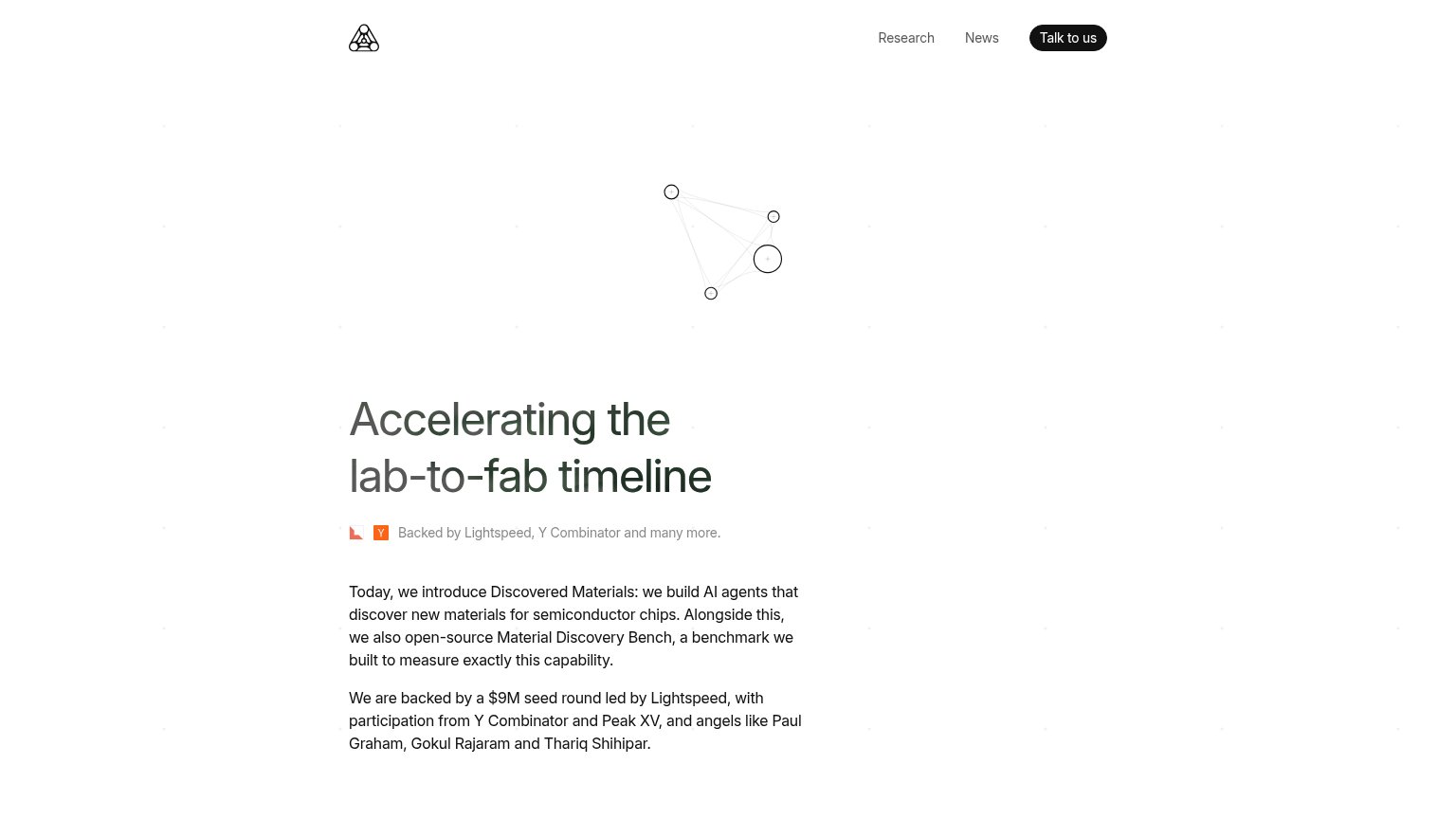
56FairCopy, size, verb, cost-feel — does the primary CTA earn the click?

Problems
- nav-sized, no hero CTA
- 'Talk to us' feels high-cost
- no low-commitment alternative
Information hierarchy
58FairDoes the design help or inhibit what the page is trying to say?
1234- Hero network animation — Faint, abstract node graph outranks the headline in position yet communicates nothing about materials discovery.
- Headline below midpoint — "Accelerating the lab-to-fab timeline" sits in the lower third, so the top half of the scan path carries no message.
- Body paragraphs in fold — Two dense announcement paragraphs compete with the headline at similar weight, turning the fold into a blog post.
- Talk to us button — Primary CTA is a small nav pill in the far corner, outside the natural left-column reading path.
Trust
58FairProof that the product is real, competent, and safe to try.
How Discovered Materials compares
Trust read
Value props
62FairTitle, subtitle, hero — do they sell the product's true value?
Discovered Materials’s headline
Accelerating the lab-to-fab timeline
Backed by Lightspeed, Y Combinator and many more.
Working
Could improve
Mobile web
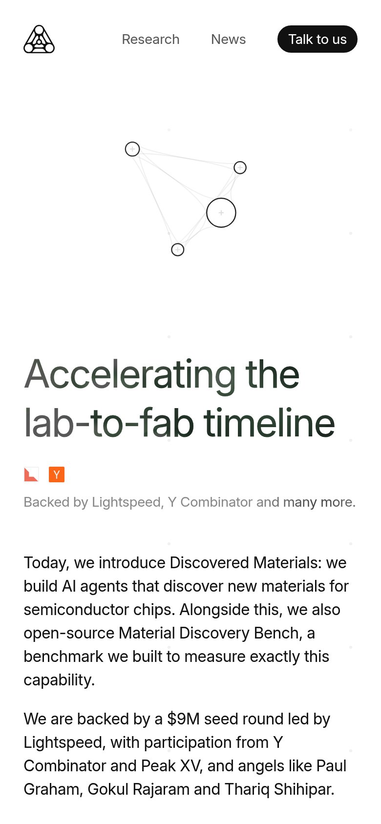
62FairThe phone experience as a first-class citizen.
What works
What to improve