
Your landing page’s weakest score is Information hierarchy.
How Databricks ranks
65Growth scoreupdated
category scores
category scoresShowHide
Information hierarchy
58FairDoes the design help or inhibit what the page is trying to say?
 1234
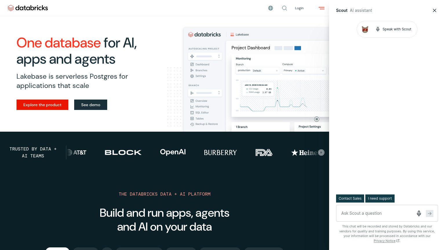
- Scout AI panel — Auto-opened sidebar eats a quarter of the fold, crops the hero visual, and hosts rival CTAs.
- Contact Sales buttons — Two same-weight dark buttons inside Scout compete directly with the red primary CTA.
- Cropped hero screenshot — The Lakebase dashboard is cut off mid-panel by the Scout overlay, weakening the product proof.
- Trust logo strip — Heineken logo and pause control are clipped by the Scout panel, breaking the credibility row.
Value props
62FairTitle, subtitle, hero — do they sell the product's true value?
Databricks’s headline undersells
One database for AI, apps and agents
Lakebase is serverless Postgres for applications that scale
Working
- Concrete category: serverless Postgres
- Hero image shows real product UI
- Strong logo bar: OpenAI, AT&T, FDA
Could improve
- Zero numbers or proof points in copy
- No emotional payoff; 'scale' is flat
- Hero sells Lakebase, not Mosaic AI
Mobile web
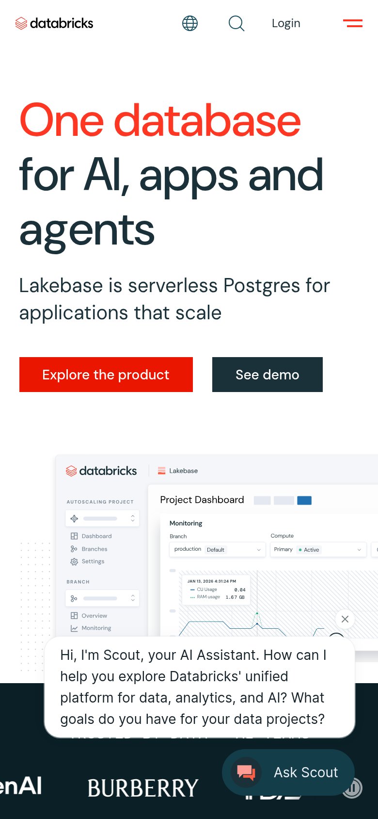
62FairThe phone experience as a first-class citizen.
What works
What to improve
CTA
68FairCopy, size, verb, cost-feel — does the primary CTA earn the click?
How Databricks compares
Recommended rewrites
Trust
76FairProof that the product is real, competent, and safe to try.
How Databricks compares
Trust read