
Your landing page’s weakest score is CTA.
How Cyvers ranks
CTA
72FairCopy, size, verb, cost-feel — does the primary CTA earn the click?
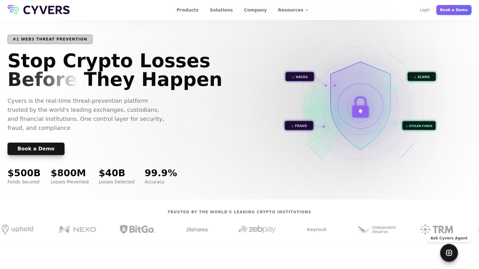
Problems
- 'Book' feels costly — calendar ask
- hero button smaller than headline
- no low-friction alternative path
Mobile web
72FairThe phone experience as a first-class citizen.
 123
- Book a Demo button — Desktop-proportioned button floats at half the column width instead of near full-bleed, and sits at the bottom edge of the fold.
- Faded 'Before' word — Gradient washes the word out against the light background, making the headline look broken.
- Seven-line body paragraph — Long unbroken block of copy pushes the primary CTA to the very edge of the first viewport.
Trust
76FairProof that the product is real, competent, and safe to try.
How Cyvers compares
Trust read
Information hierarchy
78FairDoes the design help or inhibit what the page is trying to say?
What works
What to improve
Value props
86StrongTitle, subtitle, hero — do they sell the product's true value?
Cyvers’s headline
Stop Crypto Losses Before They Happen
Cyvers is the real-time threat-prevention platform trusted by the world's leading exchanges, custodians, and financial institutions. One control layer for security, fraud, and compliance
Working
Could improve