
Your landing page’s weakest score is Mobile web.
How Cua ranks
64Growth scoreupdated
category scores
category scoresShowHide
Mobile web
54FairThe phone experience as a first-class citizen.
 123
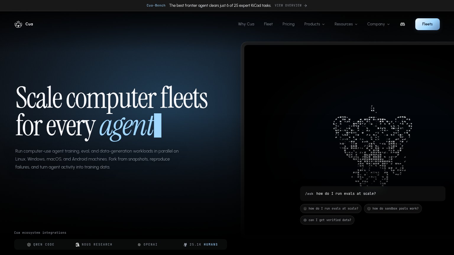
- Hero animation panel — Decorative ASCII-art frame consumes the top half of the fold and pushes the headline and any CTA out of view.
- Truncated announcement bar — Banner cuts off mid-sentence ('6 of 25 expert Ki…') with no visible link, leaving a broken message at the top.
- /ask input field — The only actionable element sits below the fold and reads as a static code snippet, not a tappable CTA.
Information hierarchy
62FairDoes the design help or inhibit what the page is trying to say?
 1234
- Fleets nav button — The only button-styled CTA is a small corner nav item with a vague noun label, invisible in a one-second scan.
- /ask input field — Competes with the nav button as the apparent primary action; the fold never signals which one to take.
- Navigation link row — Ten-plus links plus a Discord icon outweigh the CTA and leak attention before any conversion.
- Cua-Bench banner link — 'VIEW OVERVIEW' pulls first-glance attention to an exit path at the very top of the page.
CTA
62FairCopy, size, verb, cost-feel — does the primary CTA earn the click?
How Cua compares
Recommended rewrites
Trust
64FairProof that the product is real, competent, and safe to try.
How Cua compares
Trust read
Value props
76FairTitle, subtitle, hero — do they sell the product's true value?
Cua’s headline
Scale computer fleets for every agent
Run computer-use agent training, eval, and data-generation workloads in parallel on Linux, Windows, macOS, and Android machines. Fork from snapshots, reproduce failures, and turn agent activity into training data.
Working
Could improve