
Your landing page’s weakest score is Mobile web.
How Crusoe ranks
Mobile web
48PoorThe phone experience as a first-class citizen.
 1234
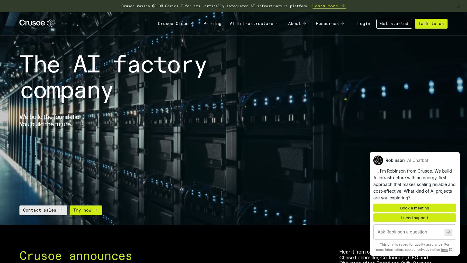
- Robinson chat overlay — Auto-opens over the primary CTA, hiding all but "Co…" of the Contact sales button.
- Truncated Contact sales — Primary CTA is buried under the chat bubble and not tappable in the first viewport.
- Ask Robinson pill — Large second chat control doubles the interruption and pushes page content down.
- Series F banner — Three-line announcement bar consumes ~150px of the fold before the logo appears.
CTA
52FairCopy, size, verb, cost-feel — does the primary CTA earn the click?
Problems
- 'Contact sales' feels costly
- chatbot covers CTA on mobile
- small vs. huge headline
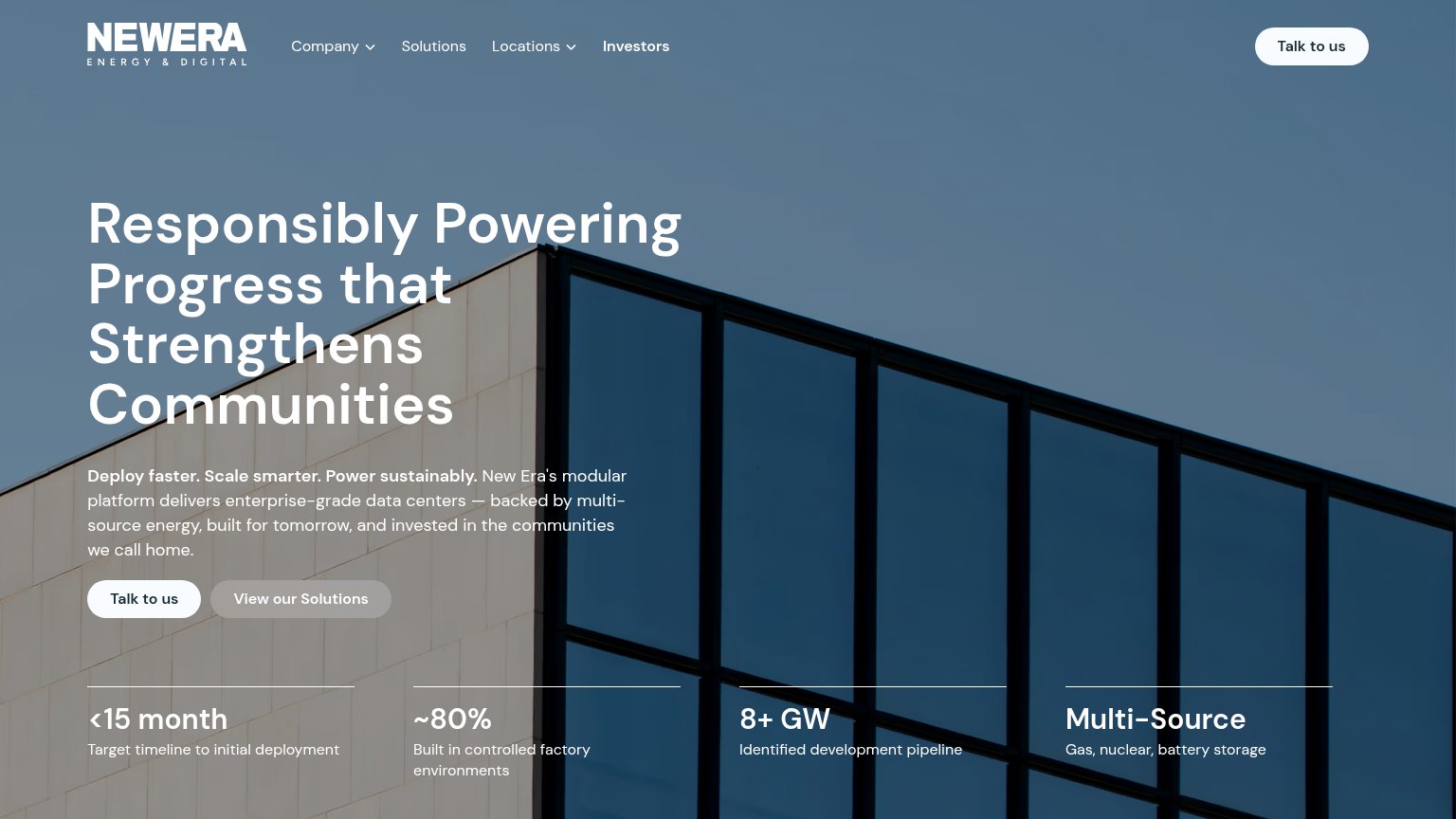
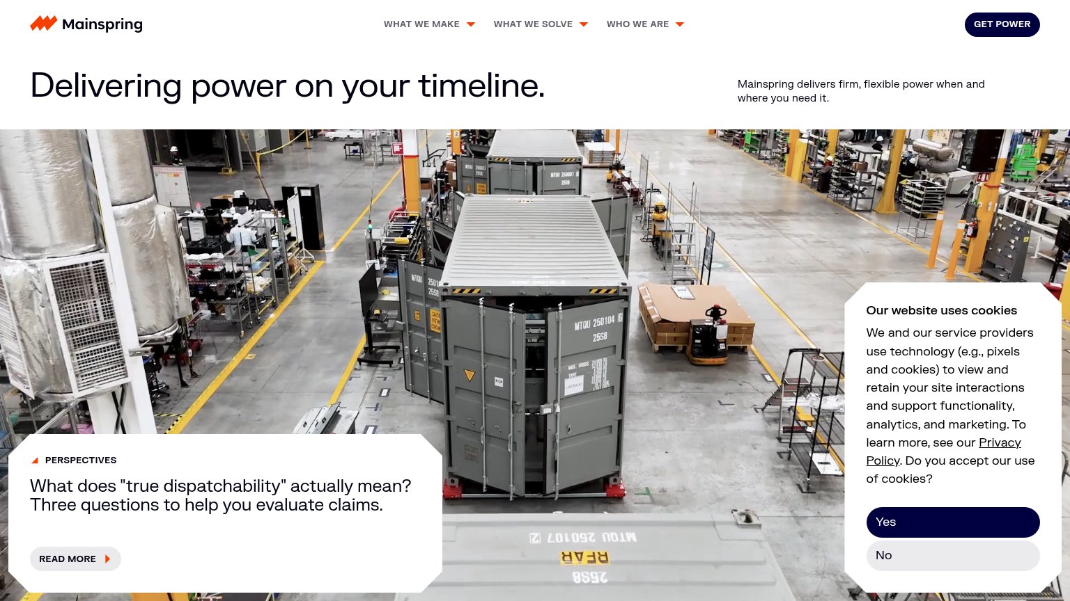
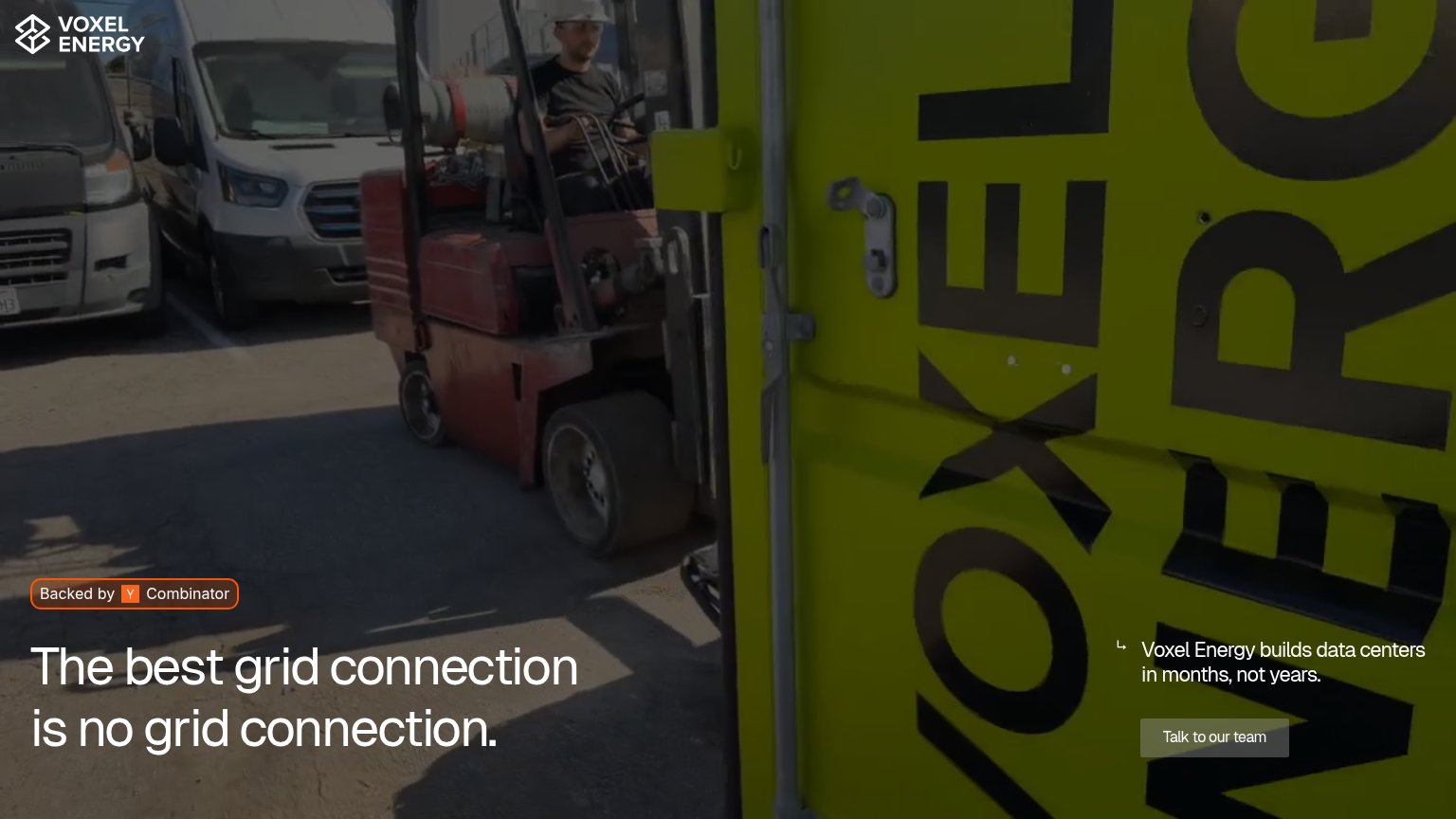
- 4 labels: sales/try/get started/talk
Information hierarchy
62FairDoes the design help or inhibit what the page is trying to say?
What works
What to improve
Value props
62FairTitle, subtitle, hero — do they sell the product's true value?
Crusoe’s headline
The AI factory company
We build the foundation. You build the future.
Working
Could improve
Trust
62FairProof that the product is real, competent, and safe to try.
How Crusoe compares
Trust read