
Your landing page’s weakest score is Mobile web.
How Certemy ranks
Mobile web
42PoorThe phone experience as a first-class citizen.
 1234
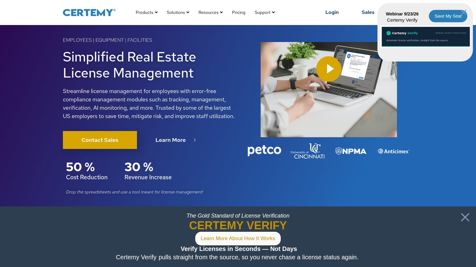
- Webinar pop-up card — Covers the logo, nav, and headline top; its 'Save My Seat' hijacks the only tappable action on the fold.
- Cropped hero headline — The pop-up slices 'Simplified' mid-word, breaking the value statement the visitor lands on.
- Hero video image — Full-height media block pushes any conversion CTA well below the first viewport.
- Blocked header bar — Logo and menu are inaccessible behind the overlay, leaving no visible navigation entry point.
CTA
52FairCopy, size, verb, cost-feel — does the primary CTA earn the click?

Problems
- click feels costly — sales call ask
- no value promised for the click
- popup competes with hero CTA
- CTA below fold on mobile
Information hierarchy
58FairDoes the design help or inhibit what the page is trying to say?
What works
What to improve
Trust
66FairProof that the product is real, competent, and safe to try.
How Certemy compares
Trust read
Value props
72FairTitle, subtitle, hero — do they sell the product's true value?
Certemy’s headline
Simplified Real Estate License Management
Streamline license management for employees with error-free compliance management modules such as tracking, management, verification, AI monitoring, and more. Trusted by some of the largest US employers to save time, mitigate risk, and impr
Working
Could improve