
Your landing page’s weakest score is Trust.
How CELUS ranks
75Growth scoreupdated
category scores
category scoresShowHide
Trust
68FairProof that the product is real, competent, and safe to try.
| Trust read | |
|---|---|
| CELUS | "TRUSTED BY INDUSTRY LEADERS" logo strip with NXP, Variscite, Littelfuse, Cadence, and Brainchip |
| No visible trust signal identified. | |
| Real schematic product screenshot with actual part numbers (e.g., "C0603C221K5RAC") and the Copilot command palette UI v | |
| "Ultra Librarian is Now Part of Cadence" banner | |
| Example searches: "2N7002P" and "Rectifier diodes" beside the search bar, demonstrating a working parts search |
Information hierarchy
74FairDoes the design help or inhibit what the page is trying to say?
 1234
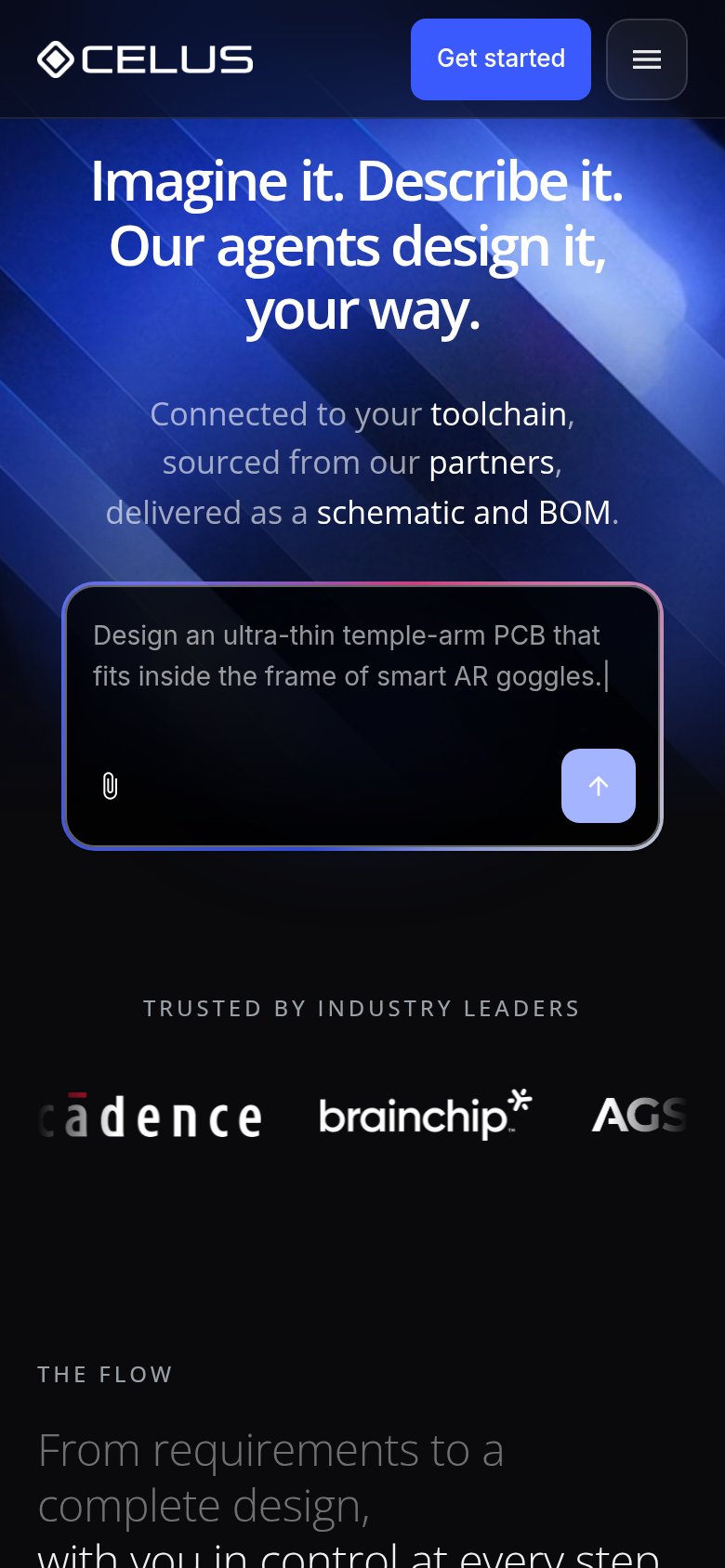
- Get started button — Blue nav CTA competes with the prompt box; visitors can't tell which action CELUS wants first.
- Prompt submit arrow — The tiny low-contrast arrow is the fold's real conversion trigger but reads as a minor icon.
- Nav link row — Overview, About, Newsroom, Contact plus Log in — five exits sitting above the primary action.
- Prompt placeholder text — Gray example copy looks like typed input, making it unclear the box is interactive.
Value props
74FairTitle, subtitle, hero — do they sell the product's true value?
CELUS’s headline
Imagine it. Describe it. Our agents design it, your way.
Connected to your toolchain, sourced from our partners, delivered as a schematic and BOM.
Working
Could improve
CTA
78FairCopy, size, verb, cost-feel — does the primary CTA earn the click?
How CELUS compares
Recommended rewrites
Mobile web
80StrongThe phone experience as a first-class citizen.
What works
What to improve