
Your landing page’s weakest score is Mobile web.
How CARPL.ai ranks
55Growth scoreupdated
category scores
category scoresShowHide
Mobile web
44PoorThe phone experience as a first-class citizen.
 123
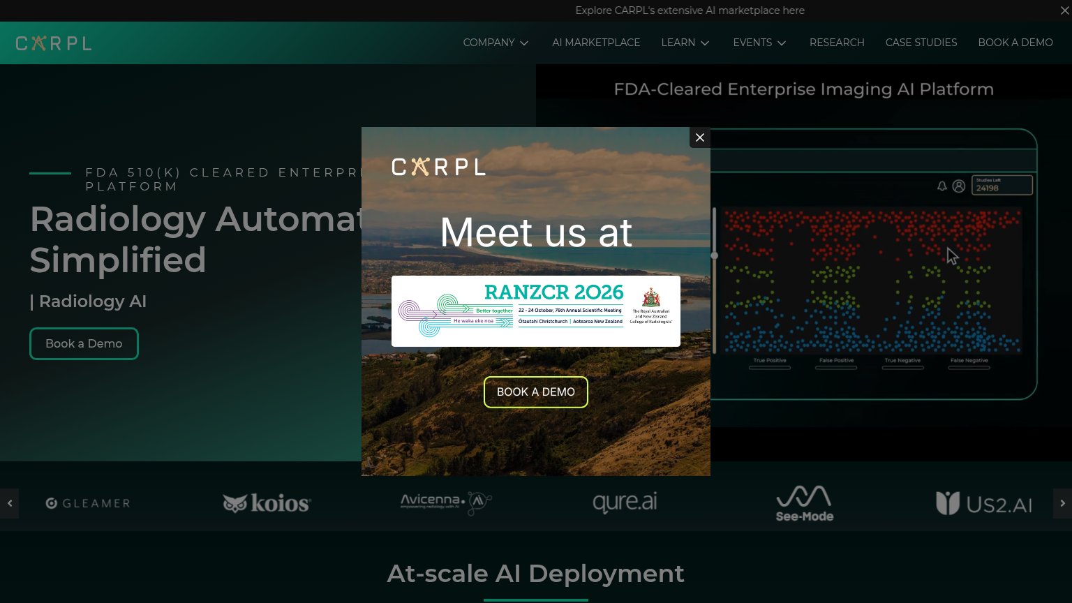
- Meet us at popup — Event modal covers most of the mobile fold and hides the hero CTA entirely; its 'Book a Demo' does conversion work but the primary action is buried.
- Radiology Automation headline — Desktop-scale headline plus the all-caps 'FDA 510(K) CLEARED' eyebrow wraps across five lines and eats the fold before any CTA appears.
- Truncated promo bar — Top announcement bar clips to 'Explo' on mobile — an unreadable strip that still costs vertical space.
Information hierarchy
48PoorDoes the design help or inhibit what the page is trying to say?
 1234
- RANZCR event popup — Modal covers the headline and hero on load, hiding the value prop and pushing the primary demo CTA behind a dismissal step.
- Truncated hero headline — "Radiology Automat..." is clipped by the popup, so the core message never lands before an interaction.
- Top nav link row — Seven equal-weight nav items plus dropdowns give attention six exits before the Book a Demo action.
- Marketplace announcement banner — "Explore CARPL's extensive AI marketplace here" adds a third competing exit layer above the hero.
Value props
58FairTitle, subtitle, hero — do they sell the product's true value?
CARPL.ai’s headline
Radiology Automation Simplified
| Radiology AI
Working
Could improve
CTA
62FairCopy, size, verb, cost-feel — does the primary CTA earn the click?
How CARPL.ai compares
Recommended rewrites
Trust
62FairProof that the product is real, competent, and safe to try.
How CARPL.ai compares
Trust read