
Your landing page’s weakest score is Trust.
How Captain ranks
67Growth scoreupdated
category scores
category scoresShowHide
Trust
44PoorProof that the product is real, competent, and safe to try.
| Trust read | |
|---|---|
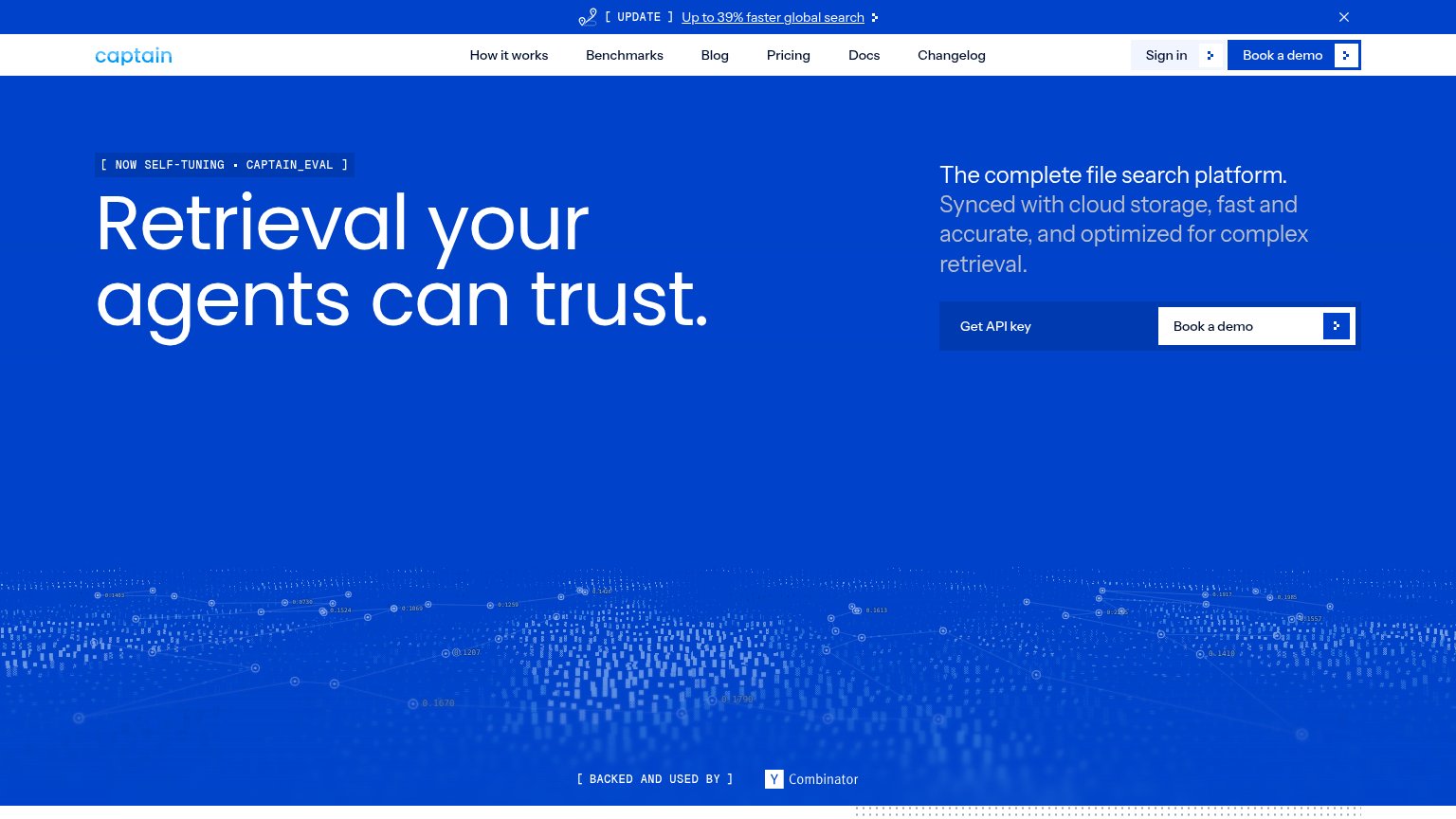
| Captain | "[ BACKED AND USED BY ] Y Combinator" badge |
| No visible trust signal identified. | |
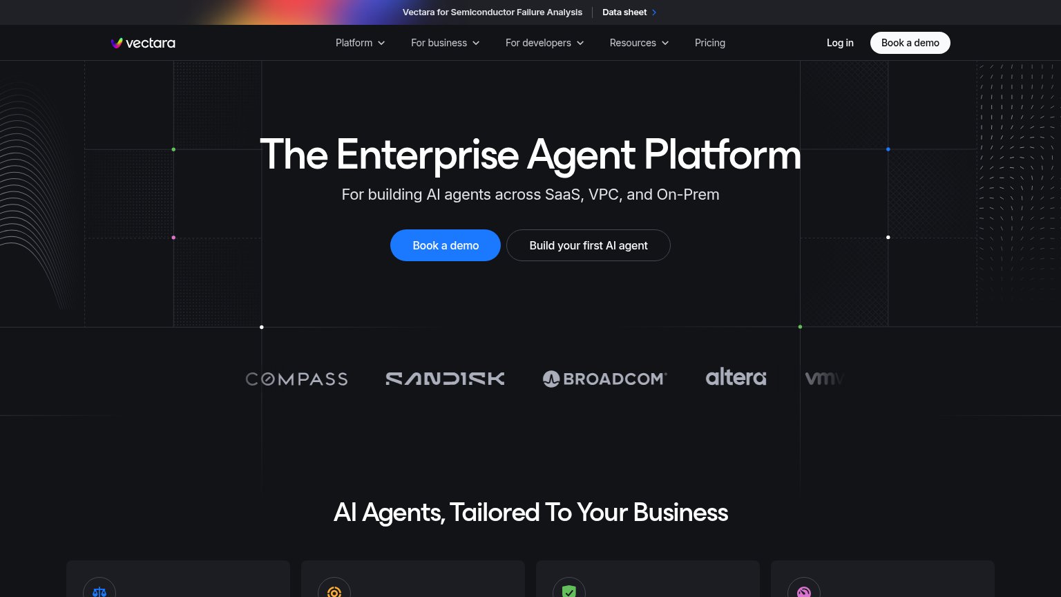
| Customer logo strip featuring Compass, SanDisk, Broadcom, Altera, and VMware below the hero | |
| "Need a code sample? Ask our AI assistant" box with SDK tabs (TypeScript, Python, .NET) and concrete example prompts | |
| Simulated Slack demo in #qualified-leads showing the agent's specific lead research ("B2B fintech, 240 employees... rais | |
| GitHub and Discord icons in the header navigation |
Information hierarchy
68FairDoes the design help or inhibit what the page is trying to say?
1234- Dual hero CTAs — "Get API key" and "Book a demo" sit at equal size side by side, splitting the primary action into two same-footprint choices.
- Duplicate Book a demo — The nav's white "Book a demo" button repeats the hero CTA at higher contrast, pulling the eye away from the conversion block.
- Update banner link — The underlined "Up to 39% faster global search" link is the topmost element and routes attention off the page before the headline is read.
- Low-contrast Get API key — "Get API key" is dark-blue-on-blue with no border, reading as a disabled panel next to the white "Book a demo" button.
CTA
70FairCopy, size, verb, cost-feel — does the primary CTA earn the click?
How Captain compares
Recommended rewrites
Value props
76FairTitle, subtitle, hero — do they sell the product's true value?
Captain’s headline
Retrieval your agents can trust.
The complete file search platform. Synced with cloud storage, fast and accurate, and optimized for complex retrieval.
Working
Could improve
Mobile web
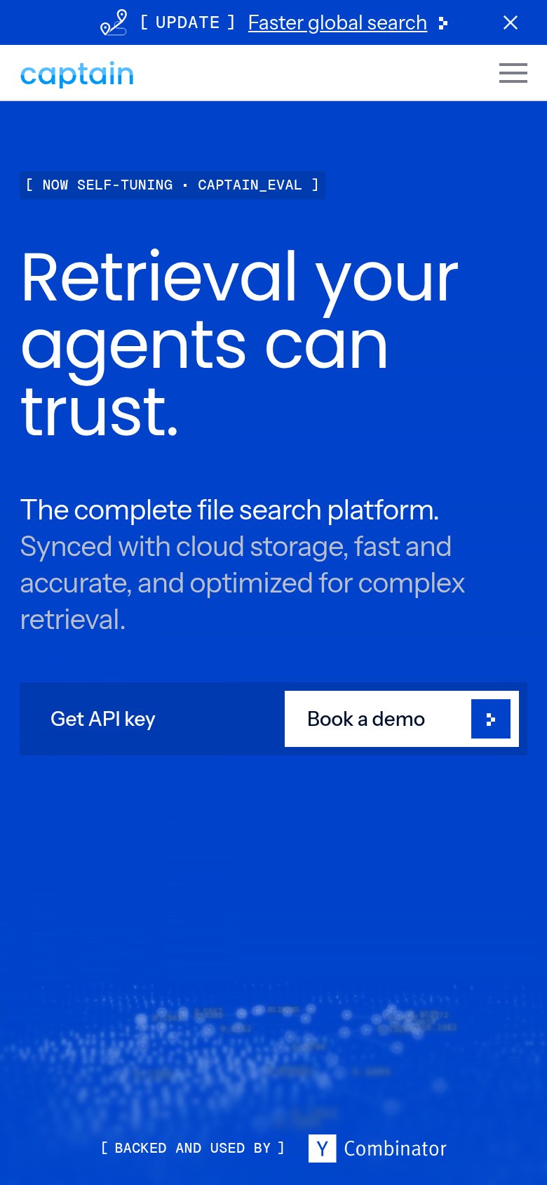
78FairThe phone experience as a first-class citizen.
What works
What to improve