
Your landing page’s weakest score is Information hierarchy.
How Bugsnag ranks
- 1.
Sentry76
- 2.
Bugsnag75
- 3.
Interfere70
- 4.
Rollbar69
- 5.
Raygun69
75Growth scoreupdated
category scores
category scoresShowHide
Information hierarchy
72FairDoes the design help or inhibit what the page is trying to say?
 1234
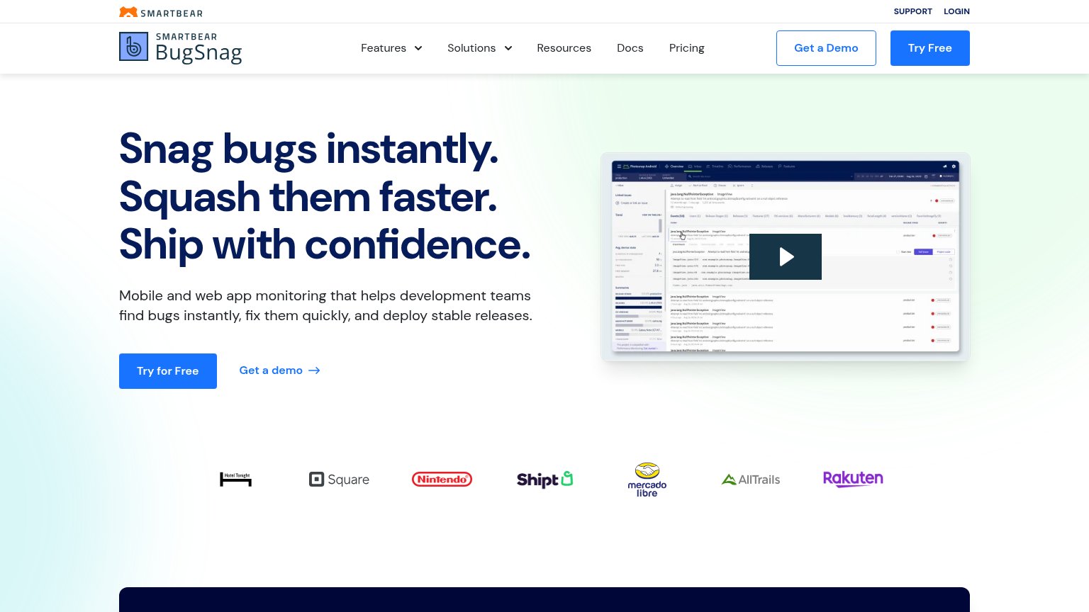
- Duplicate demo CTAs — "Get a Demo" in the nav duplicates the hero's "Get a demo" link, splitting attention across two equal-priority actions.
- Try Free nav button — Styled identically to the hero's "Try for Free", giving the fold two same-weight primary buttons competing in the scan path.
- Nav dropdown links — Six nav items plus two dropdowns offer exit paths before the visitor reaches the headline or CTA.
- Hero product screenshot — Dashboard UI is rendered too small to read; it communicates 'software exists' but not the bug-fixing outcome the headline promises.
Trust
72FairProof that the product is real, competent, and safe to try.
| Trust read | |
|---|---|
| Bugsnag | Customer logo bar: Square, Nintendo, Shipt, Mercado Libre, AllTrails, Rakuten, Hotel Tonight |
| Detailed product UI showing issue "#120 Broken password reset link" with an activity timeline and an annotated auth/rese | |
| Application monitoring software considered "not bad" by millions of developers. | |
| Illustrated error-grouping diagram with "#3430 Not found — 8,003 total" issue card showing how errors are aggregated | |
| Embedded product demo video (1:55 player visible in the mobile fold) |
Mobile web
72FairThe phone experience as a first-class citizen.
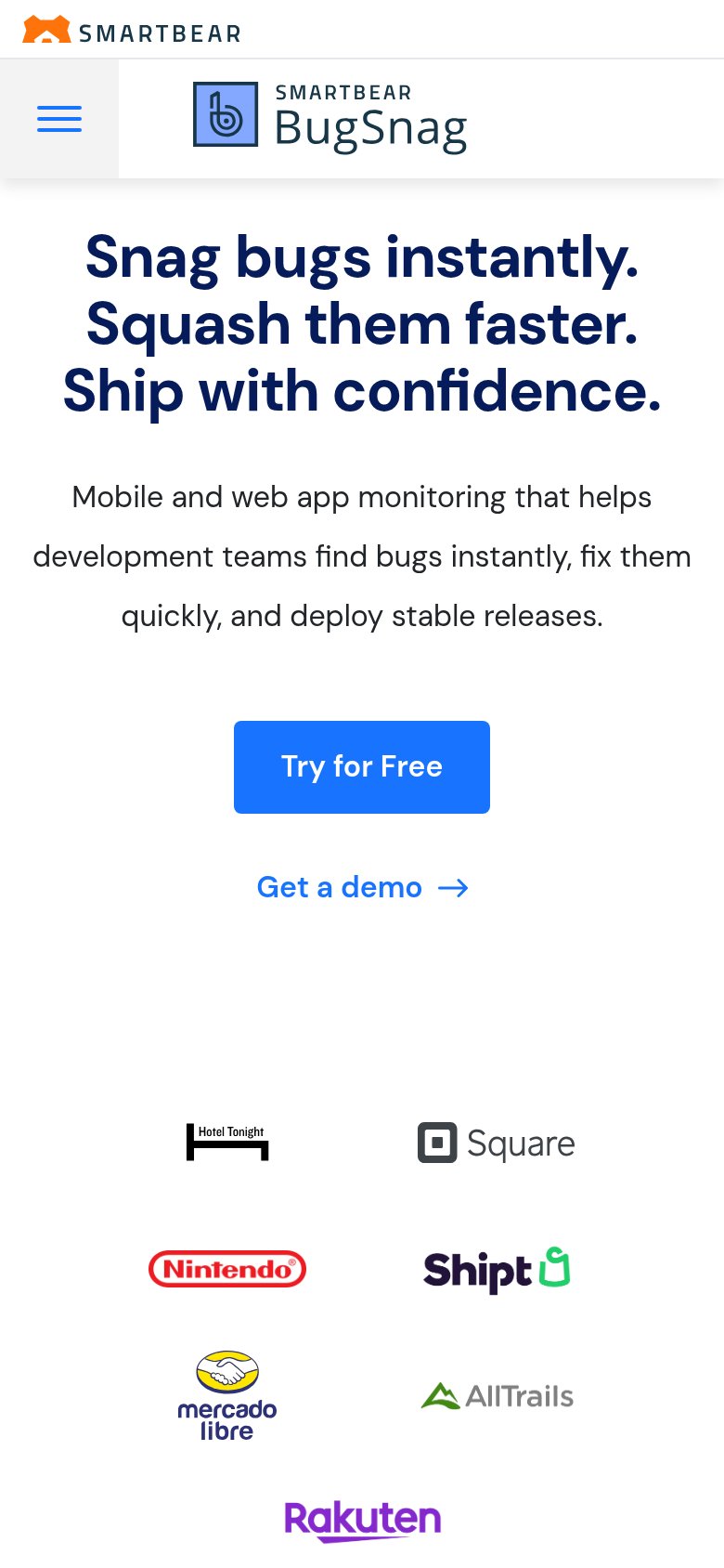
What works
What to improve
Value props
76FairTitle, subtitle, hero — do they sell the product's true value?
Bugsnag’s headline
Snag bugs instantly. Squash them faster. Ship with confidence.
Mobile and web app monitoring that helps development teams find bugs instantly, fix them quickly, and deploy stable releases.
Working
Could improve
CTA
82StrongCopy, size, verb, cost-feel — does the primary CTA earn the click?
How Bugsnag compares
Recommended rewrites