
Your landing page’s weakest score is Information hierarchy.
How Browserless ranks
79Growth scoreupdated
category scores
category scoresShowHide
Information hierarchy
74FairDoes the design help or inhibit what the page is trying to say?
 123
- Nav link cluster — Eight nav destinations plus GitHub badge, Contact Us, and Log In compete with Sign Up before the hero CTA is even seen.
- Sign Up button — A second conversion CTA in the nav splits weight with the hero's 'Get Browserless's API key' and blurs which action is primary.
- Read the Docs button — Styled at nearly the same footprint as the primary CTA, giving developers an equal-weight exit into documentation.
CTA
76FairCopy, size, verb, cost-feel — does the primary CTA earn the click?
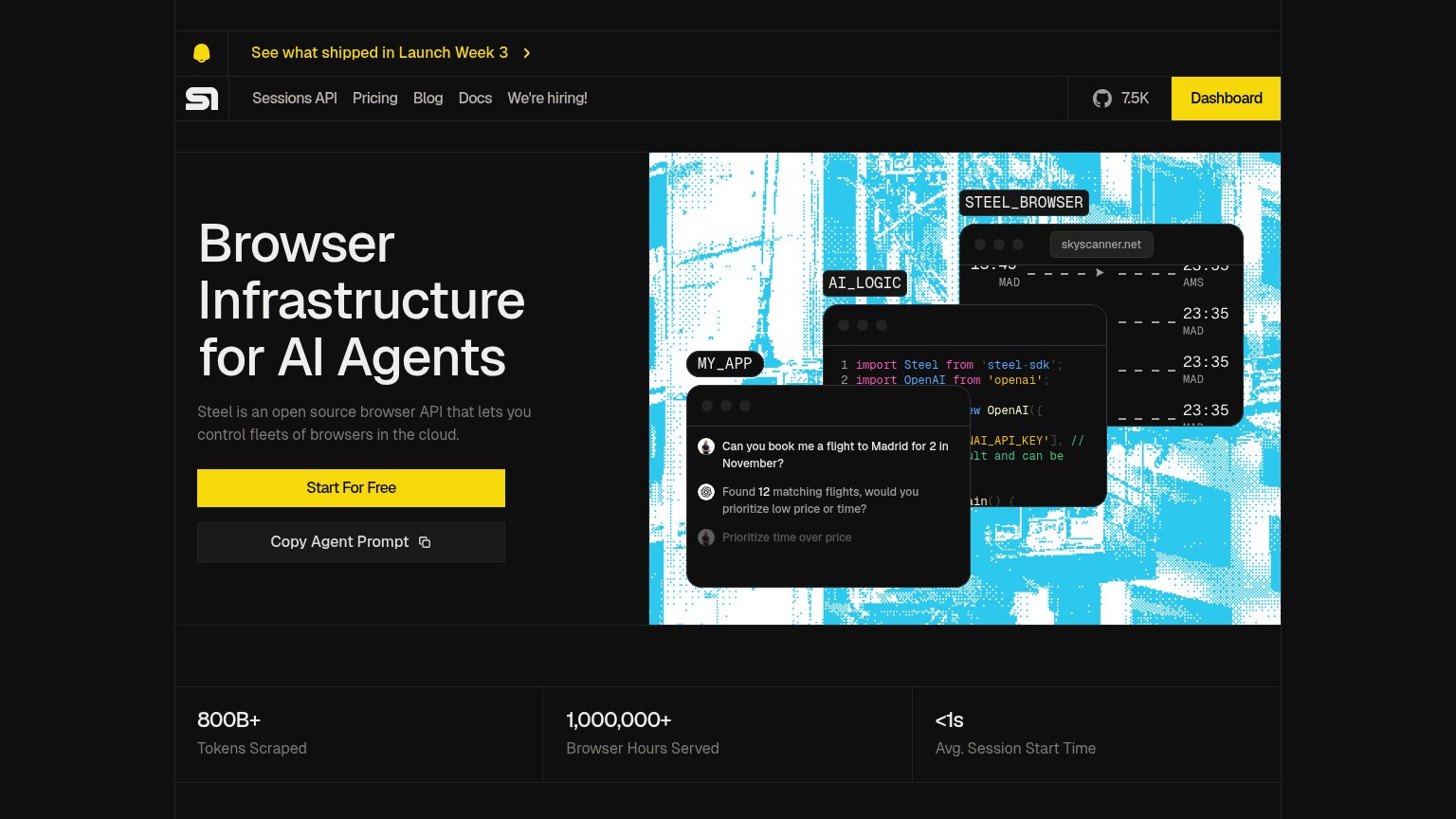
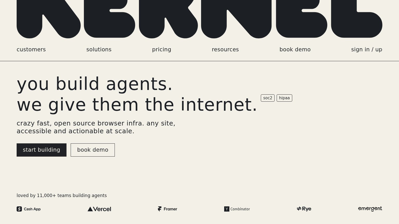

Problems
- no 'free' despite free tier
- 4 words, over the 3-word ideal
- nav 'Sign Up' splits the label
Trust
76FairProof that the product is real, competent, and safe to try.
How Browserless compares
Trust read
Value props
84StrongTitle, subtitle, hero — do they sell the product's true value?
Browserless’s headline
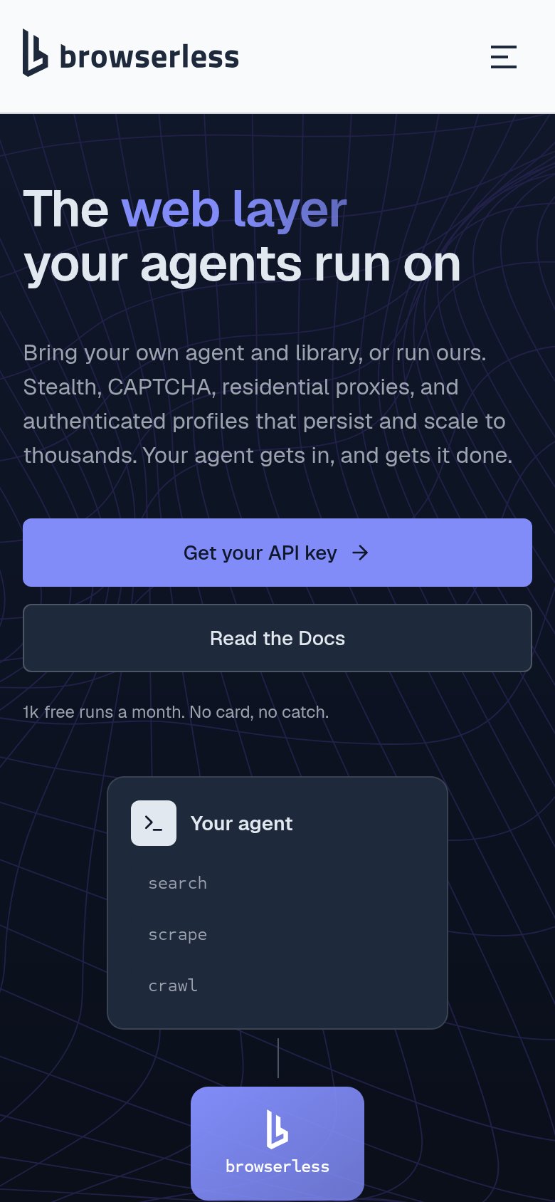
The web layer your agents run on
Bring your own agent and library, or run ours. Stealth, CAPTCHA, residential proxies, and authenticated profiles that persist and scale to thousands. Your agent gets in, and gets it done.
Working
Could improve
Mobile web
86StrongThe phone experience as a first-class citizen.
What works
What to improve