
Your landing page’s weakest score is Trust.
How Bloom ranks
- 1.
a0.dev74
- 2.
Bloom71
- 3.
Rork69
- 4.
Appacella56
71Growth scoreupdated
category scores
category scoresShowHide
Trust
55FairProof that the product is real, competent, and safe to try.
| Trust read | |
|---|---|
| Bloom | "Backed by Y Combinator" badge above the headline |
| The interactive builder UI — "An app that..." prompt with Build/Model controls and iPhone/Android/Web platform toggles | |
| "Backed by Y Combinator" badge below the prompt box | |
| No visible trust signal identified. |
Information hierarchy
72FairDoes the design help or inhibit what the page is trying to say?
 1234
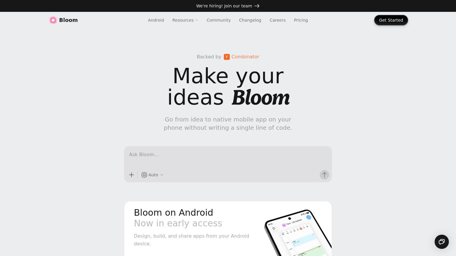
- Ask Bloom input — The primary conversion surface reads as a flat gray box with a faint arrow — it looks disabled and loses the one-second CTA test to the darker 'Get Started' button above it.
- Hiring banner — The highest-contrast band on the page is a recruiting link, pulling first attention to an exit that has nothing to do with conversion.
- Nav link row — Six equal-weight links plus a dropdown sit directly above the hero, offering exits before the visitor reaches the promise.
- Get Started button — Styled as the strongest button on the page but competes with the 'Ask Bloom...' prompt below, splitting the primary action into two destinations.
Value props
72FairTitle, subtitle, hero — do they sell the product's true value?
Bloom’s headline
Make your ideas Bloom
Go from idea to native mobile app on your phone without writing a single line of code.
Working
Could improve
Mobile web
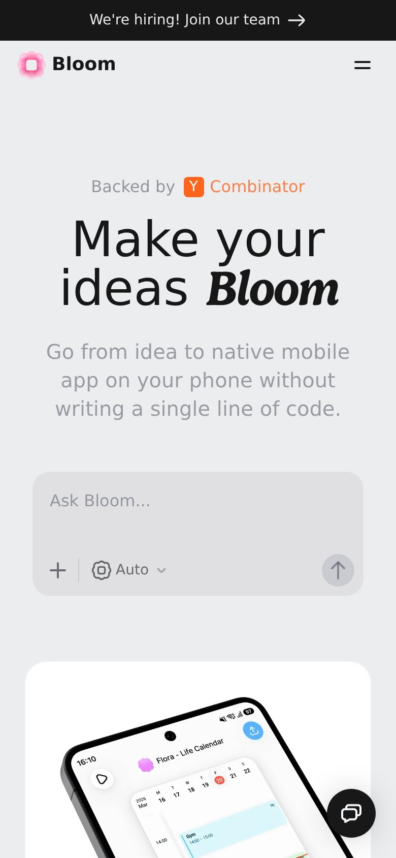
76FairThe phone experience as a first-class citizen.
What works
What to improve
CTA
78FairCopy, size, verb, cost-feel — does the primary CTA earn the click?
How Bloom compares
Recommended rewrites