
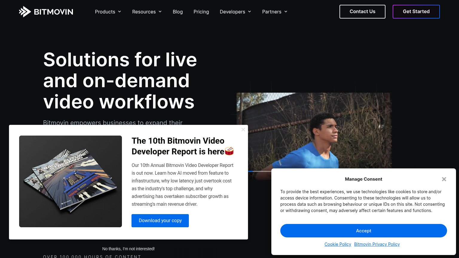
Your landing page’s weakest score is Mobile web.
How Bitmovin ranks
Mobile web
28PoorThe phone experience as a first-class citizen.
 123
- Overlapping consent links — Cookie banner links collide with the modal's dismiss text, making both hard to tap.
- Oversized modal headline — Desktop-scale title wraps into four lines and shoves the CTA below the fold.
- Small Get Started button — Only visible CTA is a desktop-proportioned header button, not thumb-friendly.
Trust
42PoorProof that the product is real, competent, and safe to try.
| Trust read | |
|---|---|
| Bitmovin | "OVER 100,000 HOURS OF CONTENT" usage stat at the fold's bottom edge |
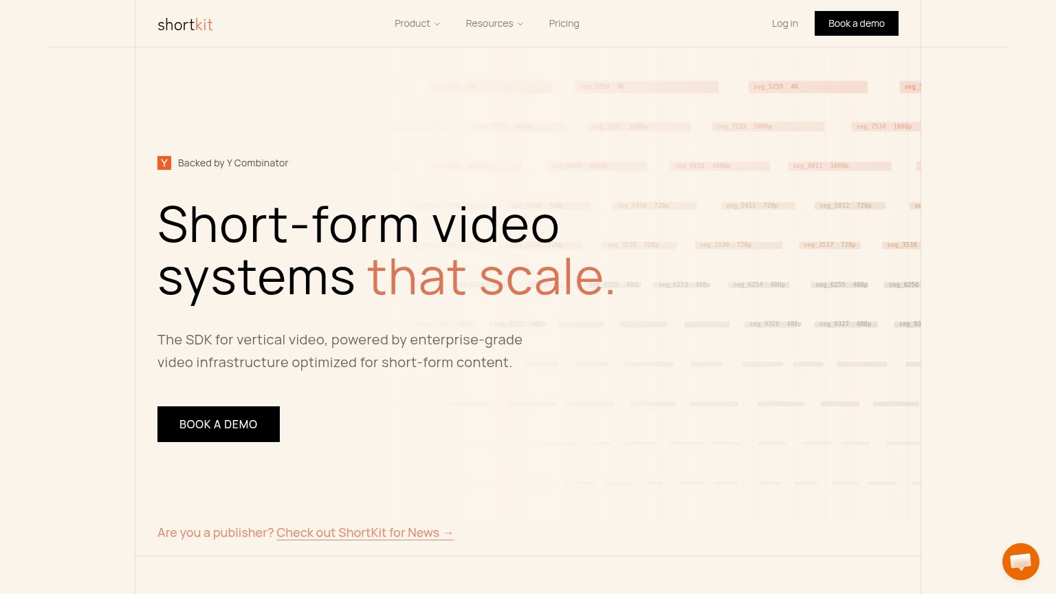
| "Backed by Y Combinator" badge above the hero headline | |
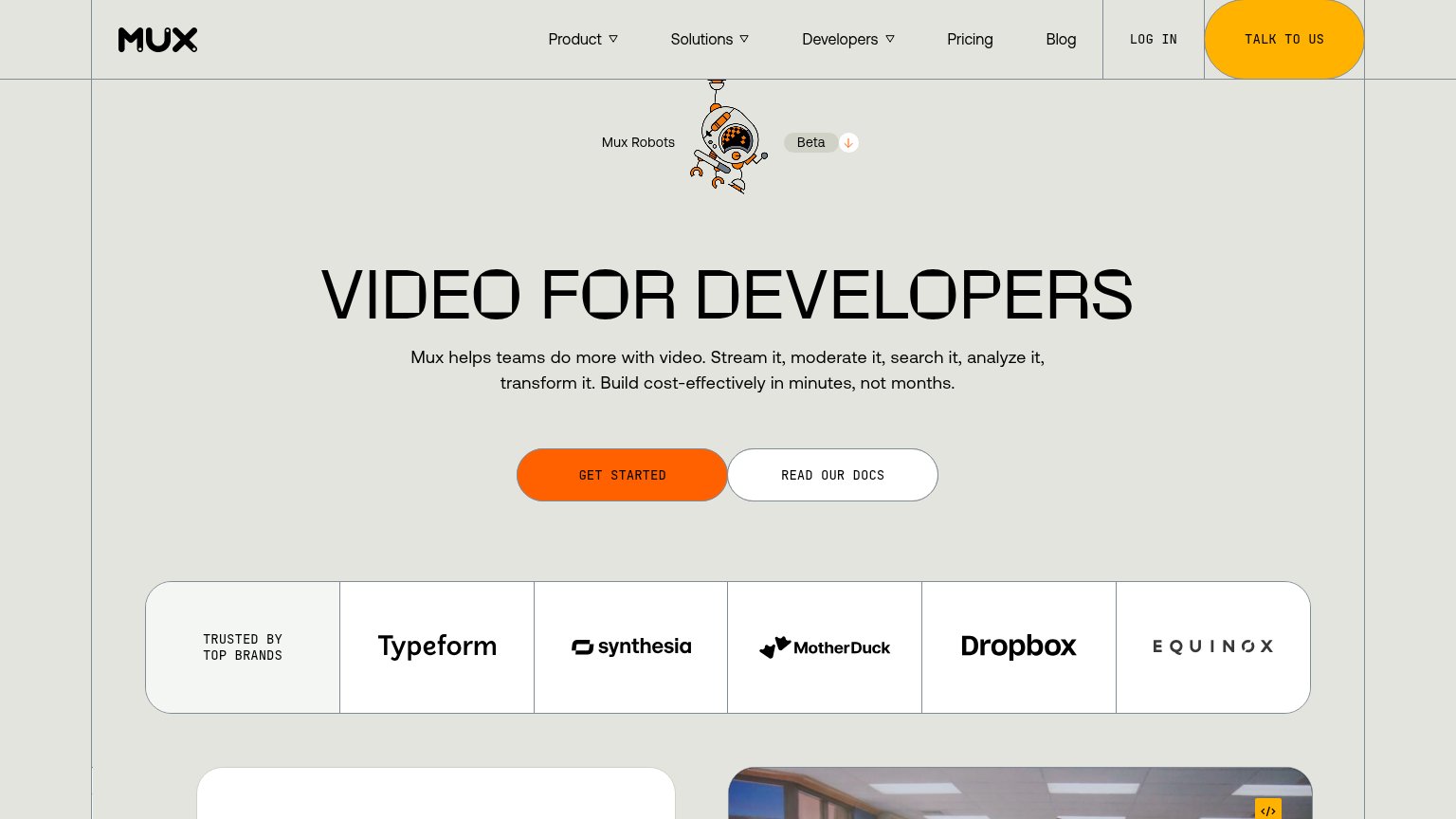
| "TRUSTED BY TOP BRANDS" logo bar: Typeform, Synthesia, MotherDuck, Dropbox, Equinox | |
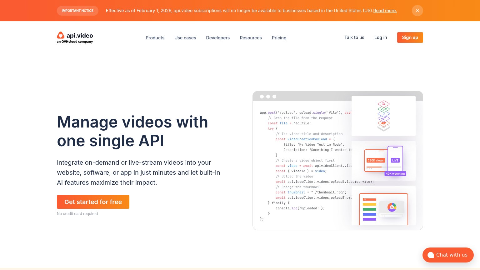
| Hero code sample showing the real upload API flow (app.post('/upload', ...) with apivideoClient.videos.upload) | |
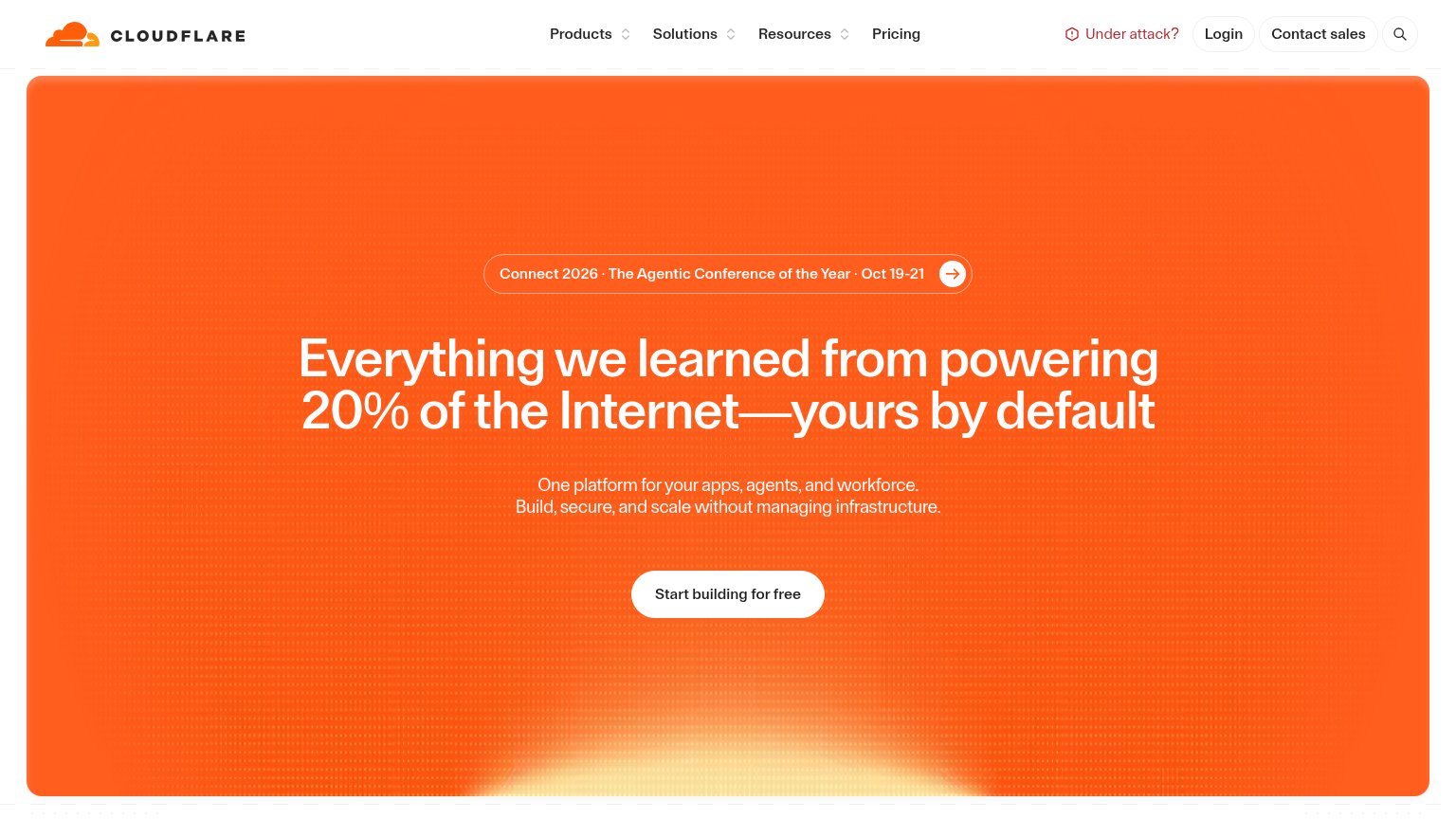
| Headline claim "Everything we learned from powering 20% of the Internet" |
Information hierarchy
44PoorDoes the design help or inhibit what the page is trying to say?
What works
What to improve
CTA
58FairCopy, size, verb, cost-feel — does the primary CTA earn the click?
How Bitmovin compares
Recommended rewrites
Value props
58FairTitle, subtitle, hero — do they sell the product's true value?
Bitmovin’s headline
Solutions for live and on-demand video workflows
Bitmovin empowers businesses to expand their
Working
Could improve