
Your landing page’s weakest score is Mobile web.
How Axion AI ranks
67Growth scoreupdated
category scores
category scoresShowHide
Mobile web
48PoorThe phone experience as a first-class citizen.
 1
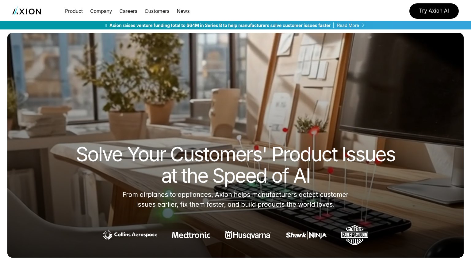
- Crowded logo stack — Five customer logos stack into three rows at the fold bottom, adding clutter where a CTA should sit.
Information hierarchy
68FairDoes the design help or inhibit what the page is trying to say?
 12
- Funding announcement banner — The teal 'Read More' banner is the highest-contrast strip on the page and pulls the first glance to a news exit instead of the value prop.
- Nav link row — Five equal-weight links (Product, Company, Careers, Customers, News) sit beside the CTA and offer exits before the pitch registers.
CTA
68FairCopy, size, verb, cost-feel — does the primary CTA earn the click?
How Axion AI compares
Recommended rewrites
Trust
72FairProof that the product is real, competent, and safe to try.
How Axion AI compares
Trust read
Value props
78FairTitle, subtitle, hero — do they sell the product's true value?
Axion AI’s headline
Solve Your Customers' Product Issues at the Speed of AI
From airplanes to appliances, Axion helps manufacturers detect customer issues earlier, fix them faster, and build products the world loves.
Working
Could improve