
Your landing page’s weakest score is CTA.
How assistant-ui ranks
- 1.
Vercel AI SDK74
- 2.
assistant-ui73
- 3.
CopilotKit67
- 4.
Chainlit66
- 5.
NLUX65
- 6.
Deep Chat62
73Growth scoreupdated
category scores
category scoresShowHide
CTA
68FairCopy, size, verb, cost-feel — does the primary CTA earn the click?
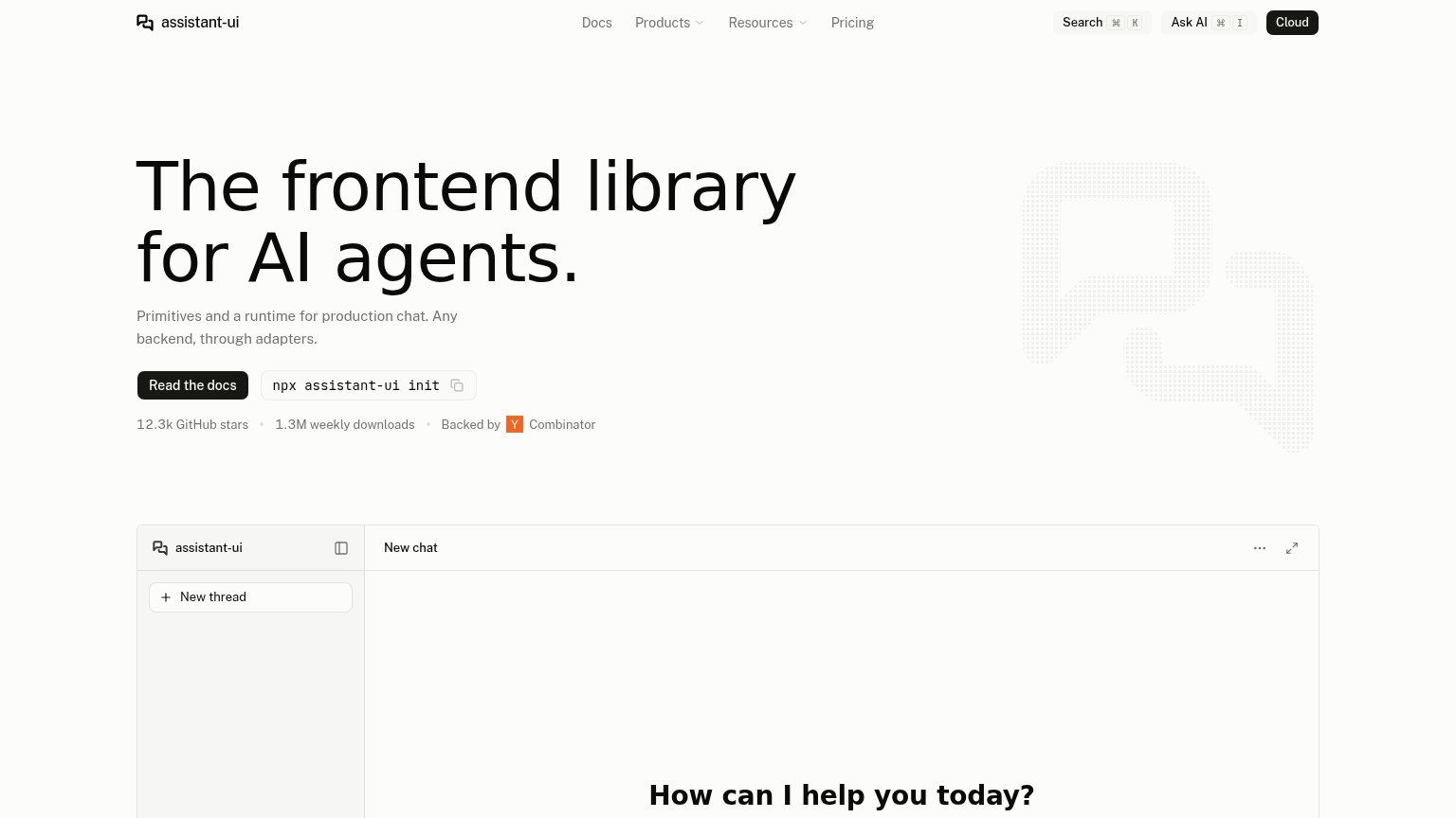
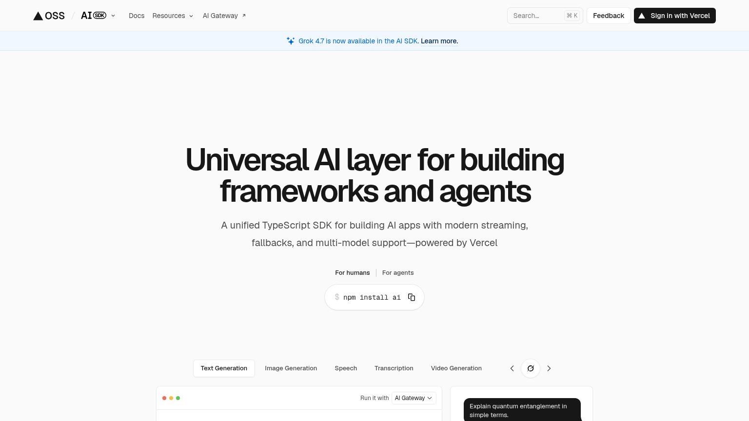
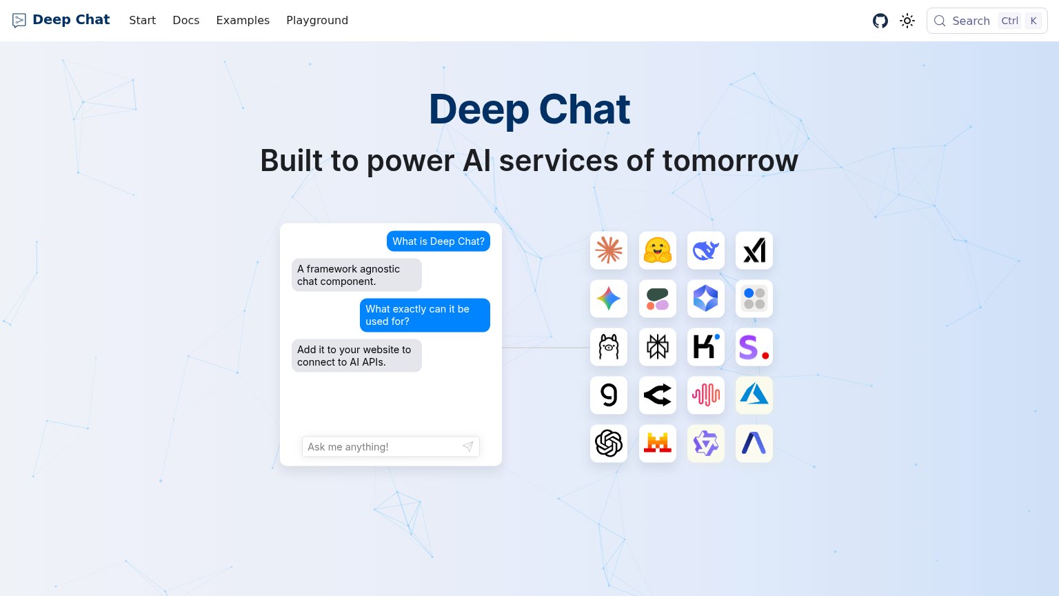
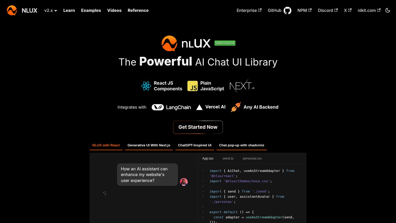
Problems
- docs, not product value
- reading feels like homework
- equal weight vs install snippet
- chat demo input not visible
Information hierarchy
72FairDoes the design help or inhibit what the page is trying to say?
1234- Docs nav link — Duplicates the 'Read the docs' primary CTA at nav weight, splitting the same action across two scan points.
- Cloud button — Solid black pill matches the primary CTA's visual weight, competing with 'Read the docs' for the click.
- npx install command — Bordered pill sits at button weight beside the primary CTA, reading as a second equal action for non-terminal visitors.
- Dotted logo motif — Faint grey texture is the only hero visual and communicates nothing about the product's chat outcome.
Mobile web
72FairThe phone experience as a first-class citizen.
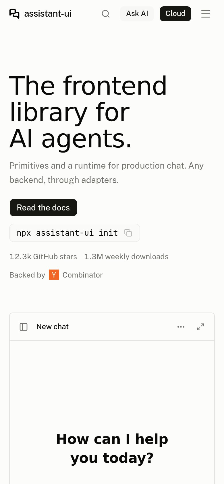
What works
What to improve
Trust
76FairProof that the product is real, competent, and safe to try.
How assistant-ui compares
Trust read
Value props
78FairTitle, subtitle, hero — do they sell the product's true value?
assistant-ui’s headline
The frontend library for AI agents.
Primitives and a runtime for production chat. Any backend, through adapters.
Working
Could improve