
Your landing page’s weakest score is Trust.
How jo ranks
Trust
38PoorProof that the product is real, competent, and safe to try.
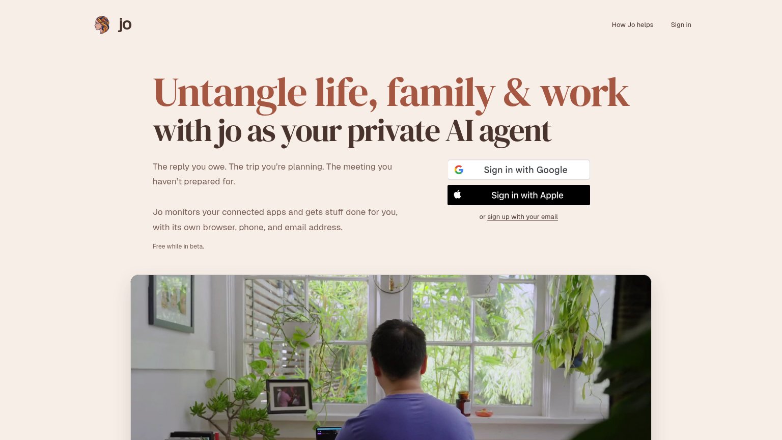
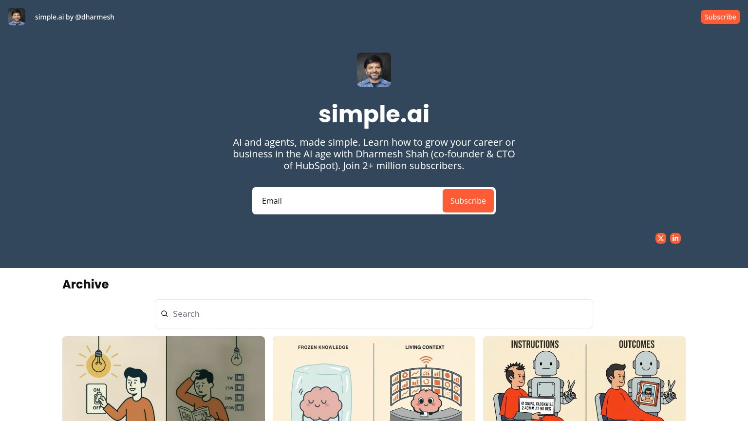

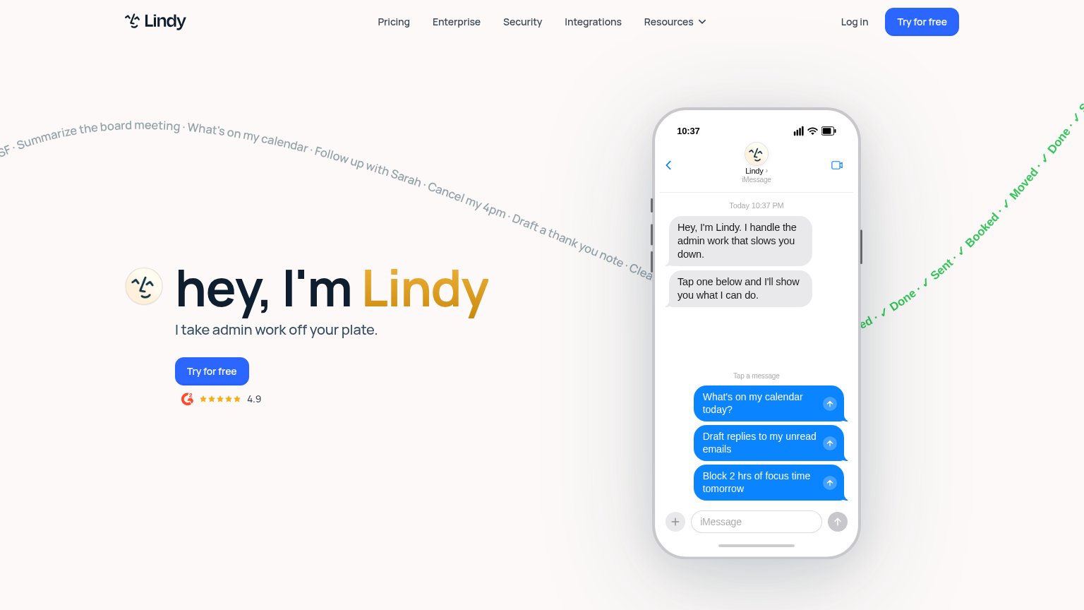
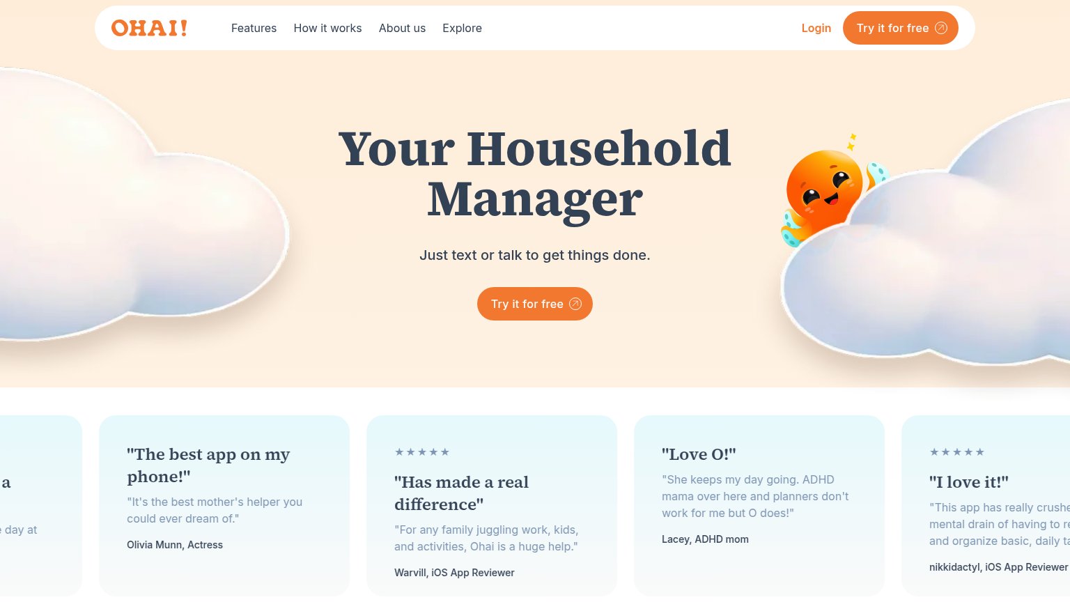
| Trust read | |
|---|---|
| jo | "Free while in beta." disclosure line |
| Product Hunt "#1 Product of the Day" badge above the headline | |
| G2 badge with 4.9 star rating below the "Try for free" CTA | |
| Five-star testimonial card: "The best app on my phone!" — Olivia Munn, Actress | |
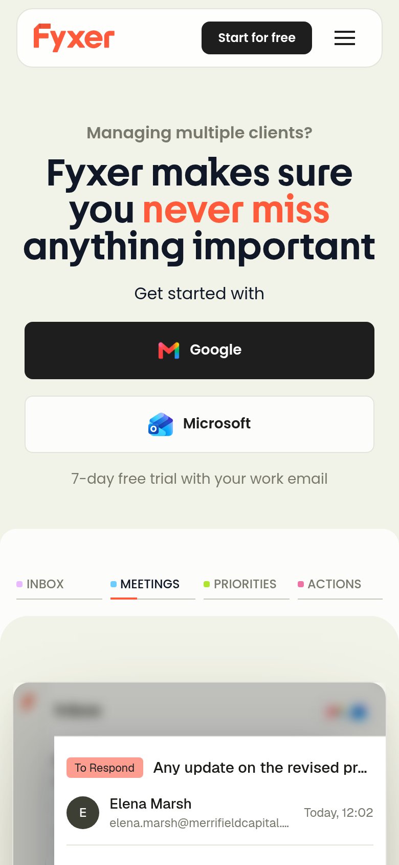
| Product UI demo with INBOX/MEETINGS/PRIORITIES/ACTIONS tabs showing a real email tagged "To Respond" from Elena Marsh | |
| "Join 2+ million subscribers." with author credential "Dharmesh Shah (co-founder & CTO of HubSpot)" |
CTA
58FairCopy, size, verb, cost-feel — does the primary CTA earn the click?
Problems
- 'Sign in' reads returning-user, not new
- no 'free' despite 'Free while in beta'
- duplicates nav 'Sign in' — role unclear
- two equal buttons split the primary action
Mobile web
62FairThe phone experience as a first-class citizen.
What works
What to improve
Value props
76FairTitle, subtitle, hero — do they sell the product's true value?
jo’s headline
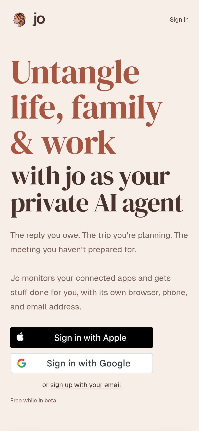
Untangle life, family & work with jo as your private AI agent
The reply you owe. The trip you're planning. The meeting you haven't prepared for.
Working
Could improve
Information hierarchy
83StrongDoes the design help or inhibit what the page is trying to say?
What works
What to improve