
Your landing page’s weakest score is Information hierarchy.
How Apprentice ranks
- 1.
Apprentice72
- 2.
AbInitio Bio68
- 3.
Aizon66
- 4.
Benchling65
- 5.
QbDVision62
72Growth scoreupdated
category scores
category scoresShowHide
Information hierarchy
68FairDoes the design help or inhibit what the page is trying to say?
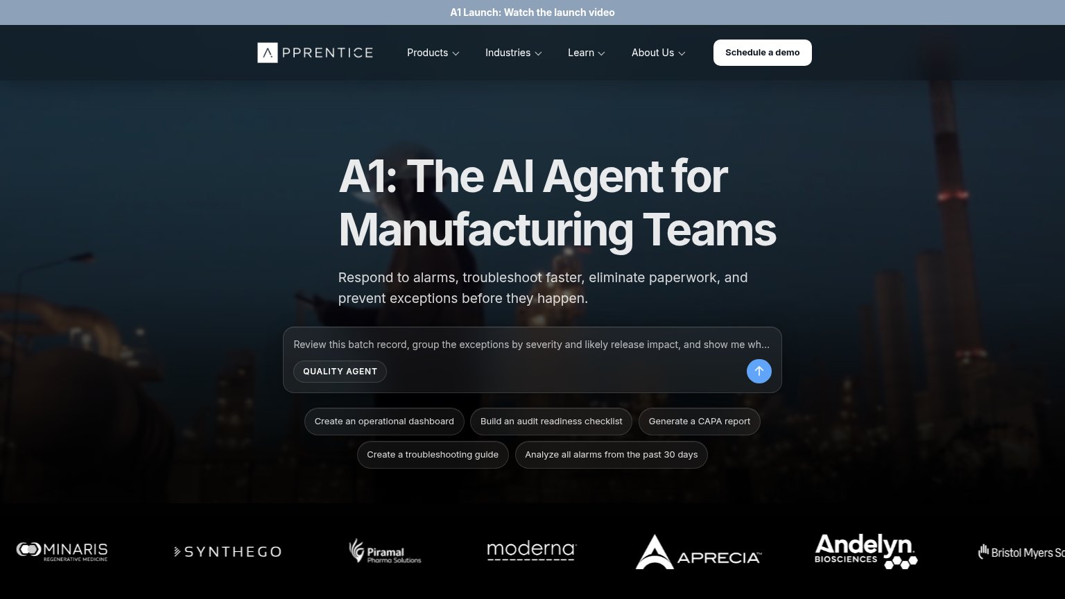 123
- Five prompt-chip cluster — Five equal-weight prompt buttons compete with the demo CTA and split the fold's action into six choices.
- Schedule a demo button — Primary CTA sits only in the top-right nav corner, outside the centered scan path of headline and prompt bar.
- Launch banner link — 'Watch the launch video' occupies the topmost slot and pulls first attention to a video exit before the value prop.
Mobile web
70FairThe phone experience as a first-class citizen.
 1234
- Schedule a demo button — Primary CTA is a desktop-proportioned pill in the header instead of a full-width thumb target in the body.
- Prompt input placeholder — Placeholder text truncates mid-sentence ('...op...'), so the interactive demo's value is unreadable on the phone.
- Launch promo bar — Sticky 'A1 Launch' banner plus the header creates a double-decker top that eats the first viewport before the hero starts.
- Suggestion chip stack — Five stacked prompt chips compete visually with the primary action and push content off the first fold.
Trust
72FairProof that the product is real, competent, and safe to try.
How Apprentice compares
Trust read
CTA
76FairCopy, size, verb, cost-feel — does the primary CTA earn the click?
How Apprentice compares
Recommended rewrites
Value props
76FairTitle, subtitle, hero — do they sell the product's true value?
Apprentice’s headline
A1: The AI Agent for Manufacturing Teams
Respond to alarms, troubleshoot faster, eliminate paperwork, and prevent exceptions before they happen.
Working
Could improve