
Your landing page’s weakest score is Information hierarchy.
How Akia ranks
74Growth scoreupdated
category scores
category scoresShowHide
Information hierarchy
72FairDoes the design help or inhibit what the page is trying to say?
 123
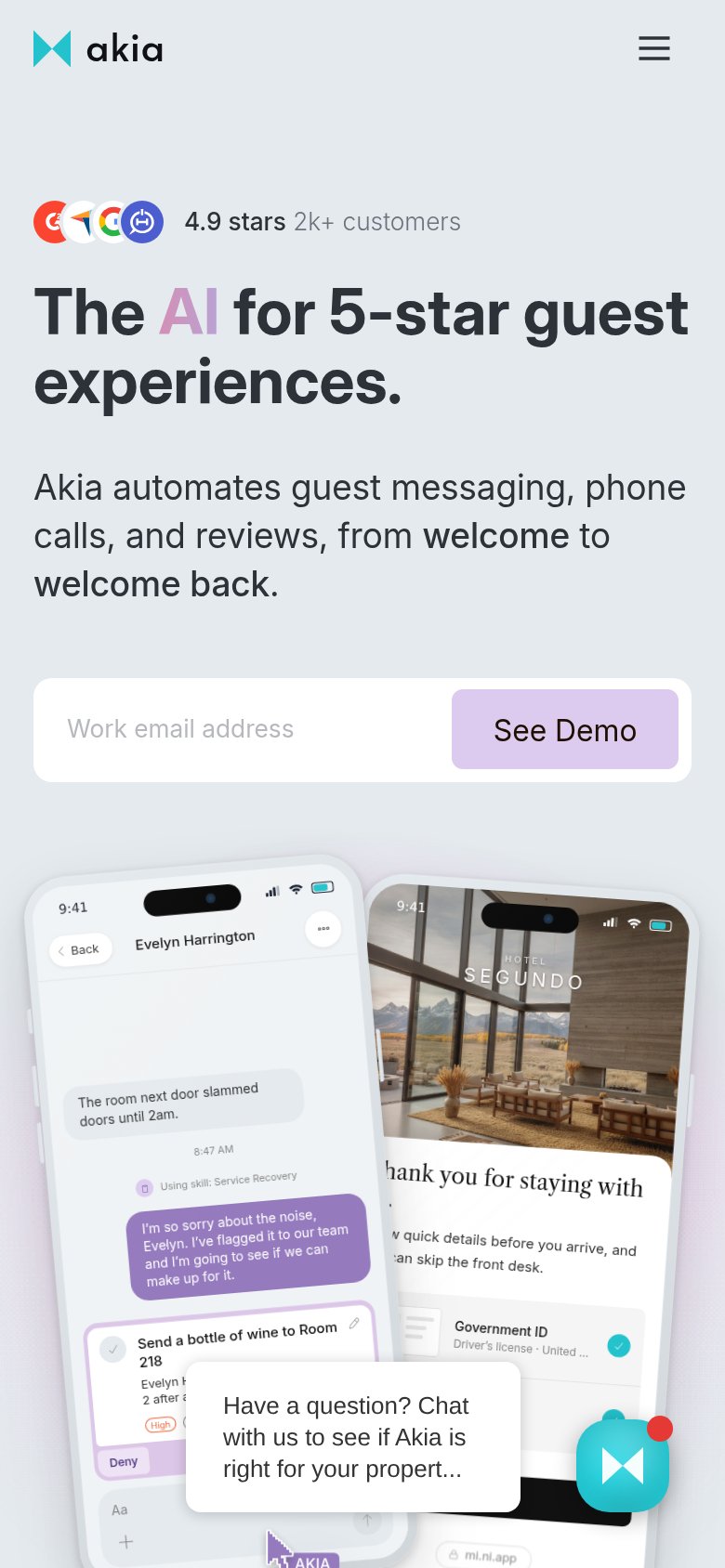
- See Demo button contrast — The primary inline CTA uses a pale lavender fill that reads weaker than the red nav 'See Demo' button, splitting primacy between two demo CTAs.
- Chat widget bubble — The auto-opened 'Have a question?' popup with red badge pulls the eye to the bottom-right corner and competes with the email-capture CTA.
- Nav dropdown row — Four dropdown menus plus Pricing and Sign In create six exit paths before the visitor reaches the hero promise.
CTA
72FairCopy, size, verb, cost-feel — does the primary CTA earn the click?
Problems
- demo implies sales call, not value
- email required before any payoff
- no instant or self-serve path
Trust
72FairProof that the product is real, competent, and safe to try.
How Akia compares
Trust read
Value props
78FairTitle, subtitle, hero — do they sell the product's true value?
Akia’s headline
The AI for 5-star guest experiences.
Akia automates guest messaging, phone calls, and reviews, from welcome to welcome back.
Working
Could improve
Mobile web
78FairThe phone experience as a first-class citizen.
What works
What to improve