
Your landing page’s weakest score is Trust.
How Zymbly ranks
- 1.
Zymbly74
74Growth scoreupdated
category scores
category scoresShowHide
Trust
58FairProof that the product is real, competent, and safe to try.
| Trust read | |
|---|---|
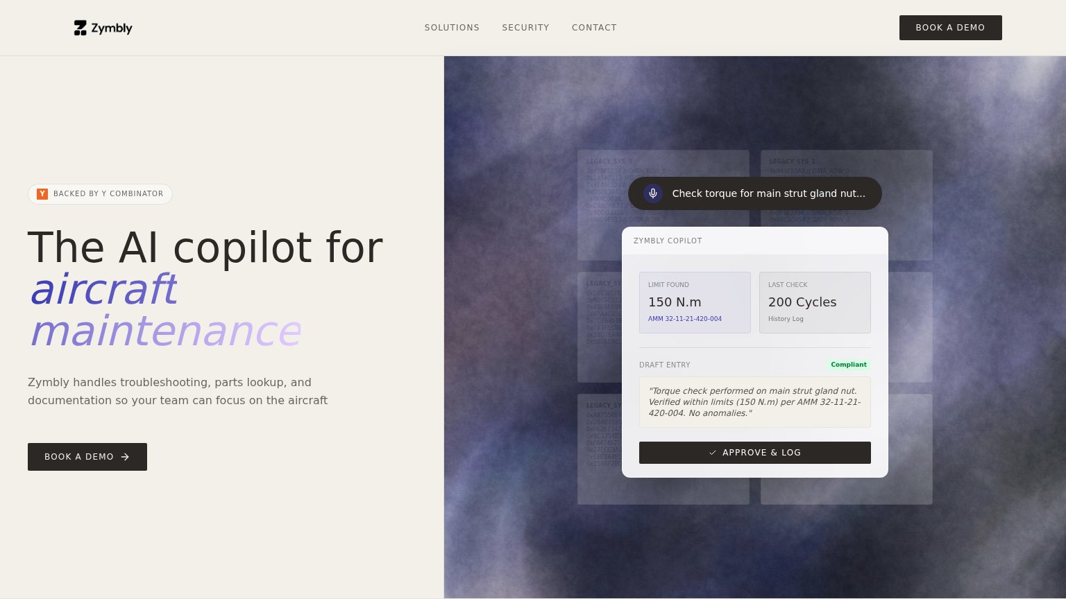
| Zymbly | ZYMBLY COPILOT demo panel showing "150 N.m" limit, "AMM 32-11-21-420-004" reference, and a "Compliant" draft log entry |
CTA
68FairCopy, size, verb, cost-feel — does the primary CTA earn the click?
Problems
- demo booking feels costly
- no low-friction secondary path
- click delivers a meeting, not value
Value props
76FairTitle, subtitle, hero — do they sell the product's true value?
Zymbly’s headline sells
The AI copilot for aircraft maintenance
Zymbly handles troubleshooting, parts lookup, and documentation so your team can focus on the aircraft
Working
- Names exact category and buyer instantly
- Subhead lists three concrete jobs
- Hero demo shows real AMM lookup + log entry
Could improve
- No numbers: time saved, lookup speed
- No emotional hook for mechanic pain
- Outcome clause is generic ("focus on the aircraft")
Information hierarchy
78FairDoes the design help or inhibit what the page is trying to say?
123- Approve & Log button — Dark button styled like the primary CTA and larger than it, pulling first-glance attention to the mockup instead of the conversion action.
- Hero CTA button — Small footprint and placed low-left; visually outweighed by both the nav's BOOK A DEMO and the demo panel's dark button.
- Duplicate nav demo CTA — Second BOOK A DEMO at equal dark weight in the top-right splits the primary action across two targets.
Mobile web
88StrongThe phone experience as a first-class citizen.
 12
- Copilot demo panel — The product demo card is cut mid-render at the fold, showing only a loading state that adds visual noise without payoff.
- Data row text — Hex strings like "0x30DBFF2C // DATA_ROW_4" render as cramped illegible clutter behind the voice pill on a phone.