Past reportsShow past reportsHide past reports
- Sep 22, 202667LiveOverall −1 · Mobile web −8 · Value props +4Viewing
- Apr 26, 202668First tracked report — strongest Information hierarchy 78, weakest Trust 48View →

Your landing page’s weakest score is Trust.
How Ventura ranks
category scores
Proof that the product is real, competent, and safe to try.

| Trust read | |
|---|---|
| Ventura | "No ERP replacement. Human review where needed." |
| implicit context Pantheon AI (getpantheon.com) may benefit from pre-existing familiarity among its target audience. | |
| "TRUSTED BY INDUSTRY LEADERS OF ALL SIZES" logo band with ArcBest, Echo, Evans, NFI, Sunset, and Kingsgate |
The phone experience as a first-class citizen.
 123
Copy, size, verb, cost-feel — does the primary CTA earn the click?
Problems
Title, subtitle, hero — do they sell the product's true value?
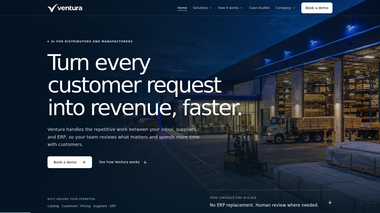
Turn every customer request into revenue, faster.
Ventura handles the repetitive work between your inbox, suppliers, and ERP, so your team reviews what matters and spends more time with customers.
Working
Could improve
Does the design help or inhibit what the page is trying to say?
12You need a lazyweb account to add your product, do a growth audit, create backlog and more
Sign me in to my Lazyweb report hub. Fetch https://www.lazyweb.com/hub/agent/sign-in.md and follow its instructions exactly. If you can't fetch URLs, tell me and I'll paste the instructions instead.
Lazyweb MCP
Step 1 of 2 · your login
Where should we send your reports? This email becomes your login on lazyweb.com — everything your agent makes lands in your workspace.
That doesn't look like an email — check it and try again.
No password, no spam — one workspace link now, then your agent command.
Step 2 of 2 · your agent
Paste this into your agent. Claude Code, Codex, Cursor, or another MCP-capable agent opens the link and sets itself up. Data access is plan-dependent.
Generating your agent command...
Free account
We’ll add Ventura as your product and bring this score into your workspace. You can change it later in Settings.