
Your landing page’s weakest score is Trust.
How Unifold ranks
70Growth scoreupdated
category scores
category scoresShowHide
Score over time
Trust
58FairProof that the product is real, competent, and safe to try.
| Trust read | |
|---|---|
| Unifold | "Backed By Y Combinator" badge beneath the hero CTAs |
| No visible trust signal identified. | |
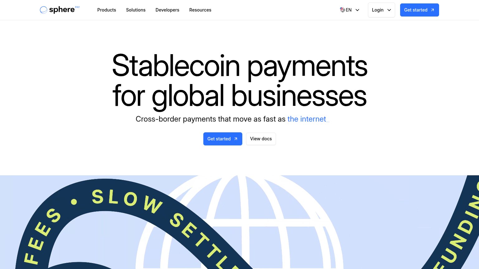
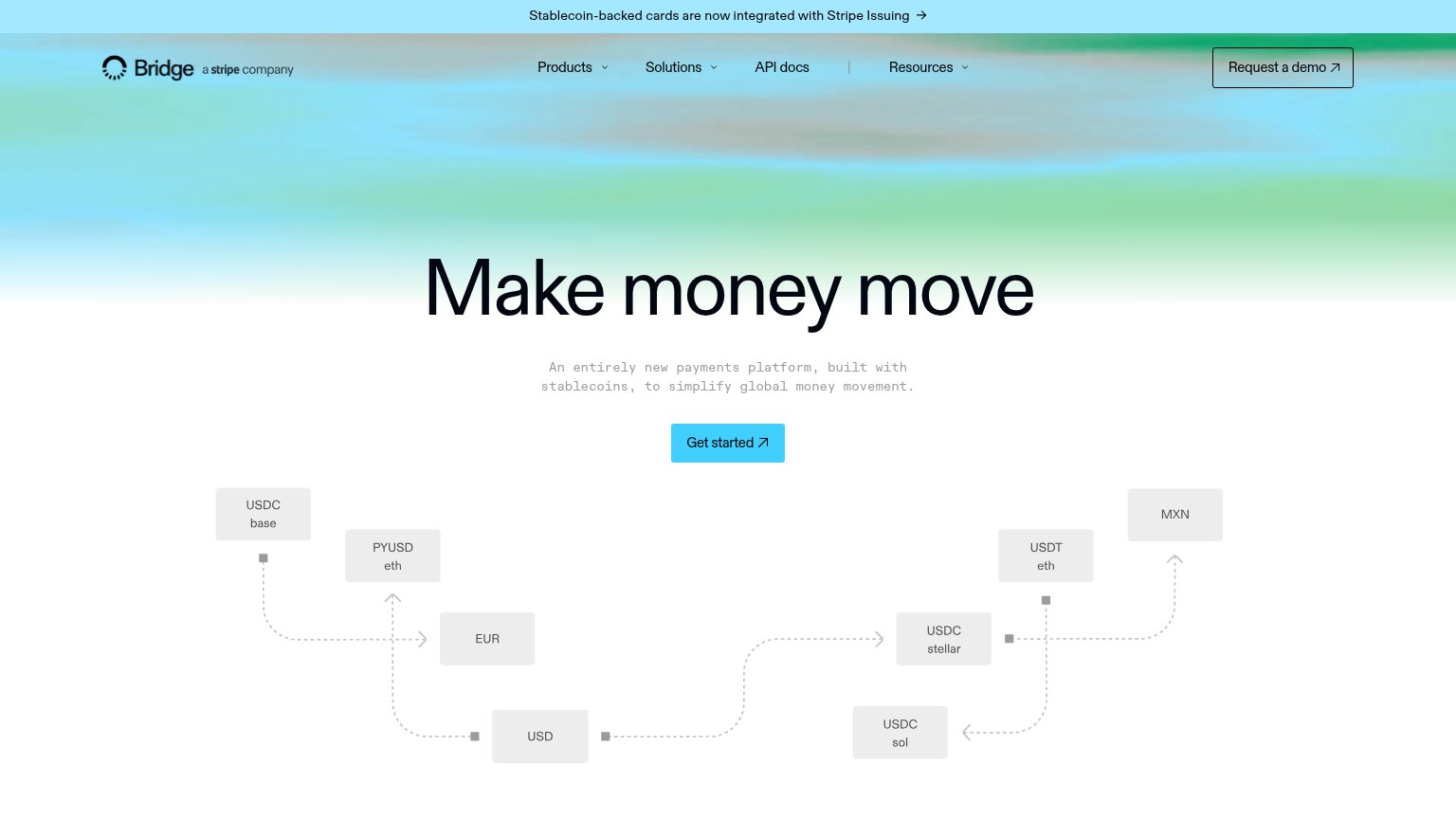
| "a stripe company" mark next to the Bridge logo, reinforced by the banner "Stablecoin-backed cards are now integrated wi | |
| Phone mockup showing the live Meso checkout UI at transfer.meso.network with fee breakdown and "Buy USDC" button | |
| Product dashboard cards showing "Total Balance (USD) $2,315,487.41" with Withdraw button and "Daily Gross Volume (USD)" | |
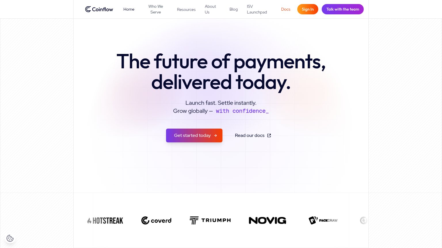
| Customer logo strip: HotStreak, Coverd, Triumph, Novig, PackDraw |
Information hierarchy
72FairDoes the design help or inhibit what the page is trying to say?
 1234
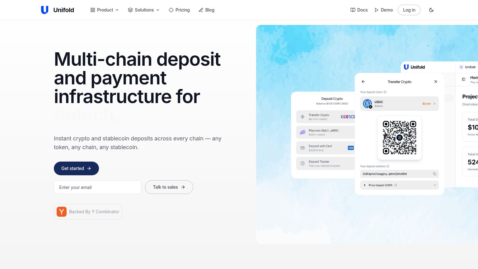
- Product screenshot cropped — The dashboard mockup runs off the right edge and gets clipped, so the fold's main visual proof reads as accidental rather than composed.
- Faded headline word — The rotating word "fintech." is rendered in near-white grey, so the headline's key audience qualifier is barely legible at the exact moment of capture.
- Three stacked CTAs — "Get started", an email field, and "Talk to sales" sit at similar weight in one column, splitting the visitor's first action three ways.
- Docs and Demo links — Two extra top-right exits styled at nav weight compete with the hero CTA before the visitor reaches the fold's action zone.
CTA
72FairCopy, size, verb, cost-feel — does the primary CTA earn the click?
Problems
- generic label, no payoff named
- email field's purpose unstated
- 3 stacked actions compete
- 'Talk to sales' near-equal weight
Value props
72FairTitle, subtitle, hero — do they sell the product's true value?
Unifold’s headline sells
Multi-chain deposit and payment infrastructure for fintech.
Instant crypto and stablecoin deposits across every chain — any token, any chain, any stablecoin.
Working
- Names category and buyer plainly
- Hero image shows real product UI
- Subhead nails the any-chain promise
Could improve
- No concrete numbers anywhere in copy
- Flat tone — no pain or relief evoked
- Rotating audience word dilutes focus
Mobile web
76FairThe phone experience as a first-class citizen.
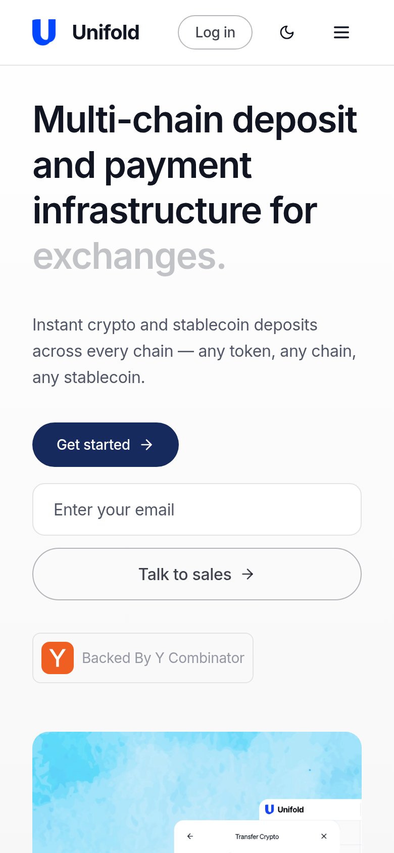 123
- Get started button — Primary CTA is half-width while the secondary button below is full-bleed, inverting the tap hierarchy.
- Enter Unifold's email field — Orphaned input with no submit label or context, splitting attention between two adjacent CTAs.
- Talk to sales button — Secondary action is the largest, most thumb-friendly element in the fold, outcompeting the primary CTA.