
Your landing page’s weakest score is Trust.
How Turnstone ranks
72Growth scoreupdated
category scores
category scoresShowHide
Score over time
Trust
62FairProof that the product is real, competent, and safe to try.
| Trust read | |
|---|---|
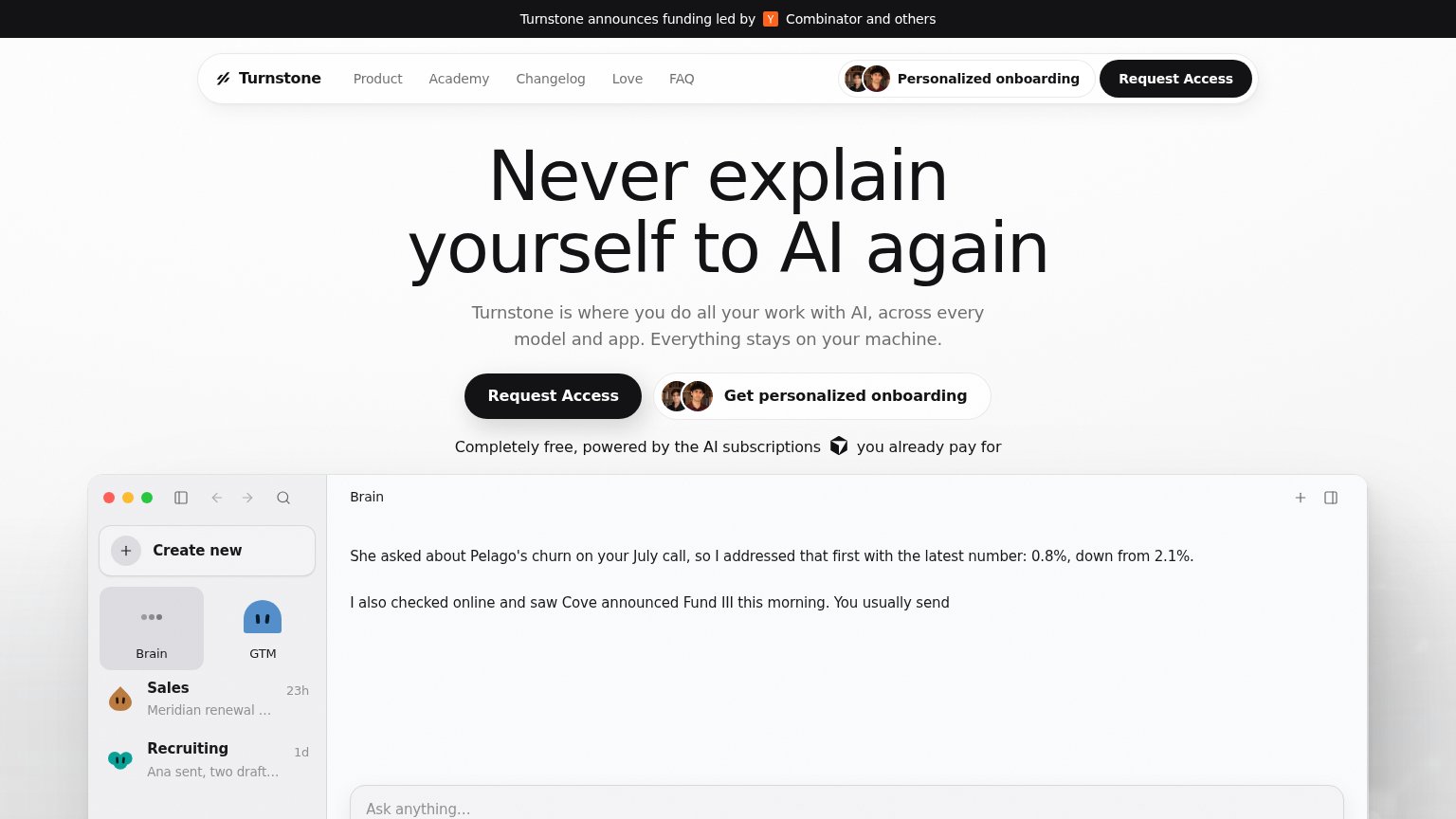
| Turnstone | Announcement bar: "Turnstone announces funding led by Y Combinator and others" |
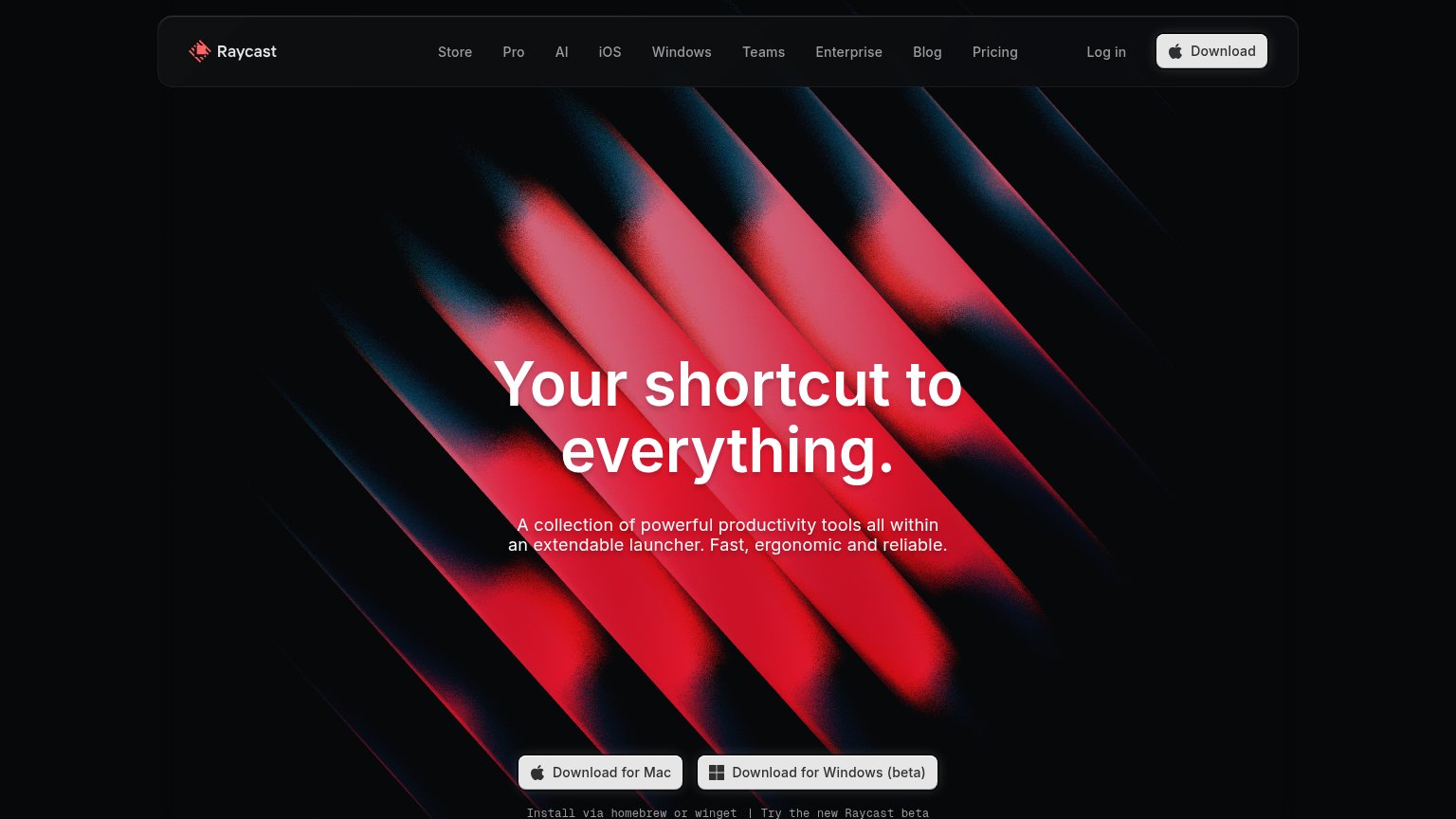
| implicit context Raycast (Raycast AI) may benefit from pre-existing familiarity among its target audience. | |
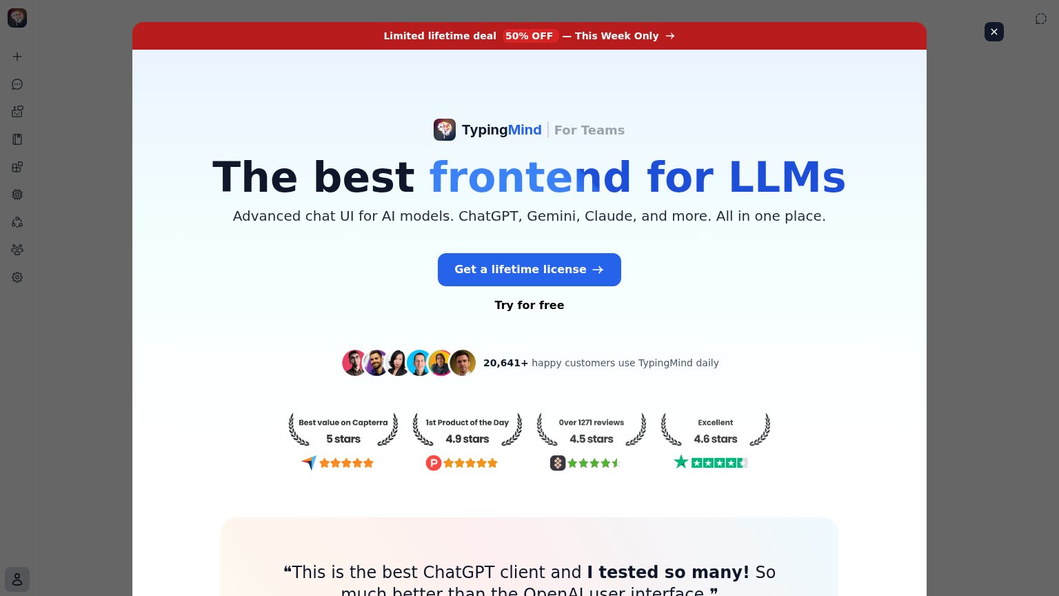
| Detailed product demo screenshot showing Cluely's overlay answering "A discounted cash flow model values a company by pr | |
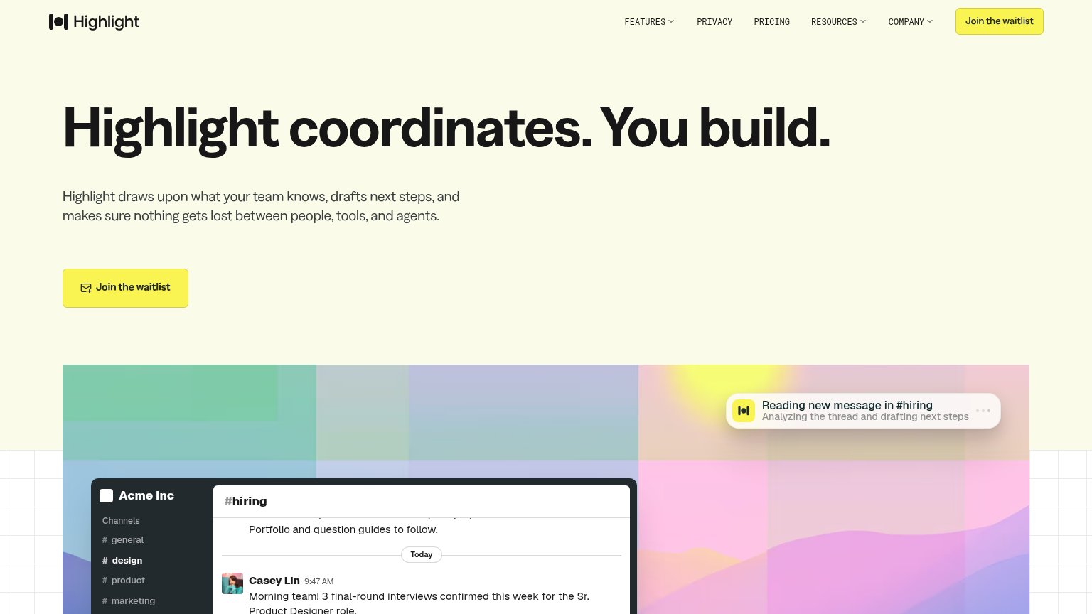
| Product demo overlay: "Reading new message in #hiring — Analyzing the thread and drafting next steps" | |
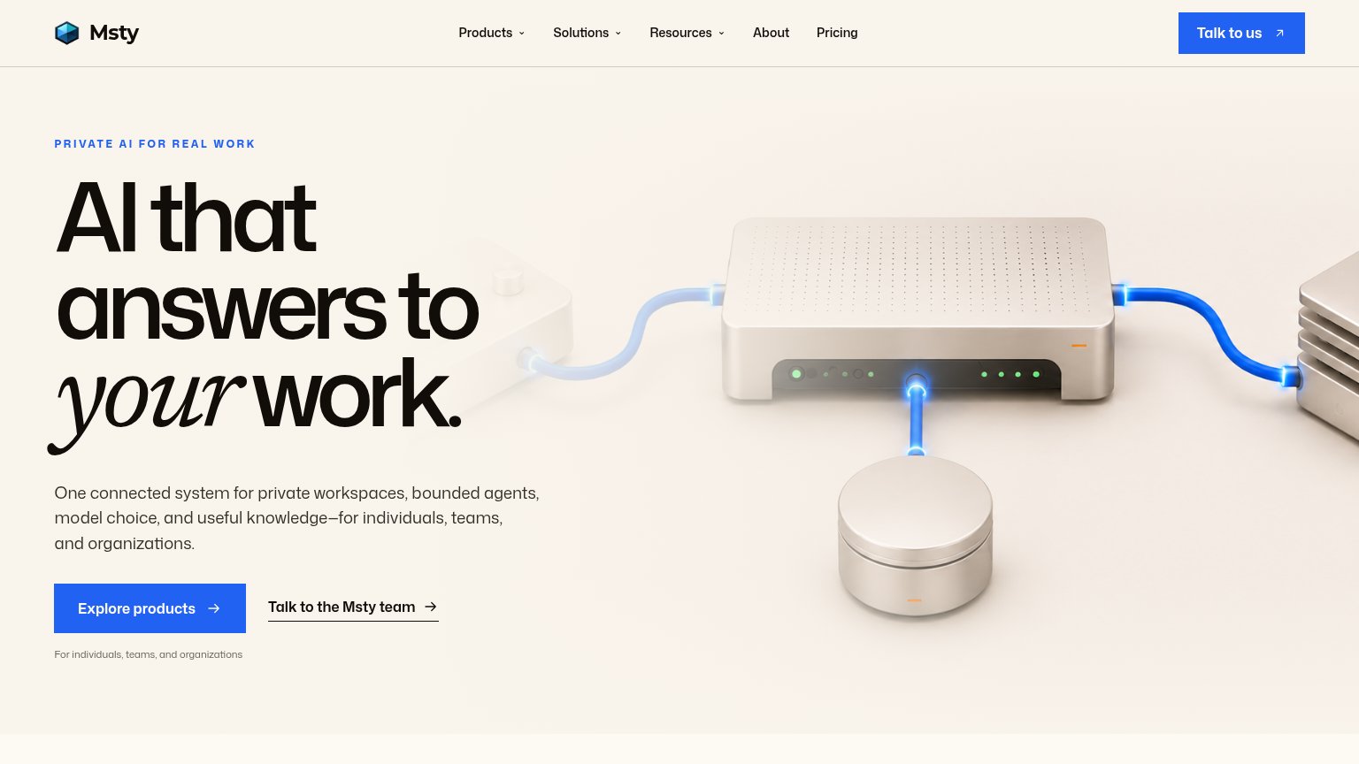
| Testimonial section opening visible on mobile ("Msty has been a…" with quotation mark) | |
| Row of four review badges with scores and counts: "Over 1271 reviews, 4.5 stars", "Excellent 4.6 stars" (Trustpilot), "1 |
CTA
64FairCopy, size, verb, cost-feel — does the primary CTA earn the click?

Problems
- no 'free' despite free product
- 'Request' implies gate and delay
- click delivers waiting, not value
Value props
72FairTitle, subtitle, hero — do they sell the product's true value?
Turnstone’s headline undersells
Never explain yourself to AI again
Turnstone is where you do all your work with AI, across every model and app. Everything stays on your machine.
Working
- Taps a real, felt frustration
- Privacy claim: stays on Turnstone's machine
- Demo shows context recall, not decor
Could improve
- Never says 'memory' or 'context'
- Headline is a negation, not a gain
- No numbers or proof points in copy
Information hierarchy
78FairDoes the design help or inhibit what the page is trying to say?
1234- Get personalized onboarding pill — Styled at near-equal weight beside Request Access, splitting the primary click two ways.
- Five-link nav row — Product, Academy, Changelog, Love, FAQ are five exit paths before the visitor reads the headline.
- Nav onboarding pill — Duplicates the hero's secondary CTA, crowding the nav's Request Access with a competing avatar button.
- YC funding banner — Full-width black bar outranks the nav and pulls the first glance to news, not the promise.
Mobile web
83StrongThe phone experience as a first-class citizen.
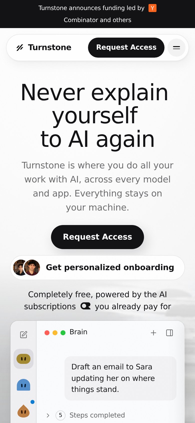 1234
- Two-line announcement banner — Funding banner wraps to two lines, stealing header space before the hero starts.
- Duplicate nav CTA — "Request Access" repeats in the nav pill and hero button one thumb-length apart, splitting attention.
- Onboarding pill placement — Secondary "Get personalized onboarding" sits flush under the primary CTA, competing for the same tap.
- Hero button width — "Request Access" stays desktop-proportioned instead of near-full-bleed for easy thumb reach.