
Your landing page’s weakest score is Value props.
How Cardinal ranks
68Growth scoreupdated
category scores
category scoresShowHide
Score over time
Value props
54FairTitle, subtitle, hero — do they sell the product's true value?
Cardinal’s headline vague
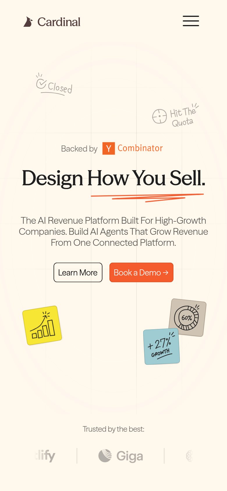
Design How You Sell.
The AI Revenue Platform Built For High-Growth Companies. Build AI Agents That Grow Revenue From One Connected Platform.
Working
- YC badge lends instant credibility
- Real customer logo row (Mintlify, Deepgram)
- Names the category: AI agents for revenue
Could improve
- Headline could caption any sales tool
- No concrete numbers or outcomes in copy
- Hero decorates; never shows the product
Trust
64FairProof that the product is real, competent, and safe to try.


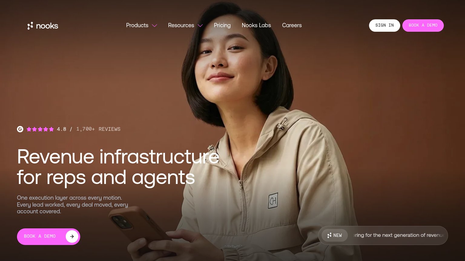
| Trust read | |
|---|---|
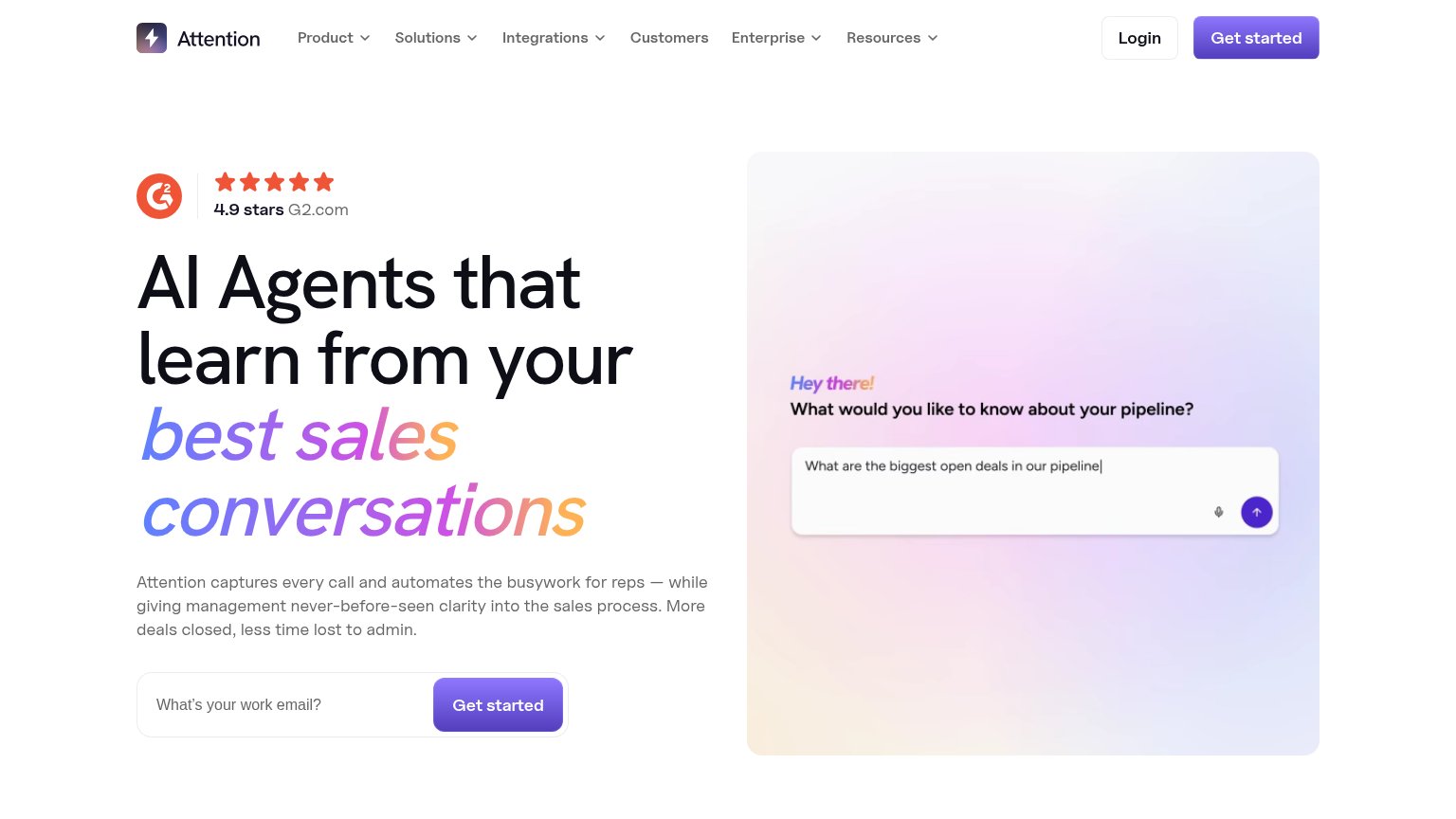
| Cardinal | "Trusted by the best:" logo row — Mintlify, Giga, Parcha, Luminai, Deepgram |
| Product UI mockup showing "Conversation Data Sources" with Gmail, Slack, and Teams integrations and an opportunity panel | |
| "4.9 stars G2.com" rating badge in the desktop hero | |
| Customer logo strip featuring MongoDB, WSP, Ramp, together.ai, Cloud Software Group, and XBOW | |
| G2 badge: "4.8 / 1,700+ REVIEWS" | |
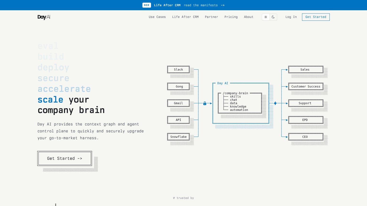
| Integration diagram naming Slack, Gong, Gmail, API, and Snowflake feeding the Day AI /company-brain |
CTA
68FairCopy, size, verb, cost-feel — does the primary CTA earn the click?
Problems
- demo booking feels costly
- no low-commitment alternative
- secondary 'Learn More' is vague
Information hierarchy
72FairDoes the design help or inhibit what the page is trying to say?
1234- Duplicate Book a Demo — The hero repeats the header's 'Learn More' + 'Book a Demo' pair, splitting attention across four buttons in one fold.
- Six-link nav row — Product, Playbooks, Enterprise, Customers, Team, Blog offer six equal-weight exits before the visitor reads the headline.
- Learn More button — A same-size secondary button sits directly beside the primary CTA, halving its claim on the click.
- Deepgram logo faded — The last logo in the trust strip is noticeably lighter than the others, reading as a rendering glitch rather than a deliberate style.
Mobile web
80StrongThe phone experience as a first-class citizen.
 12
- Side-by-side CTA pair — "Book a Demo" shares the row with "Learn More"; both are desktop-sized instead of one full-width thumb target.
- Clipped logo carousel — Trust logos like "tlify" are cut off at the edges, weakening the "Trusted by the best" proof.