
Your landing page’s weakest score is Value props.
How Servo7 ranks
71Growth scoreupdated
category scores
category scoresShowHide
Score over time
Value props
58FairTitle, subtitle, hero — do they sell the product's true value?
Servo7’s headline vague
Fully autonomous supply chains
Unloading loose-loaded containers end to end with unmatched ROI.
Working
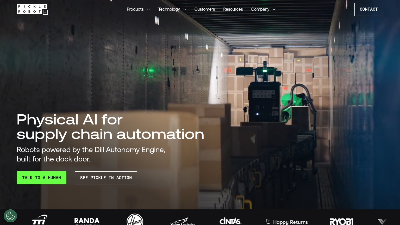
- Hero video shows robot doing the real job
- Subhead names the concrete task
- Logo strip + YC badge back the claim
Could improve
- Headline overclaims beyond container unloading
- "Unmatched ROI" has no number
- No emotional hook: labor, injuries, delays
CTA
62FairCopy, size, verb, cost-feel — does the primary CTA earn the click?

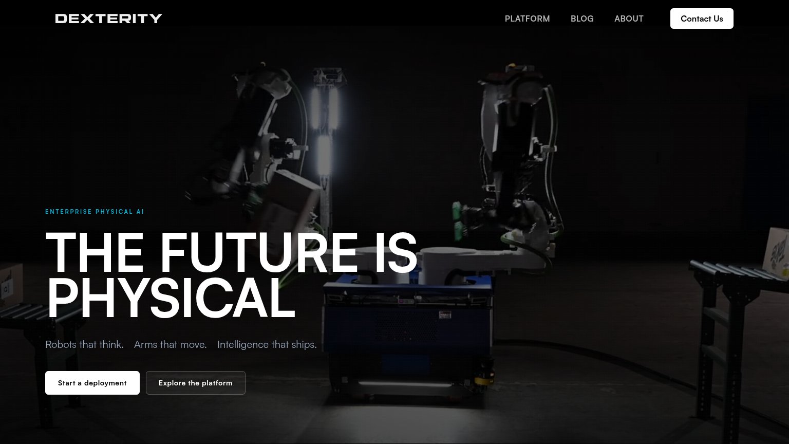
Problems
- no action verb — reads as a label
- 'demo' feels like a sales-call ask
- nav CTA is 'Contact', not the demo
Trust
76FairProof that the product is real, competent, and safe to try.
| Trust read | |
|---|---|
| Servo7 | Real in-container video of the Servo7 robot arm unloading boxes in the hero |
| Customer logo strip (Cintas, Ryobi, Happy Returns, Hoover, TTI, Randa, Yusen Logistics) | |
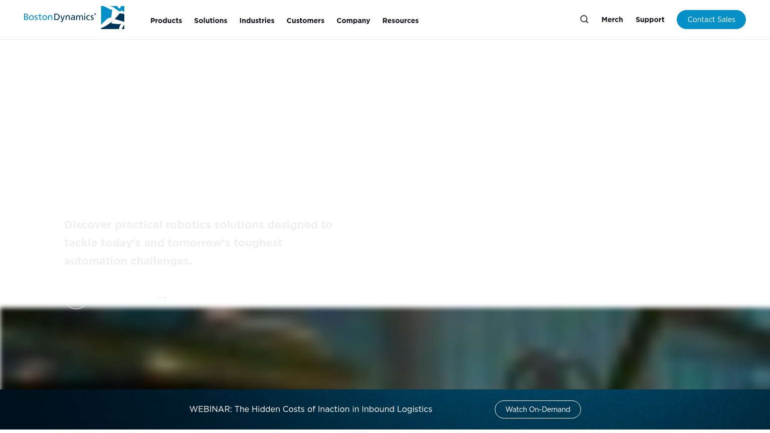
| implicit context Boston Dynamics Stretch may benefit from pre-existing familiarity among its target audience. | |
| No visible trust signal identified. | |
| No visible trust signal identified. |
Information hierarchy
78FairDoes the design help or inhibit what the page is trying to say?
123- Dark grainy hero video — Underlit warehouse footage reads as murky brown-black; the robot's action is hard to parse at a glance, muting the value-prop payoff.
- Duplicate Contact buttons — 'Contact' appears twice in the fold — nav top-right and beside 'Product demo' — splitting weight with the primary CTA.
- Cropped logo strip — Right-edge logo is cut mid-word and low-contrast marks vary wildly in style, making the trust bar feel unfinished.
Mobile web
80StrongThe phone experience as a first-class citizen.
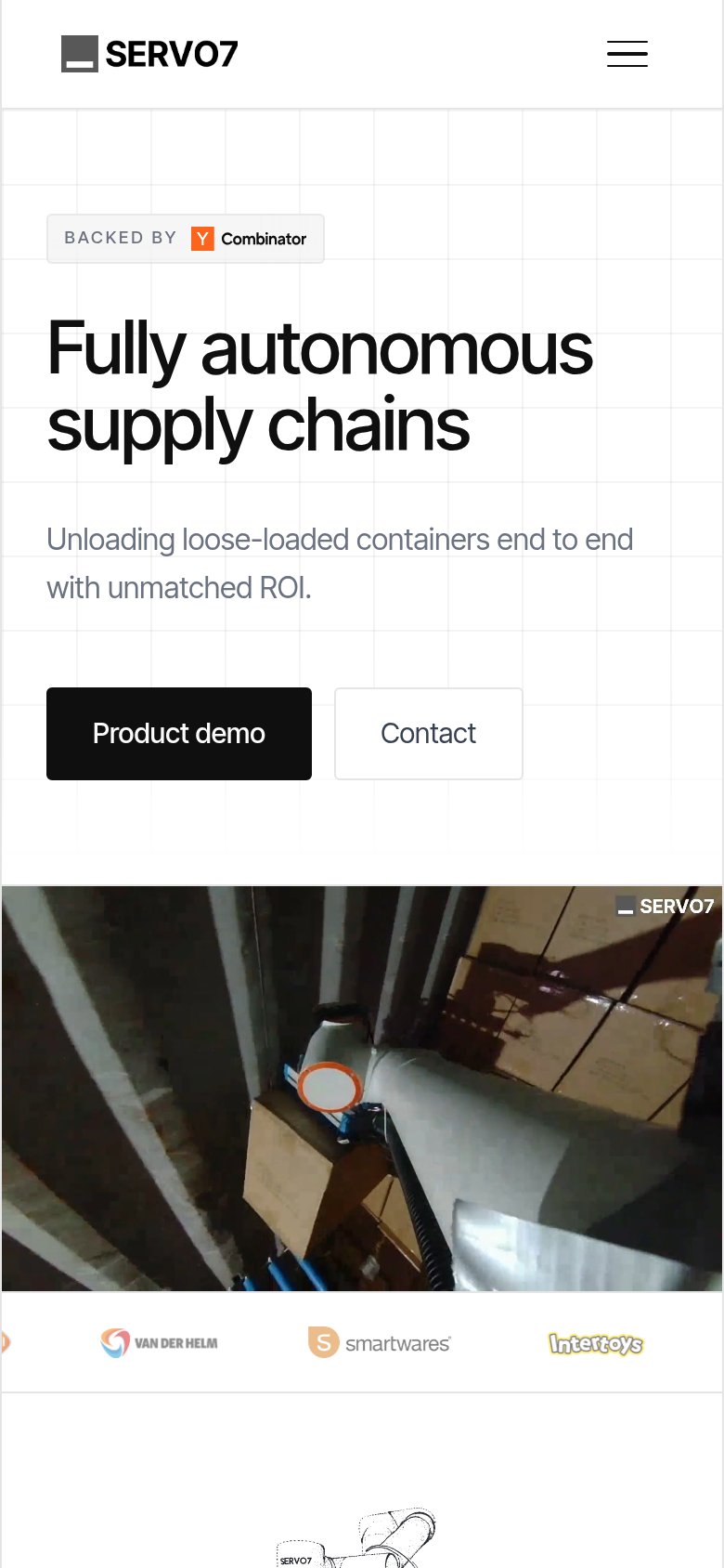 123
- Product demo button — Desktop-proportioned button sits at roughly 40% width instead of full-bleed for a thumb-friendly tap.
- Split CTA row — "Product demo" and "Contact" compete side by side at similar visual weight, diluting the primary action.
- Partner logo strip — Leftmost logo is clipped mid-icon at the viewport edge, signaling an unpolished carousel.