Rhizome AIYC W26 landing page report.
← Back to YC W26

Score over time

90807060504030Basil Systems 64 on Sep 22 (Live)DDi RegulatoryOne (Regulatory Intelligence) 61 on Apr 15 (Wayback)DDi RegulatoryOne (Regulatory Intelligence) 55 on May 11 (Wayback)DDi RegulatoryOne (Regulatory Intelligence) 55 on Jun 10 (Wayback)DDi RegulatoryOne (Regulatory Intelligence) 61 on Sep 22 (Live)Cortellis Regulatory Intelligence (Clarivate) 44 on Mar 28 (Wayback)Cortellis Regulatory Intelligence (Clarivate) 46 on Sep 22 (Live)Rhizome AI 80 on Apr 11 (Wayback)Rhizome AI 79 on Jun 5 (Wayback)Rhizome AI 80 on Sep 22 (Live)Apr 11Jun 5Sep 22
Past reportsShow past reportsHide past reports
  1. Sep 22, 202680LiveOverall +1 · Information hierarchy +6 · CTA −4Viewing
  2. Jun 5, 202679Overall −1 · CTA +10 · Trust −10View →
  3. Apr 11, 202680First tracked report — strongest Value props 86, weakest CTA 72View →

Trust

72Fair

Proof that the product is real, competent, and safe to try.

Trust read
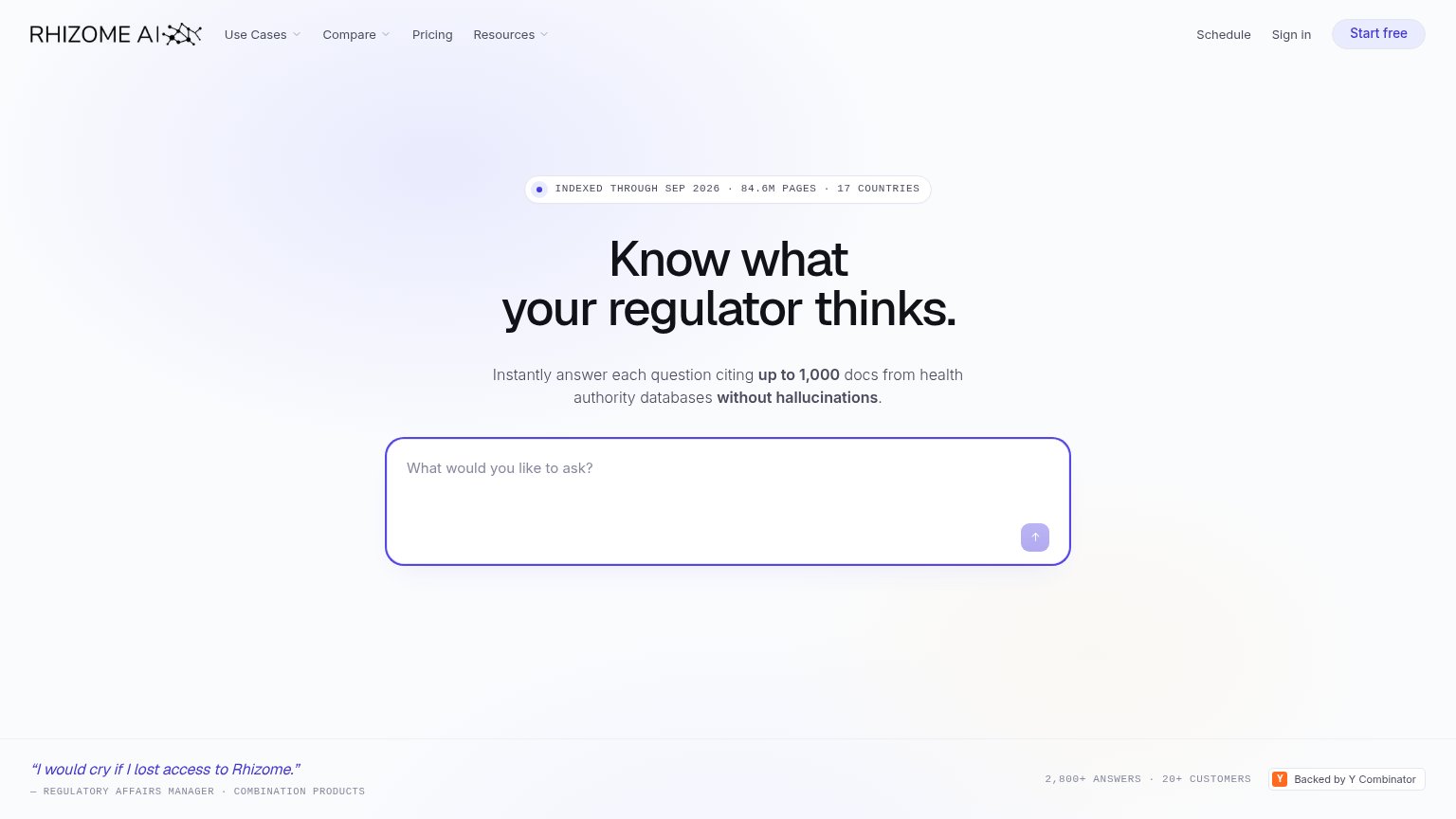
Rhizome AI"2,800+ ANSWERS · 20+ CUSTOMERS" usage stats beside the "Backed by Y Combinator" badge
Basil Systems"Trusted By" logo wall with Siemens, Johnson & Johnson, Medtronic, ZOLL, Boston Scientific, Baxter
DDi RegulatoryOne (Regulatory Intelligence)Stats bar: "50+ Enterprise Clients", "140+ Mid-Market Clients", "15yrs Domain Expertise"
Cortellis Regulatory Intelligence (Clarivate)implicit context Cortellis Regulatory Intelligence (Clarivate) may benefit from pre-existing familiarity among its target audience.

CTA

78Fair

Copy, size, verb, cost-feel — does the primary CTA earn the click?

Rhizome AIin-product action

Problems

  • icon-only submit, no promise
  • generic placeholder, no domain cue
  • no 'free' despite free tier in nav
  • nav 'Start free' competes with input

Mobile web

82Strong

The phone experience as a first-class citizen.

Mobile web annotations on the mobile capture12
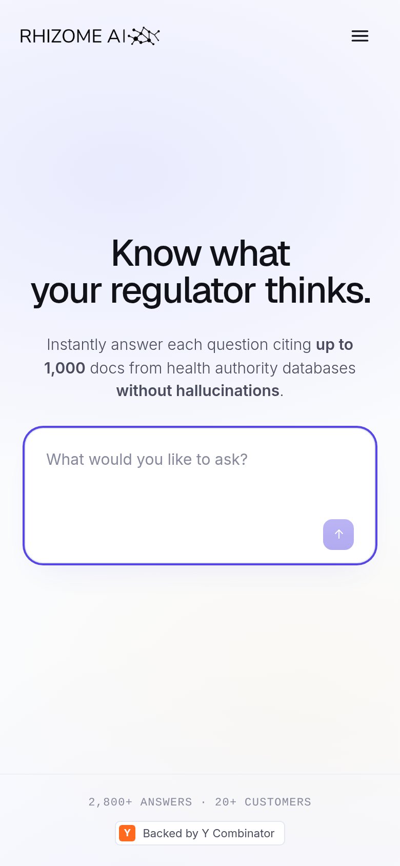
  1. Submit arrow button — Small, low-contrast, unlabeled arrow is the only submit affordance — not thumb-friendly or self-explanatory.
  2. Hamburger menu icon — Hides the desktop 'Start free' CTA entirely; no visible signup path in the mobile fold.

Information hierarchy

84Strong

Does the design help or inhibit what the page is trying to say?

Information hierarchy annotations on the desktop capture1234
  1. Start free button — Second styled CTA competes with the ask box for the primary action; visitors split between signup and trying a query.
  2. Ask box submit arrow — Primary action is an unlabeled icon at low contrast — no verb tells the visitor what happens on submit.
  3. Nav link cluster — Six links plus two dropdowns above the fold offer exits before the visitor reaches the ask box.
  4. Stat chip micro-copy — Tiny all-caps letterspaced type makes the strongest proof point (84.6M pages) nearly illegible at a glance.

Value props

84Strong

Title, subtitle, hero — do they sell the product's true value?

Rhizome AI’s headline sellsKnow what your regulator thinks.Instantly answer each question citing up to 1,000 docs from health authority databases without hallucinations.

Working

  • Headline hits the core anxiety of the ICP
  • Specific proof: 84.6M pages, 17 countries
  • 'Without hallucinations' preempts AI doubt

Could improve

  • 'Up to 1,000 docs' is a spec, not an outcome
  • Domain (health authority) buried mid-subhead
  • Empty ask box gives no example query