
Your landing page’s weakest score is Trust.
How REV1 ranks
70Growth scoreupdated
category scores
category scoresShowHide
Trust
44PoorProof that the product is real, competent, and safe to try.
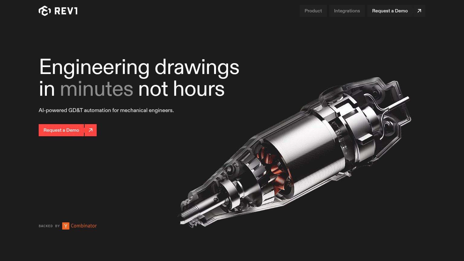

| Trust read | |
|---|---|
| REV1 | "BACKED BY Y Combinator" badge |
| Update banner: "Updated: ARES Commander 2027 SP1" with Explore New Features / Download Now links showing an actively shi |
CTA
64FairCopy, size, verb, cost-feel — does the primary CTA earn the click?
Problems
- click buys a sales call, not value
- 'Request' implies waiting for approval
- no low-friction alternative CTA
Value props
76FairTitle, subtitle, hero — do they sell the product's true value?
REV1’s headline sells
Engineering drawings in minutes not hours
AI-powered GD&T automation for mechanical engineers.
Working
- Time outcome named: minutes not hours
- GD&T names the exact job automated
- Audience explicit: mechanical engineers
Could improve
- Hero image decorates, doesn't demo output
- "AI-powered" is generic filler
- No hard numbers or customer proof
Information hierarchy
82StrongDoes the design help or inhibit what the page is trying to say?
123- Duplicate Request a Demo — Nav repeats the hero's 'Request a Demo' at equal weight, splitting attention between two identical CTAs.
- Nav arrow icon button — Standalone arrow button next to the nav CTA reads as a third clickable exit with no label or purpose.
- Grey headline word — 'minutes' — the payoff word of the promise — is dimmed to grey, de-emphasizing the strongest part of the headline.
Mobile web
86StrongThe phone experience as a first-class citizen.
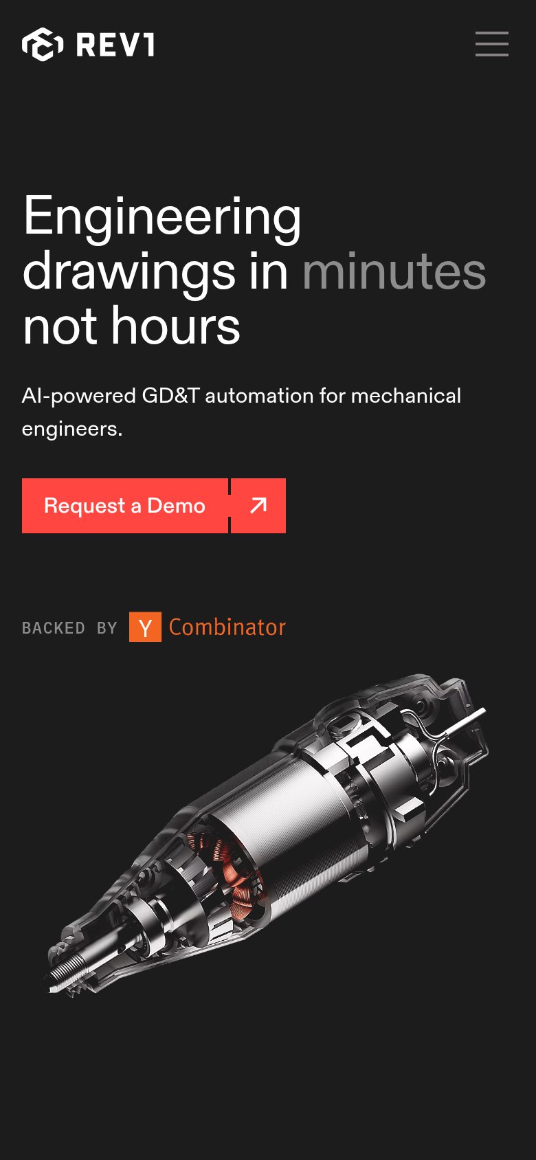 12
- Request a Demo button — Stops at roughly half width and is split into label + arrow segments, shrinking the thumb target on mobile.
- Grey "minutes" keyword — The dimmed grey treatment de-emphasizes the strongest word in the value prop against the dark background.