
Your landing page’s weakest score is Value props.
How Remy AI ranks
69Growth scoreupdated
category scores
category scoresShowHide
Value props
58FairTitle, subtitle, hero — do they sell the product's true value?
Remy AI’s headline undersells
Dexterous robots for fulfillment automation
The latest in AI and robotics, built for real-world flexibility
Working
- Names the exact category and buyer
- 'Dexterous' hints at differentiation
- YC/backer logos add early proof
Could improve
- Subhead is generic filler
- No numbers or named outcomes
- Hero shows idle robot, not work
Trust
58FairProof that the product is real, competent, and safe to try.
| Trust read | |
|---|---|
| Remy AI | "Backed by" section with Y Combinator logo |
| Dated research timeline, e.g. "π0.7: a Steerable Model with Emergent Capabilities — April 16, 2026" | |
| No visible trust signal identified. | |
| Hero photo of a real warehouse deployment with robotic picking cell and conveyor lines |
Information hierarchy
72FairDoes the design help or inhibit what the page is trying to say?
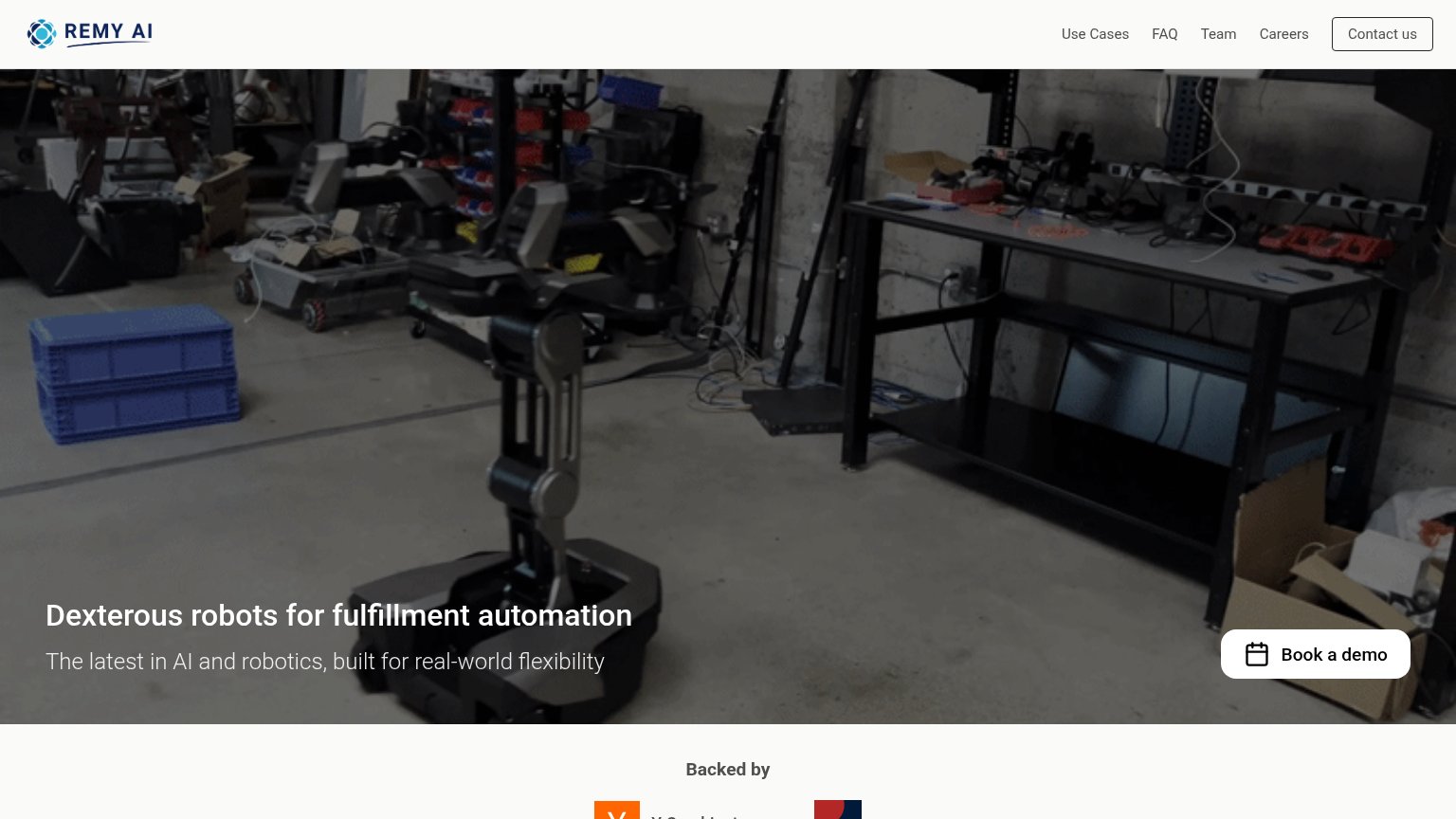 1234
- Book a demo button — Stranded in the bottom-right corner, opposite the scan path that ends at the left-aligned headline.
- Contact us nav button — Bordered button styling makes it compete with, and duplicate the intent of, Book a demo.
- Headline over busy footage — White text sits on cluttered mid-tone workshop imagery with no scrim, thinning legibility.
- Nav link cluster — Four equal-weight links (Use Cases, FAQ, Team, Careers) offer exits before the value prop lands.
CTA
76FairCopy, size, verb, cost-feel — does the primary CTA earn the click?
Problems
- 'Book' feels like a time commitment
- competes with 'Contact us' in header
- desktop button sits low, off-axis
Mobile web
83StrongThe phone experience as a first-class citizen.
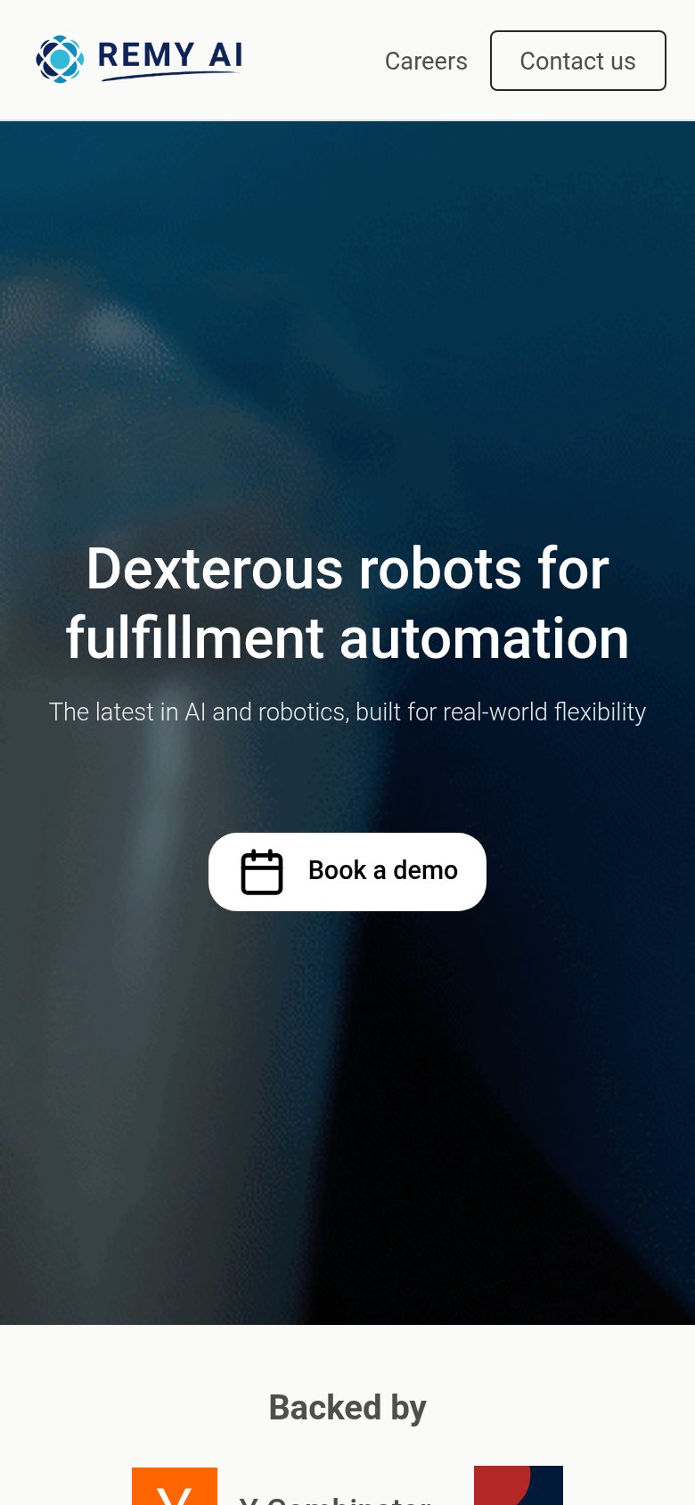 12
- Book a demo button — Desktop-proportioned pill instead of a full-width, thumb-friendly mobile bar.
- Contact us header button — Second conversion ask in the header competes with the hero's Book a demo CTA.