
Your landing page’s weakest score is Trust.
How Oximy ranks
- 1.
Oximy69
- 2.
Multitudes... (skip)38
69Growth scoreupdated
category scores
category scoresShowHide
Trust
44PoorProof that the product is real, competent, and safe to try.
| Trust read | |
|---|---|
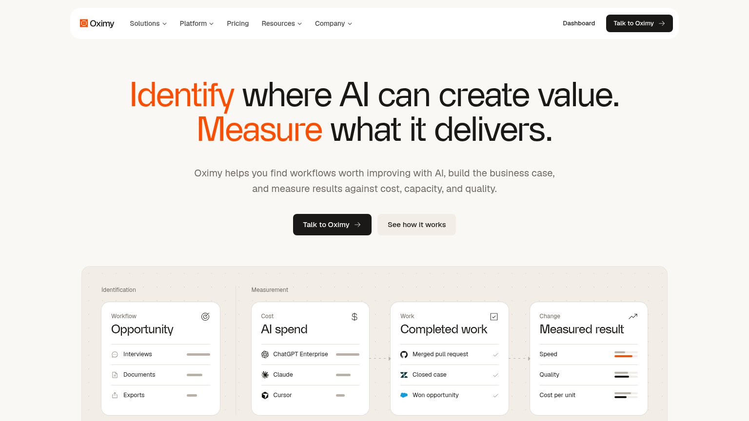
| Oximy | Product workflow diagram with "AI spend" card listing ChatGPT Enterprise, Claude, and Cursor |
| No visible trust signal identified. |
CTA
62FairCopy, size, verb, cost-feel — does the primary CTA earn the click?
Problems
- 'Talk' feels like a sales call
- ambiguous: demo, chat, or human?
- no value payoff in the label
Value props
78FairTitle, subtitle, hero — do they sell the product's true value?
Oximy’s headline sells
Identify where AI can create value. Measure what it delivers.
Oximy helps you find workflows worth improving with AI, build the business case, and measure results against cost, capacity, and quality.
Working
- Two-verb headline maps to the product's real jobs
- Subhead adds concrete criteria: cost, capacity, quality
- Hero visual demonstrates the pipeline, not decoration
Could improve
- No numbers or proof points anywhere in the fold
- No emotional hook on wasted AI spend
- Audience (who it's for) is unstated
Mobile web
78FairThe phone experience as a first-class citizen.
 12
- Half-width primary CTA — "Talk to Oximy" shares the row with "See how it works", shrinking the primary tap target to half-width.
- Ambiguous + menu icon — The nav collapses to a "+" glyph that reads as add/expand, not as a menu control.
Information hierarchy
82StrongDoes the design help or inhibit what the page is trying to say?
1234- Nav dropdown cluster — Five nav groups plus Pricing open exit paths before the hero pitch lands.
- Header Talk to Oximy — Duplicates the hero CTA at equal weight, splitting the single action focus.
- Dashboard link — Login-style exit sits beside the primary CTA and siphons intent traffic.
- See how it works — Low-contrast twin sits at near-equal size to the primary, diluting the click.
Competitors
inferred from product, audience, and value prop#1Oximy69
#2