o11YC W26 landing page report.
← Back to YC W26

Your landing page’s weakest score is Trust.

Fix Trust

Score over time

807570656055Mozart Data 62 on Sep 21 (Live)Y42 74 on Sep 21 (Live)Definite 73 on May 7 (Wayback)Definite 71 on Sep 21 (Live)o11 59 on May 17 (Wayback)o11 58 on Sep 17 (Wayback)o11 62 on Sep 21 (Live)May 17Sep 17Sep 21
Past reportsShow past reportsHide past reports
  1. Sep 21, 202662LiveOverall +4 · Mobile web +12 · Information hierarchy +6Viewing
  2. Sep 17, 202658Overall −1 · Mobile web −24 · Value props +14View →
  3. May 17, 202659First tracked report — strongest Mobile web 76, weakest Trust 44View →

Trust

48Poor

Proof that the product is real, competent, and safe to try.

o11
Y42
Definite
Trust read
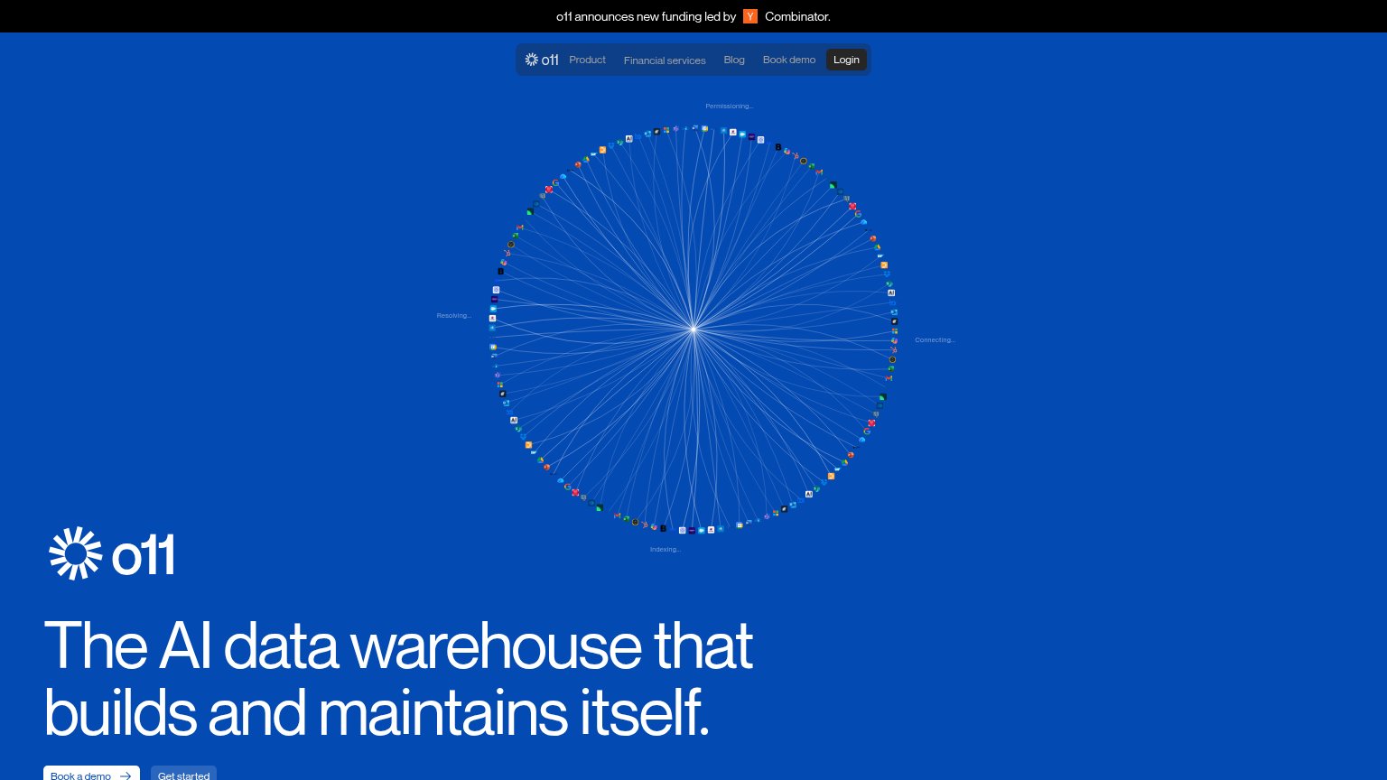
o11"o11 announces new funding led by Y Combinator." announcement bar
Mozart Data"Trusted by data-driven companies" section header signaling a customer logo section
Y42Real product UI screenshot showing pipeline lineage with "BigQuery — Connected", "Git repository — Connected", "Storage
Definite"Definite runs as a private deployment in your own cloud (AWS, GCP, Azure, or anywhere with Kubernetes); you keep contro

Information hierarchy

64Fair

Does the design help or inhibit what the page is trying to say?

Information hierarchy annotations on the desktop capture1234
  1. Headline clipped by fold — The hero headline and CTA pair sit at the very bottom edge — 'Book a demo' is cut off, so the fold's key message and action arrive half-hidden.
  2. Radial integrations visual — The full-height burst graphic occupies the entire scan path and outranks the headline, pushing the value prop and CTAs below the viewer's first glance.
  3. Equal-weight CTA pair — 'Book a demo' and 'Get started' sit side by side at similar weight, splitting the single conversion into two competing actions.
  4. YC announcement banner — The topmost element is a funding banner linking away from the page before the visitor sees what o11 is.

Mobile web

64Fair

The phone experience as a first-class citizen.

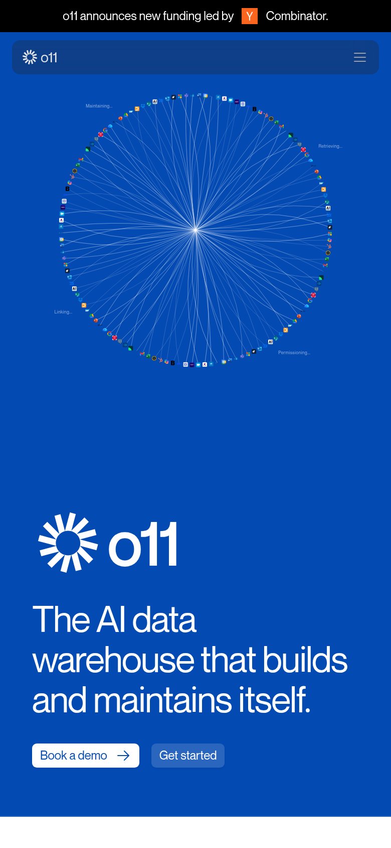
Mobile web annotations on the mobile capture1234
  1. Headline and CTAs — The headline "The AI data warehouse that builds and maintains itself" and both CTAs sit near the very bottom of the fold, pushed down by the oversized graphic above.
  2. Hero network graphic — The animated node-circle consumes over half the first viewport, delaying the value statement; its micro-labels like "Permissioning..." are illegibly small on a phone.
  3. Book a demo button — The primary CTA keeps desktop proportions — a narrow pill instead of a full-width, thumb-friendly button.
  4. Funding announcement bar — The sticky black "o11 announces new funding" banner stacks above the nav, creating a double-decker header that eats fold height.

CTA

68Fair

Copy, size, verb, cost-feel — does the primary CTA earn the click?

o11
Y42
Definite

Problems

  • demo click feels costly
  • cheaper 'Get started' is secondary
  • nav says 'Book demo', hero 'Book a demo'
  • desktop CTAs cut off at fold edge

Value props

68Fair

Title, subtitle, hero — do they sell the product's true value?

o11’s headline sellsThe AI data warehouse that builds and maintains itself.

Working

  • Clear category: AI data warehouse
  • Self-maintaining is a sharp differentiator
  • Hero graph shows connectors at work

Could improve

  • No subhead adds any specifics
  • Zero numbers or proof points
  • Outcome for the buyer left implicit

Competitors

inferred from product, audience, and value prop