
Your landing page’s weakest score is Trust.
How Mirabelle ranks
- 1.
Posha70
- 2.
Thermomix70
- 3.
Mirabelle67
- 4.
Suvie65
67Growth scoreupdated
category scores
category scoresShowHide
Score over time
Trust
32PoorProof that the product is real, competent, and safe to try.
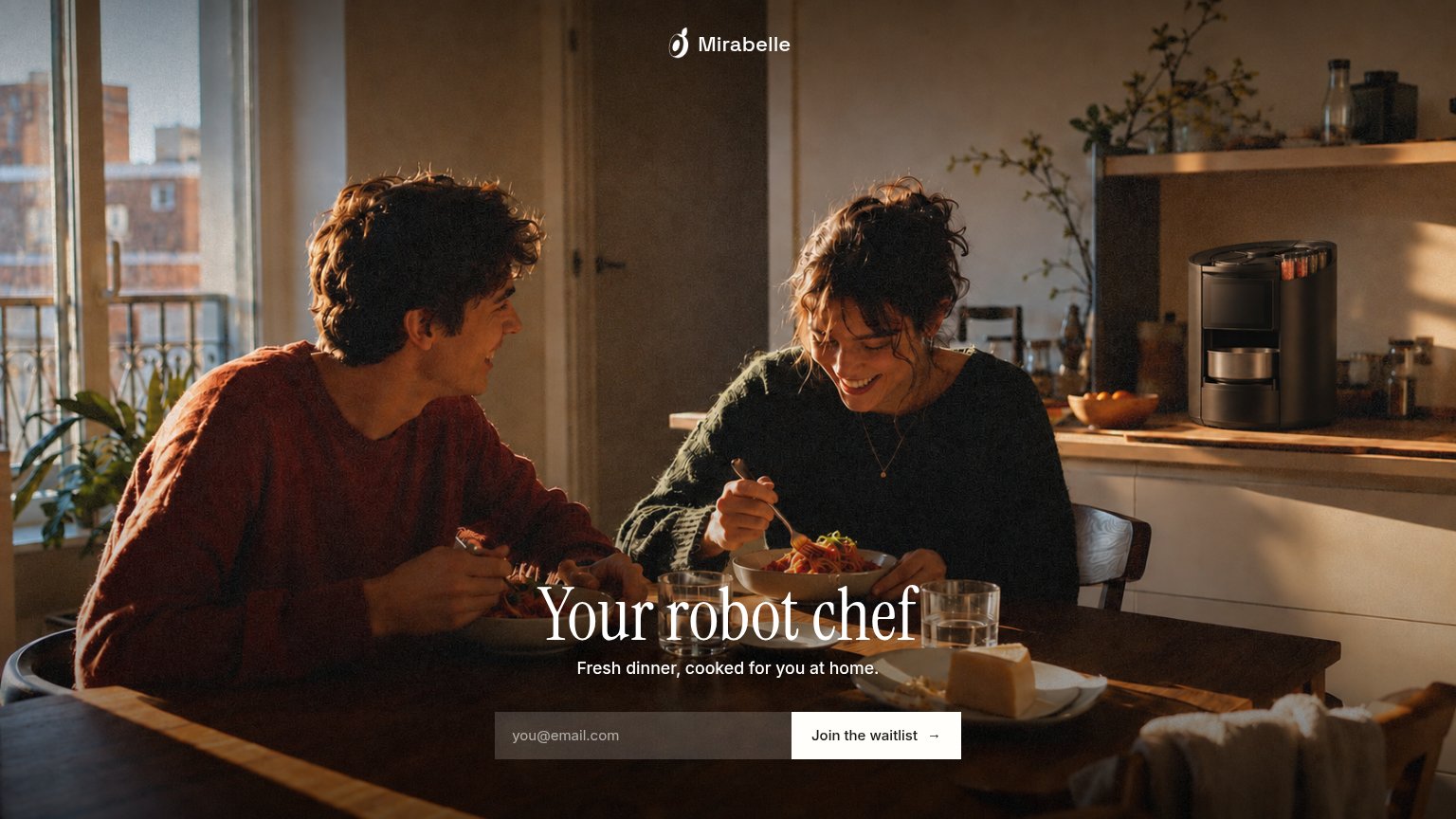
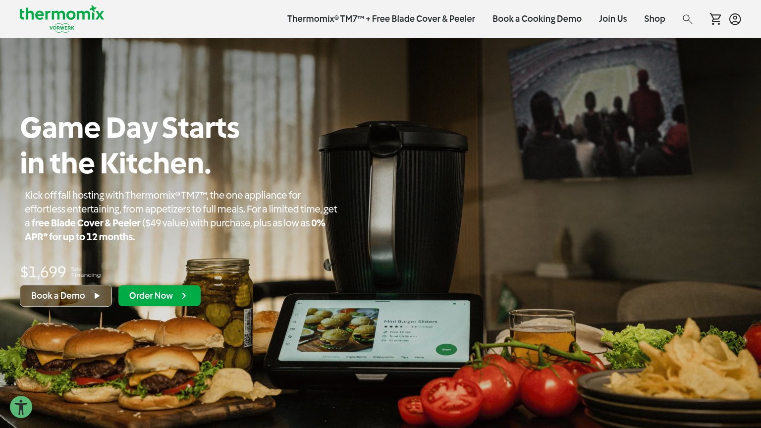
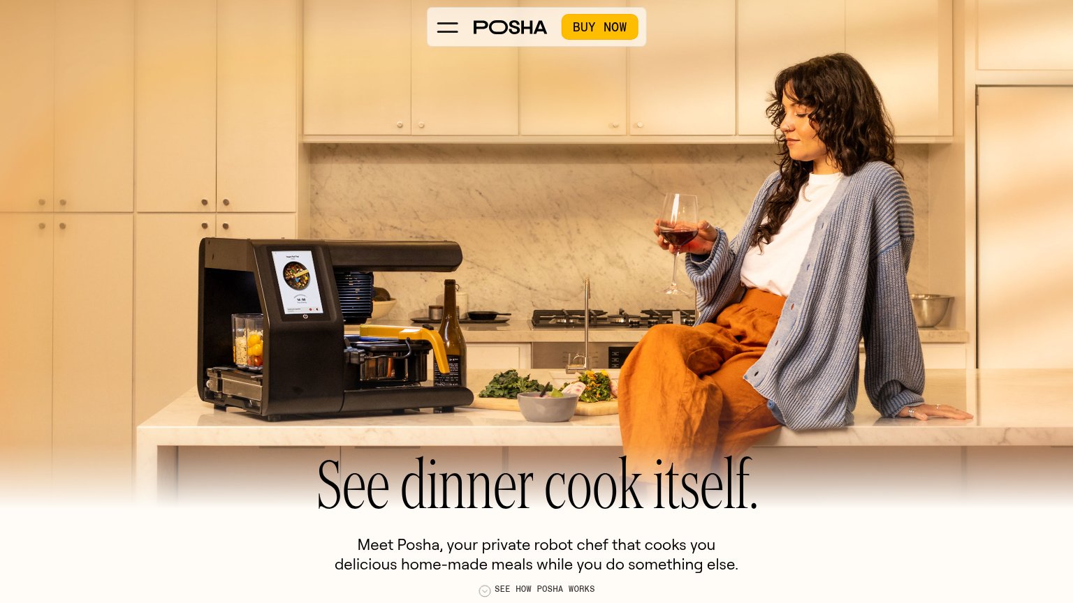
| Trust read | |
|---|---|
| Mirabelle | The Mirabelle appliance visible on the kitchen counter in the hero photo |
| No visible trust signal identified. | |
| Real product photo of the Posha robot cooking on a kitchen counter with its touchscreen recipe UI visible | |
| Real TM7 product shot with its guided-cooking screen showing a live "Mini Burger Sliders" recipe (prep time, portions, r |
Value props
68FairTitle, subtitle, hero — do they sell the product's true value?
Mirabelle’s headline sells
Your robot chef
Fresh dinner, cooked for you at home.
Working
- Instantly clear category: robot chef
- Outcome-first subhead: dinner done at home
- Photo sells the payoff, not the specs
Could improve
- Zero numbers — no minutes, meals, or price
- Product barely visible, reads as coffee maker
- No proof or how-it-works cue in the fold
CTA
72FairCopy, size, verb, cost-feel — does the primary CTA earn the click?
Problems
- 'waitlist' signals delay, not value
- no payoff echoing the headline
- email asked before value shown
Mobile web
76FairThe phone experience as a first-class citizen.
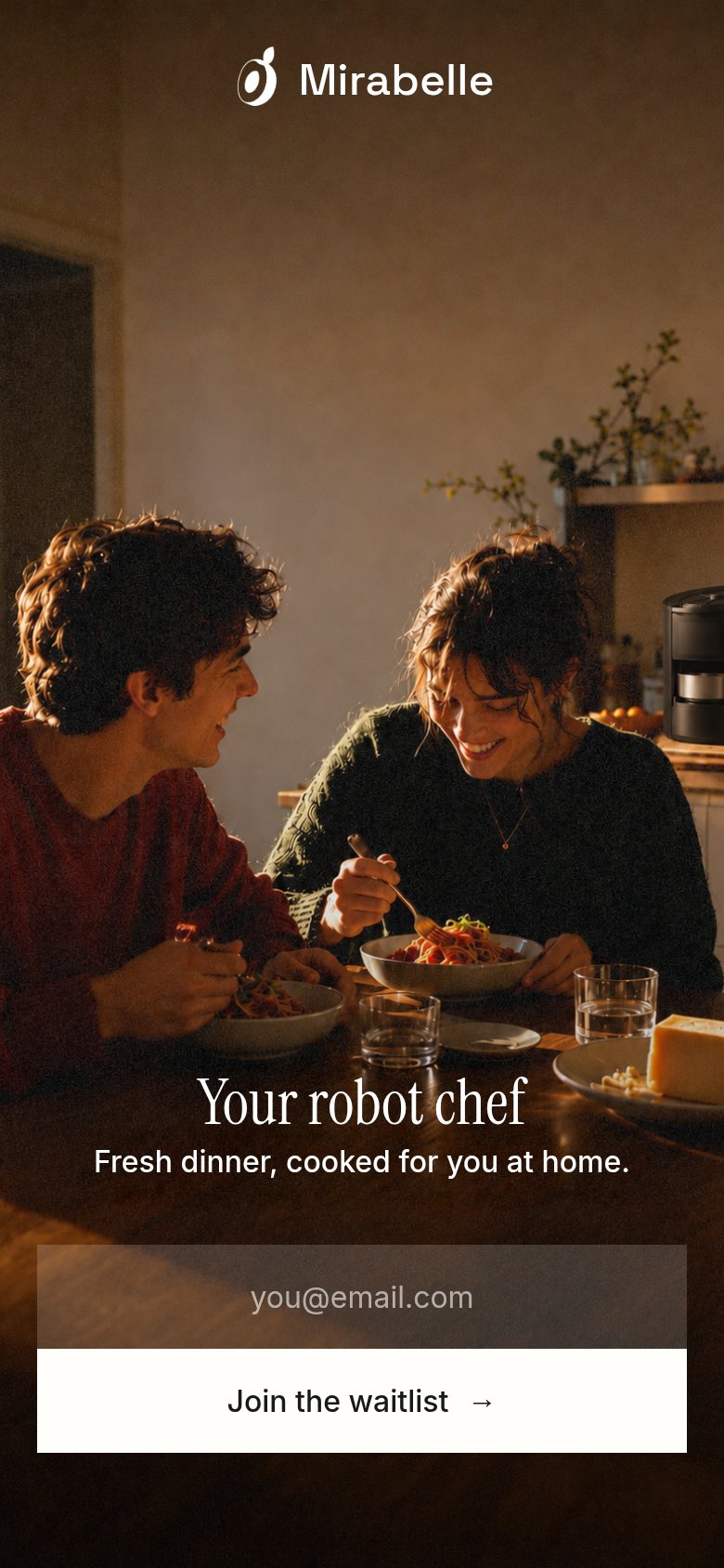 123
- Waitlist form placement — Email field and CTA sit at the extreme bottom edge, forcing a full scroll past the hero before the action is reachable.
- Email input field — Translucent field with faint placeholder blends into the dark photo and barely reads as a tappable input.
- Headline over tableware — White serif headline overlaps the bright bowls and glasses, reducing contrast at the line's center.
Information hierarchy
86StrongDoes the design help or inhibit what the page is trying to say?
123- Headline over tableware — White serif 'Mirabelle's robot chef' overlaps glasses and cheese plate, costing legibility at a glance.
- Translucent email field — The Mirabelle@email.com input's low-contrast glass fill nearly disappears against the dark table.
- Robot chef placement — The actual product sits small at the far right edge, outside the natural scan path to the CTA.