
Your landing page’s weakest score is CTA.
How Mantis ranks
- 1.
Aitia54
- 2.
Mantis48
- 3.
Unlearn.AI40
48Growth scoreupdated
category scores
category scoresShowHide
CTA
30PoorCopy, size, verb, cost-feel — does the primary CTA earn the click?


Problems
- no CTA anywhere on either fold
- no nav links or buttons at all
- hero interest has no next step
Trust
30PoorProof that the product is real, competent, and safe to try.
| Trust read | |
|---|---|
| Mantis | No visible trust signal identified. |
| Dimmed top banner referencing a 2025 AI Innovation Awards win for clinical trial design (obscured behind the webinar mod | |
| Named proprietary technology: "Gemini Digital Twin (GDT) platform" with "reverse-engineering and forward-simulation (REF |
Mobile web
48PoorThe phone experience as a first-class citizen.
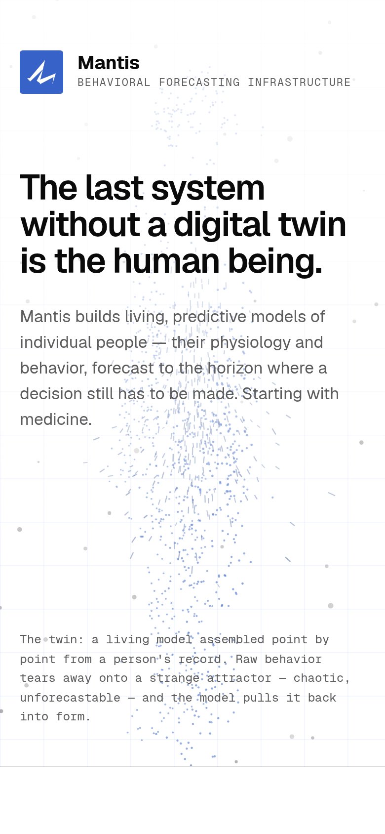 123
- Hero subhead block — No CTA follows the pitch — there is nothing to tap anywhere in the mobile fold.
- Header tagline text — Wide-tracked monospace tagline runs edge-to-edge and nearly clips the right margin.
- Caption over particle art — Low-contrast monospace caption overlaps the particle graphic, hurting legibility.
Information hierarchy
58FairDoes the design help or inhibit what the page is trying to say?
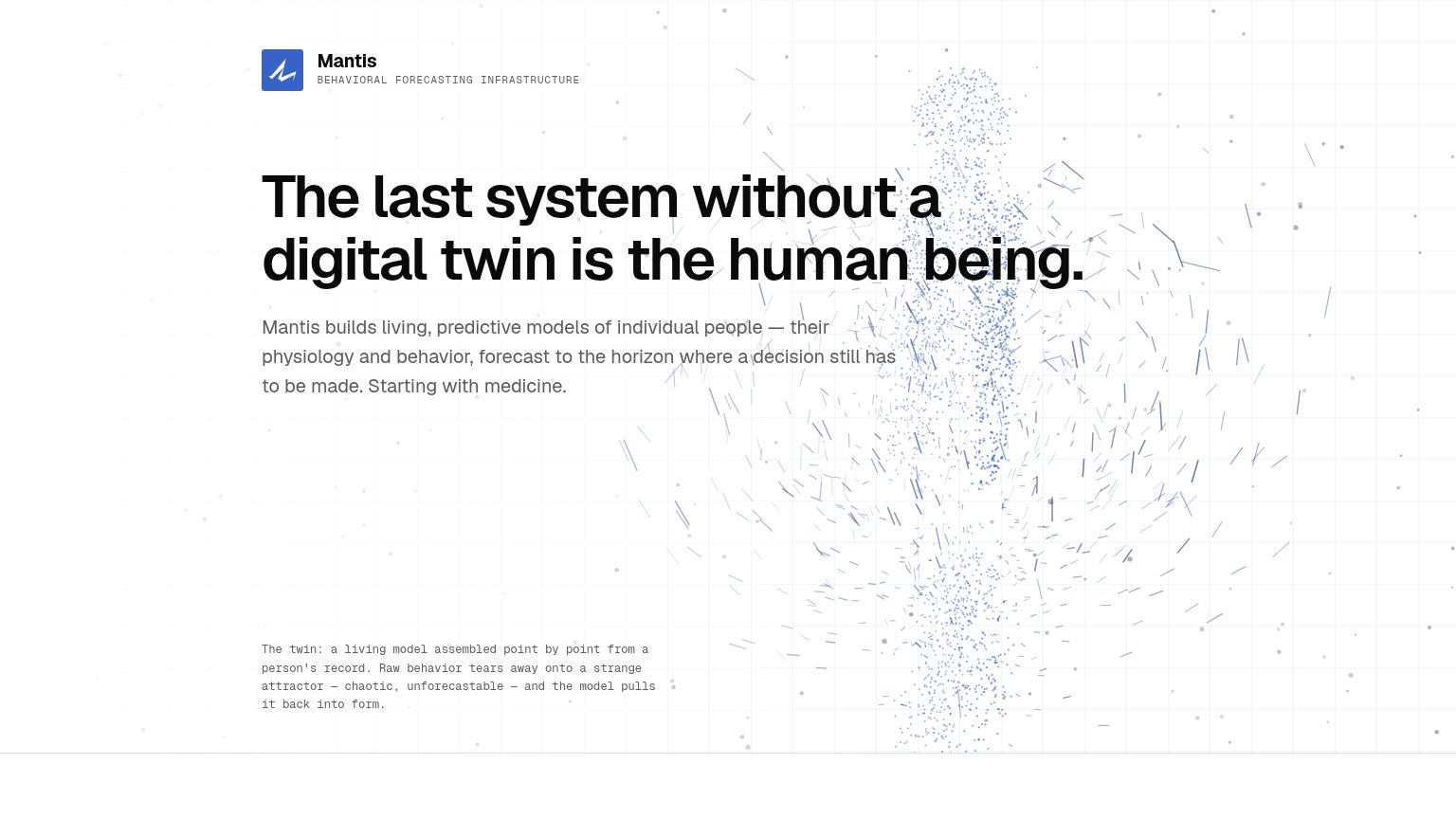 1
- Monospace caption text — Low-contrast gray monospace at small size makes the twin explanation nearly unreadable in the scan path.
Value props
72FairTitle, subtitle, hero — do they sell the product's true value?
Mantis’s headline sells
The last system without a digital twin is the human being.
Mantis builds living, predictive models of individual people — their physiology and behavior, forecast to the horizon where a decision still has to be made. Starting with medicine.
Working
- Headline frames a bold, ownable category
- Subhead states what Mantis actually builds
- Hero visual shows a human-shaped twin forming
Could improve
- No numbers or proof points anywhere in fold
- Outcome for the buyer never named
- "Starting with medicine" is vague on use case