
Your landing page’s weakest score is Trust.
How Instinct ranks
- 1.
Instinct48
48Growth scoreupdated
category scores
category scoresShowHide
Score over time
Trust
32PoorProof that the product is real, competent, and safe to try.
| Trust read | |
|---|---|
| Instinct | No visible trust signal identified. |
Value props
38PoorTitle, subtitle, hero — do they sell the product's true value?
Instinct’s headline vague
Trade your instinct
Working
- Memorable brand-led wordplay
- Phone mockup shows real trading UI
- Emotional hook: act on gut feel
Could improve
- No subhead explaining the product
- Zero numbers or proof points
- Copy could caption any trading app
CTA
42PoorCopy, size, verb, cost-feel — does the primary CTA earn the click?
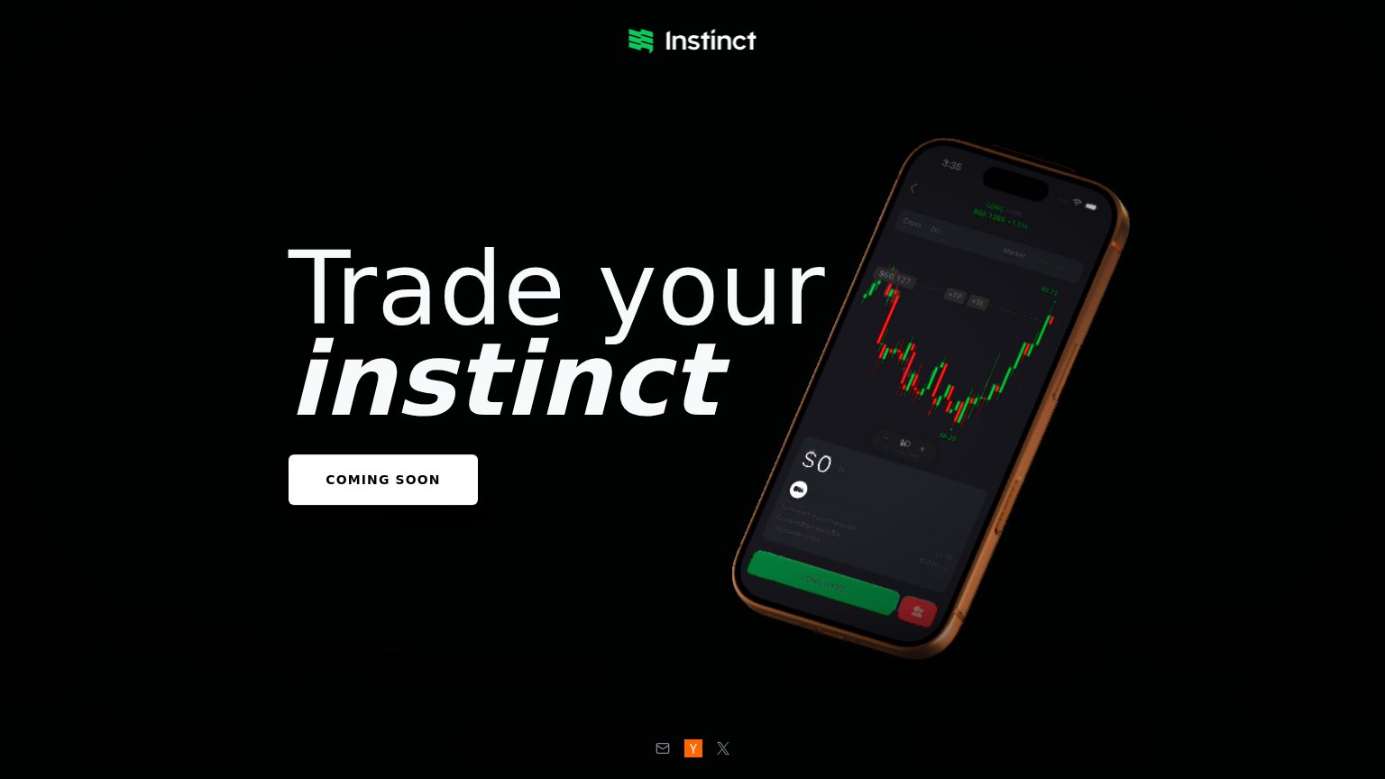
Problems
- status label, not an action
- no action verb
- no payoff or next step implied
- unclear if clickable at all
Information hierarchy
64FairDoes the design help or inhibit what the page is trying to say?
123- COMING SOON button — Styled as the primary CTA but labels a status, not an action — visitors have nothing to do.
- Phone screen mockup — Trading UI is so dark it is nearly illegible, wasting the page's only product proof.
- Footer social icons — Mail, Y, and X icons sit in the fold as the only clickable exits competing with the CTA.
Mobile web
64FairThe phone experience as a first-class citizen.
 123
- COMING SOON button — Primary CTA is a dead-end label with no waitlist or signup action behind it.
- Headline over chart — "Trade Instinct's instinct" overlaps the busy candlestick mockup, hurting legibility.
- LONG HYPE mockup button — Green in-mockup button reads as a tappable CTA and competes with the real one.
Competitors
Couldn’t identify competitors
429 {"type":"error","request_id":"req_bg2roykycuskrq4mtcjeyuhda2vllqpdzbncfln7ppdjfbi2se6a","error":{"type":"rate_limit_error","message":"Rate limit exceeded: tpd (InputTokens)"}}