
Your landing page’s weakest score is Trust.
How Fern ranks
64Growth scoreupdated
category scores
category scoresShowHide
Score over time
Trust
48PoorProof that the product is real, competent, and safe to try.
| Trust read | |
|---|---|
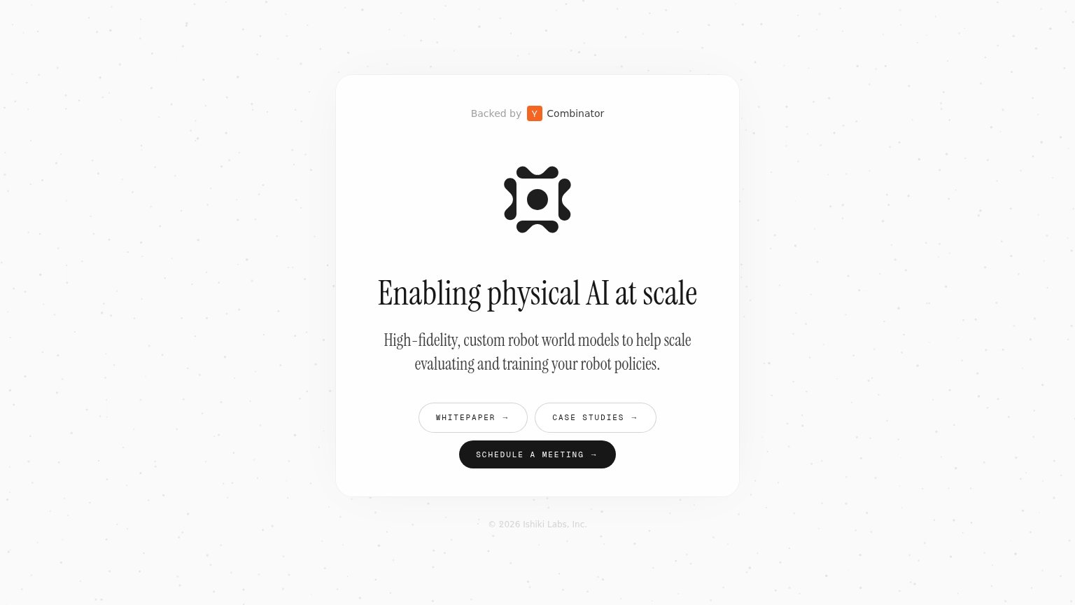
| Fern | "Backed by Y Combinator" badge |
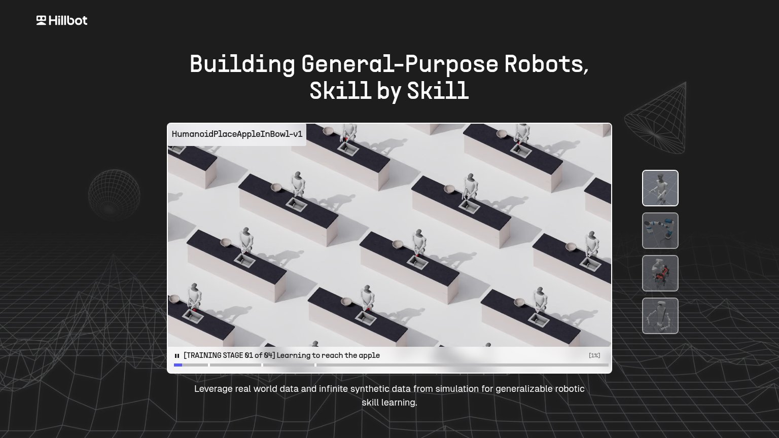
| Simulation demo player labeled "HumanoidPlaceAppleInBowl-v1" with "[TRAINING STAGE 01 of 04] Learning to reach the apple | |
| No visible trust signal identified. | |
| "CLICK TO EXPLORE" interactive world demo in the mobile hero | |
| No visible trust signal identified. |
Value props
58FairTitle, subtitle, hero — do they sell the product's true value?
Fern’s headline vague
Enabling physical AI at scale
High-fidelity, custom robot world models to help scale evaluating and training your robot policies.
Working
- Subhead names product and job precisely
- "Fern's robot policies" speaks to the buyer
- YC badge adds credibility
Could improve
- Headline is a category slogan, not a claim
- No numbers or proof points in the fold
- Logo mark hero shows nothing of the product
CTA
62FairCopy, size, verb, cost-feel — does the primary CTA earn the click?
Problems
- 'meeting' makes click feel costly
- no value promised for the click
- modest footprint vs headline on desktop
Mobile web
72FairThe phone experience as a first-class citizen.
 123
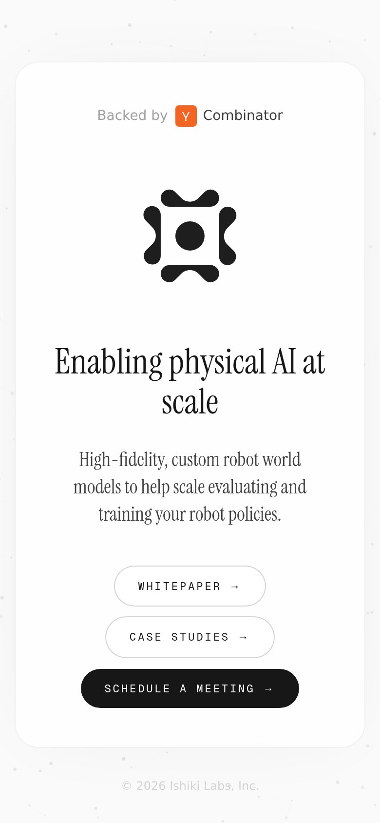
- Schedule a Meeting CTA — Primary CTA is last in the button stack at the fold edge, behind two secondary links.
- Whitepaper button — Secondary link sits above the primary CTA, intercepting the first thumb tap (Case Studies duplicates the problem).
- Logo mark — Oversized decorative mark consumes a large slice of the fold, pushing CTAs to the bottom edge.
Information hierarchy
78FairDoes the design help or inhibit what the page is trying to say?
123- Whitepaper Case Studies row — Two outlined buttons sit above the primary CTA and intercept the scan before the conversion action.
- Schedule a Meeting button — The primary CTA is narrower than the secondary buttons above it, so it reads as third in a stack instead of the one action.
- Backed by YC badge — The badge is the topmost element and, if linked, is an exit path outranking the headline in the scan order.