
Your landing page’s weakest score is Trust.
How Ditto Biosciences ranks
- 1.
Sonoma Biotherapeutics66
- 2.
Ditto Biosciences63
- 3.
Parallel Bio57
- 4.
Holoclara57
- 5.
Seismic Therapeutic51
63Growth scoreupdated
category scores
category scoresShowHide
Score over time
Trust
55FairProof that the product is real, competent, and safe to try.
| Trust read | |
|---|---|
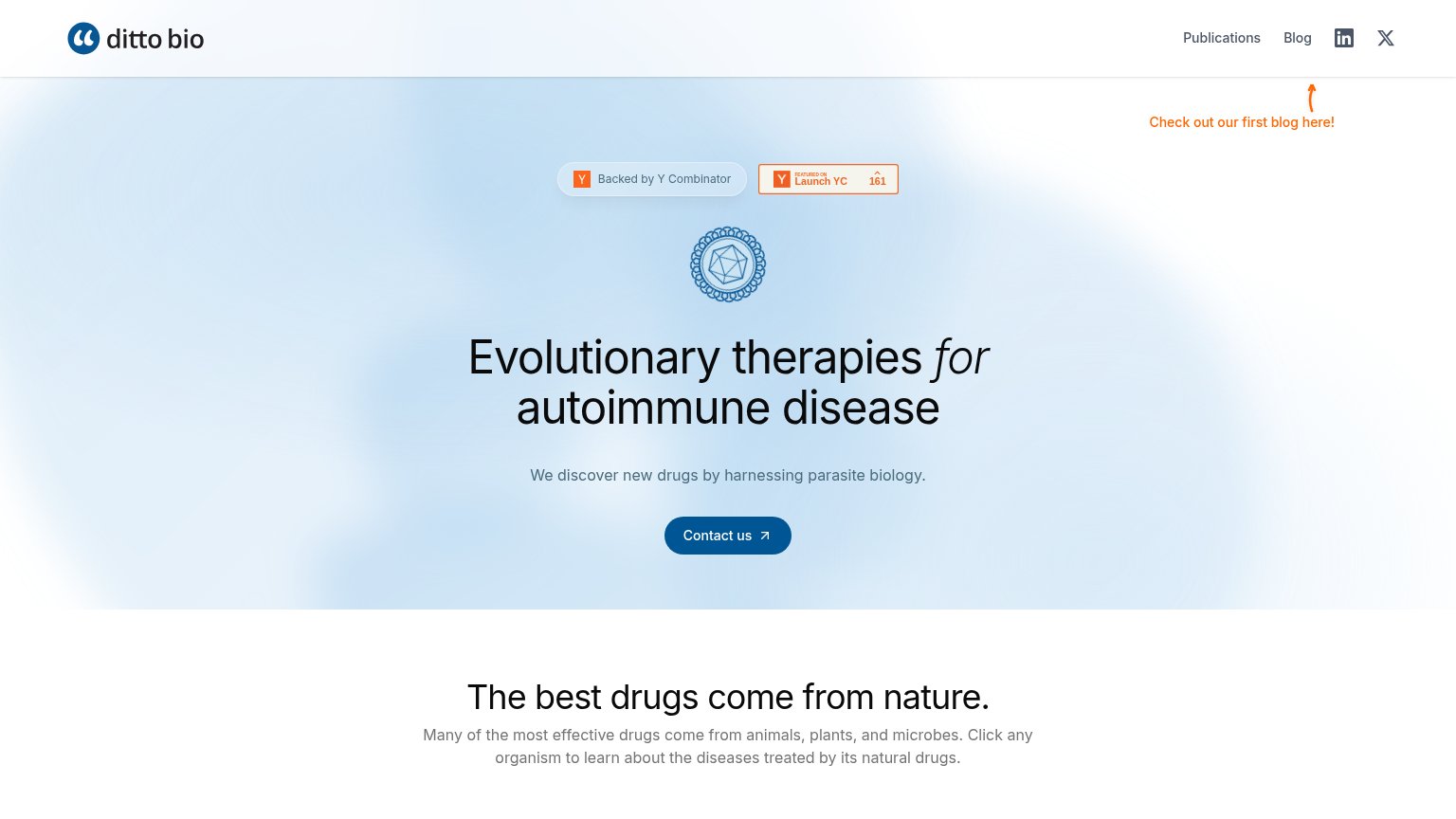
| Ditto Biosciences | "Backed by Y Combinator" badge with Launch YC upvote count (161) |
| No visible trust signal identified. | |
| "We develop novel therapeutics derived from symbiotic organisms that modulate inflammation, metabolism, and tissue regen | |
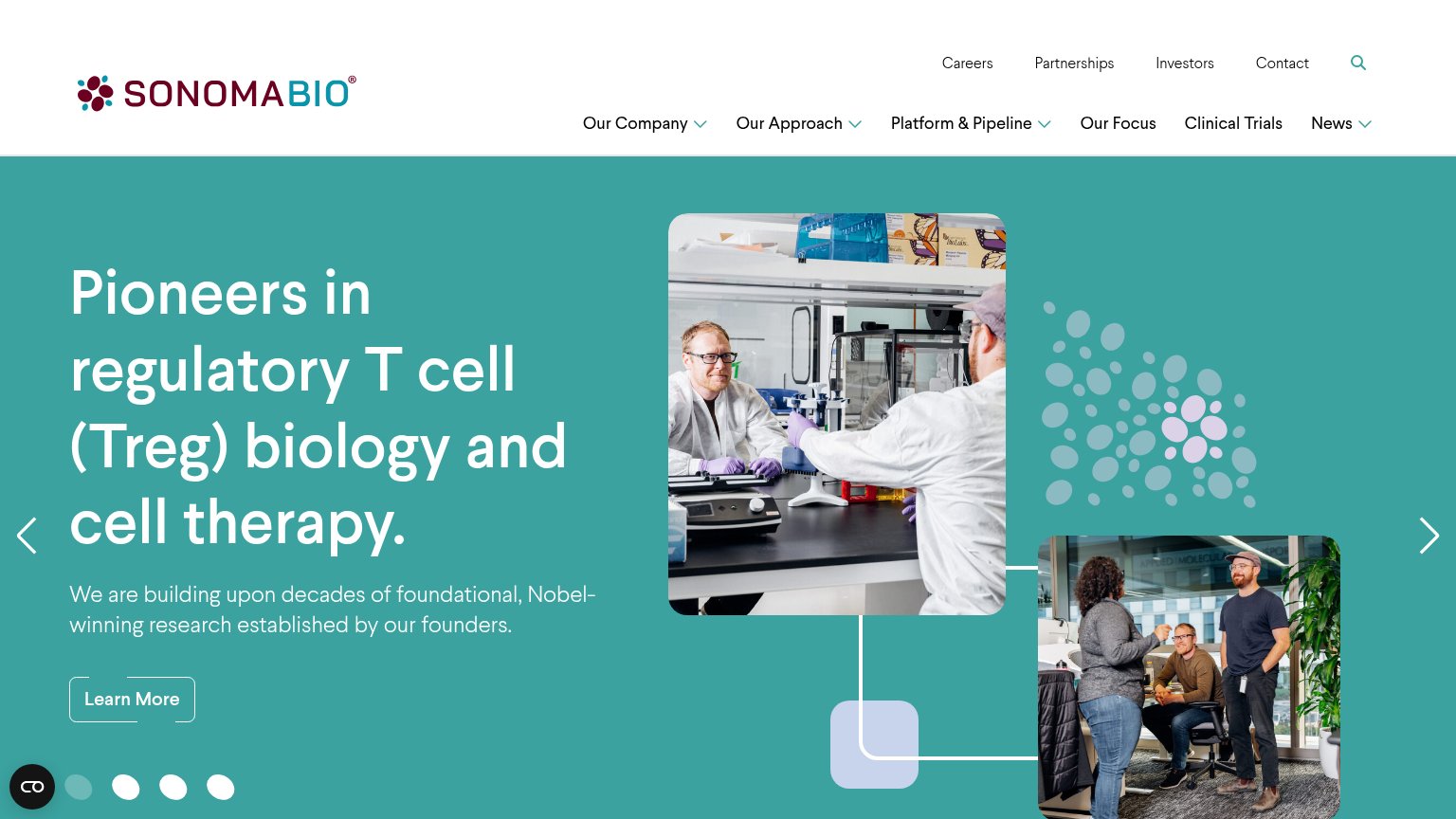
| "We are building upon decades of foundational, Nobel-winning research established by our founders." | |
| "Seismic Therapeutic™ is a clinical-stage immunology company creating transformative biologic medicines for autoimmune a |
CTA
62FairCopy, size, verb, cost-feel — does the primary CTA earn the click?
Problems
- 'Contact' promises cost, not value
- no payoff named for the click
- orange blog link competes for attention
Value props
62FairTitle, subtitle, hero — do they sell the product's true value?
Ditto Biosciences’s headline undersells
Evolutionary therapies for autoimmune disease
We discover new drugs by harnessing parasite biology.
Working
- Names the disease area plainly
- Parasite biology is a distinct hook
- YC badge adds early credibility
Could improve
- No patient or partner outcome named
- Zero specifics: diseases, targets, stage
- Hero icon decorates, shows nothing
Mobile web
62FairThe phone experience as a first-class citizen.
 1234
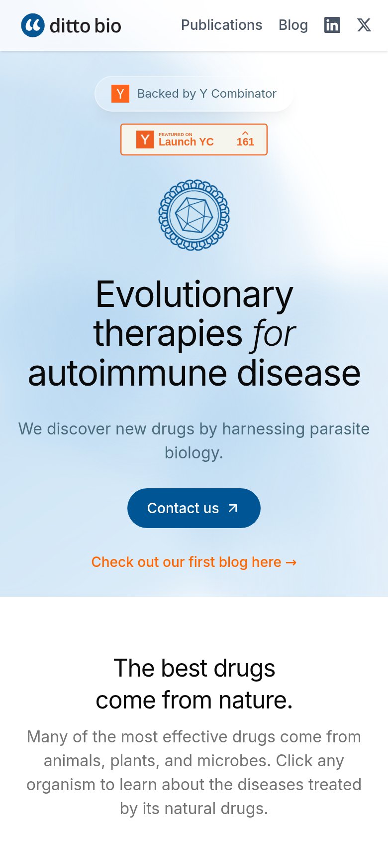
- Stacked YC badges — Two redundant Y Combinator widgets consume the top of the hero and push the CTA down.
- Uncollapsed nav row — Full desktop link row with social icons instead of a hamburger crowds the mobile header.
- Contact us button — Desktop-sized button far below the fold; should be full-width and visible in the first viewport.
- Blog link below CTA — Orange 'Check out our first blog' link competes with and sits directly under the primary CTA.
Information hierarchy
76FairDoes the design help or inhibit what the page is trying to say?
123- Orange blog callout — Brightest element in the fold; its saturated orange outranks the navy Contact us CTA and pulls the eye to the blog before the pitch.
- Launch YC vote widget — A clickable off-site upvote control sitting above the headline adds an exit path with no conversion payoff; the adjacent badge already conveys the YC credential.
- Nav social icons — LinkedIn and X icons in the header send visitors off-site before they read the headline; footer placement would remove two exits.