
Your landing page’s weakest score is Trust.
How Waypoint Transit ranks
- 1.
Waypoint Transit67
- 2.
UrbanFootprint61
- 3.
Replica54
- 4.
Remix (via Via)54
- 5.
UrbanSim46
67Growth scoreupdated
category scores
category scoresShowHide
Score over time
Trust
32PoorProof that the product is real, competent, and safe to try.
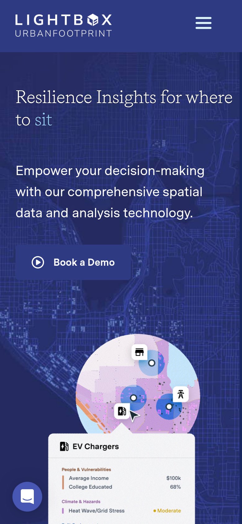
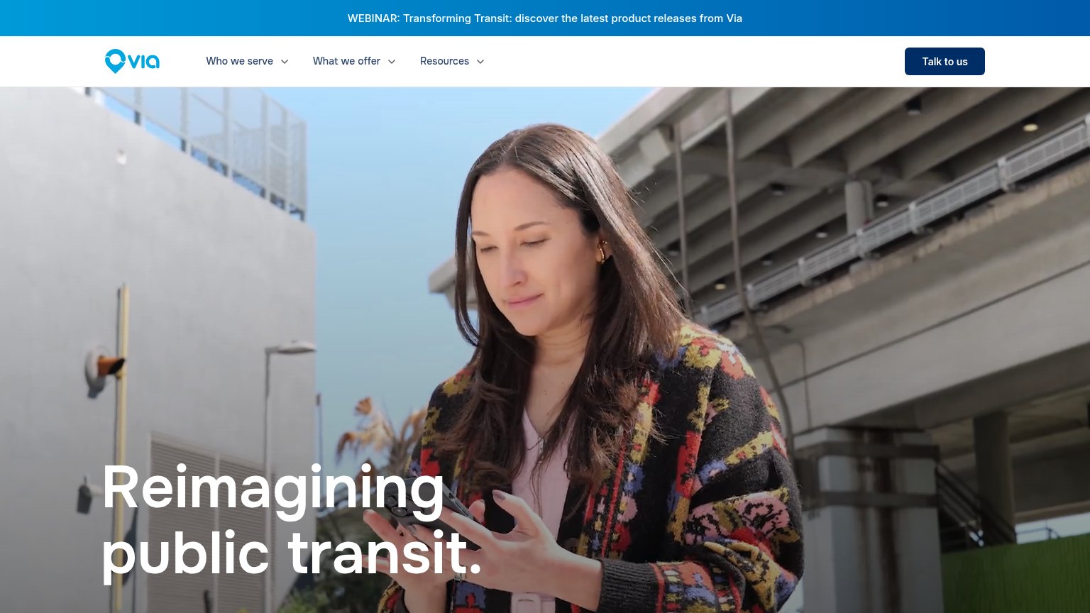
| Trust read | |
|---|---|
| Waypoint Transit | No visible trust signal identified. |
| Mobile product UI panel showing "EV Chargers" with data layers like "Average Income $100k" and "Heat Wave/Grid Stress · | |
| No visible trust signal identified. | |
| No visible trust signal identified. | |
| WEBINAR: Transforming Transit: discover the latest product releases from Via |
Value props
62FairTitle, subtitle, hero — do they sell the product's true value?
Waypoint Transit’s headline undersells
City Planning, Accelerated.
Spend less time on routine tasks and more time on the meaningful work only planners can do. Waypoint is the best way to use AI for city planning.
Working
- Names the audience: city planners
- Emotional hook: less drudgery, more meaning
- Short, confident headline
Could improve
- No concrete tasks or numbers
- "Best way to use AI" is empty superlative
- Hero art decorates, never demonstrates
CTA
68FairCopy, size, verb, cost-feel — does the primary CTA earn the click?
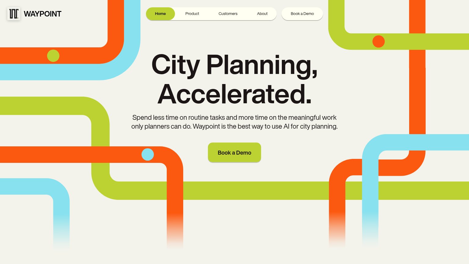
Problems
- click feels costly — sales call
- no low-commitment alternative
- no value promised for the click
Information hierarchy
86StrongDoes the design help or inhibit what the page is trying to say?
12- Duplicate nav CTA — Second "Book a Demo" in the nav competes at similar weight with the hero button below.
- Green Home tab — The lime highlight on "Home" mirrors the primary CTA color, pulling first-glance attention to a dead-end nav item.
Mobile web
86StrongThe phone experience as a first-class citizen.
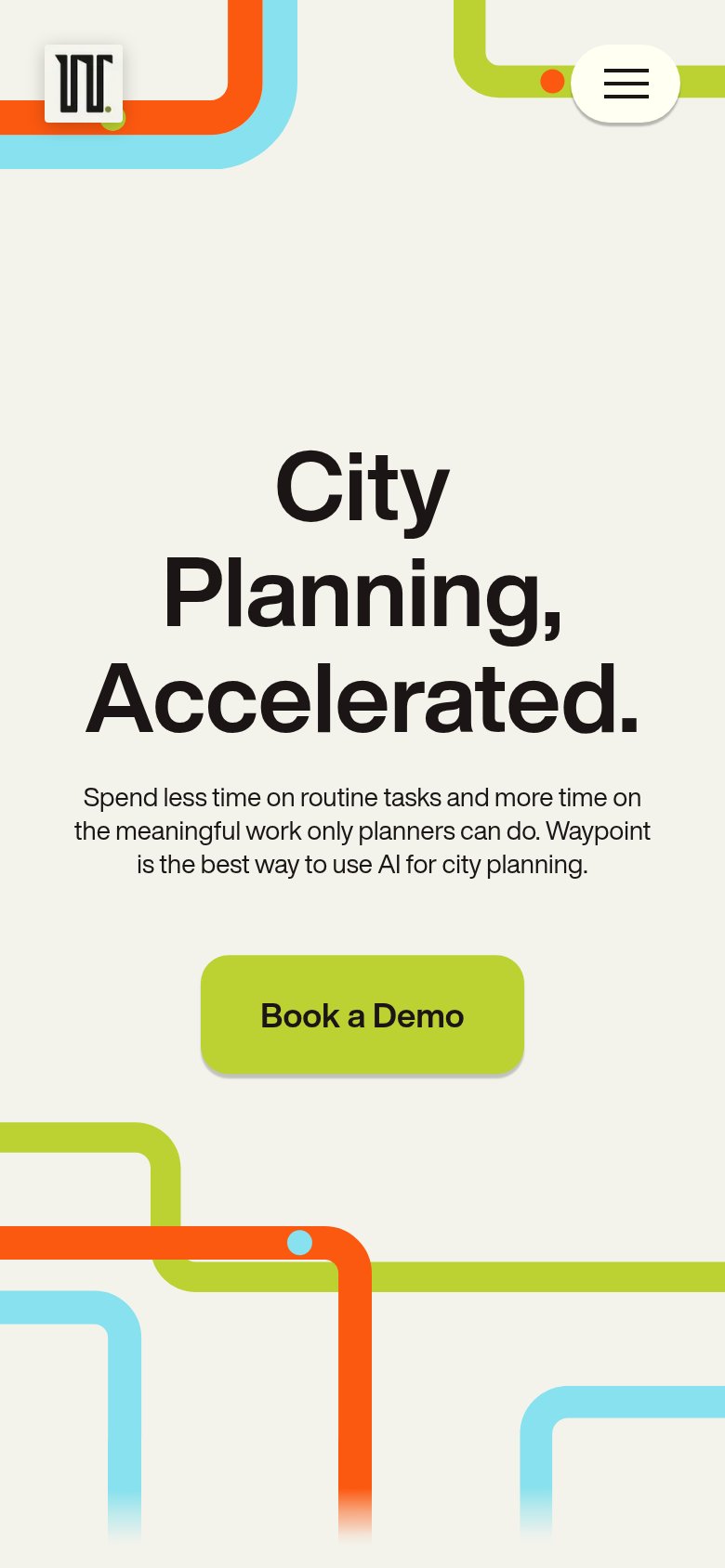 12
- Book a Demo button — Floats at partial width instead of near-full-bleed, wasting easy thumb-target real estate.
- Three-line hero headline — Oversized wrap eats most of the fold and pushes the CTA toward the viewport edge.