
Your landing page’s weakest score is Trust.
How Rebolt ranks
66Growth scoreupdated
category scores
category scoresShowHide
Score over time
Trust
42PoorProof that the product is real, competent, and safe to try.


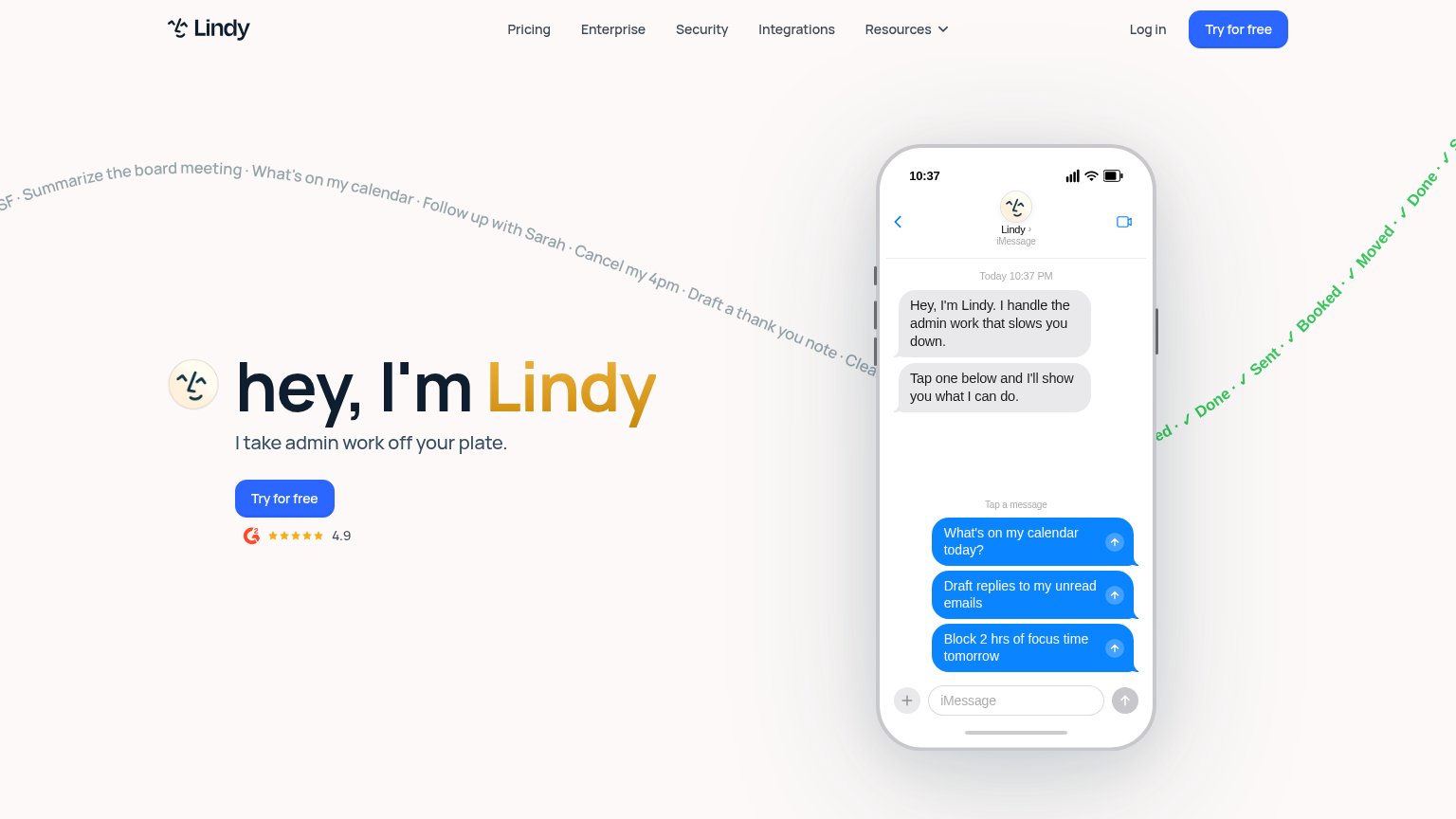
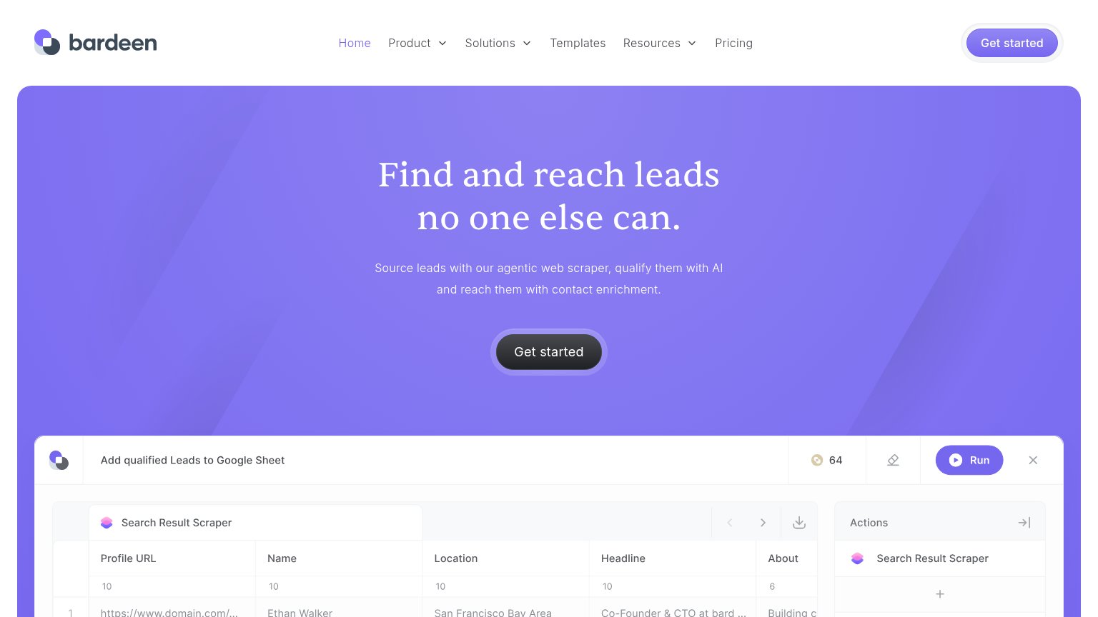
| Trust read | |
|---|---|
| Rebolt | "Backed by Y Combinator" badge above the hero headline |
| "We raised a $50M Series B led by Benchmark" banner | |
| No visible trust signal identified. | |
| G2 badge with 4.9 star rating below the "Try for free" CTA | |
| "Add qualified Leads to Google Sheet" product UI showing a real scraped lead table with Actions panel (Scraper, Enrichme | |
| No visible trust signal identified. |
Value props
52FairTitle, subtitle, hero — do they sell the product's true value?
Rebolt’s headline vague
AI-Powered Operations tailored for you
Rebolt turns how your company works into a live operating model, then generates autonomous governed software that runs operations across your existing systems.
Working
- Subhead describes an actual mechanism
- YC badge adds credibility
- Low-friction email + free CTA
Could improve
- H1 is generic AI buzzword copy
- No numbers or named outcomes
- Hero image decorates, shows nothing
Mobile web
72FairThe phone experience as a first-class citizen.
 123
- Start for free button — Button bleeds past the right screen edge and is clipped at the viewport bottom, shrinking the tap target.
- Hero headline — Desktop-scale type wraps into three tall lines, pushing the email capture to the fold's bottom edge.
- Subhead paragraph — Four lines of large body copy stack under the headline and crowd the CTA out of comfortable reach.
Information hierarchy
78FairDoes the design help or inhibit what the page is trying to say?
1234- Start for free capture — Primary CTA sits bottom-right, off the left-anchored scan path from headline to action.
- Talk to us pill — White pill in the nav outweighs its role and competes with the primary conversion.
- Careers Blog Login links — Three exit links plus a jobs-count badge pull attention before the value prop lands.
- Explore scroll cue — A second labeled action in the fold splits intent away from the email capture.
CTA
84StrongCopy, size, verb, cost-feel — does the primary CTA earn the click?
Problems
- email field gates the first click
- 'Work email' placeholder sells nothing
- nav 'Talk to us' competes with hero CTA