
Your landing page’s weakest score is Trust.
How Olive ranks
63Growth scoreupdated
category scores
category scoresShowHide
Score over time
Trust
52FairProof that the product is real, competent, and safe to try.



| Trust read | |
|---|---|
| Olive | Interactive product demo showing a prompt producing a customer health dashboard with churn risk, ARR, and account detail |
| Product demo screenshot showing a generated 'Top 5 Most Popular Films by Rental Count and Revenue' chart | |
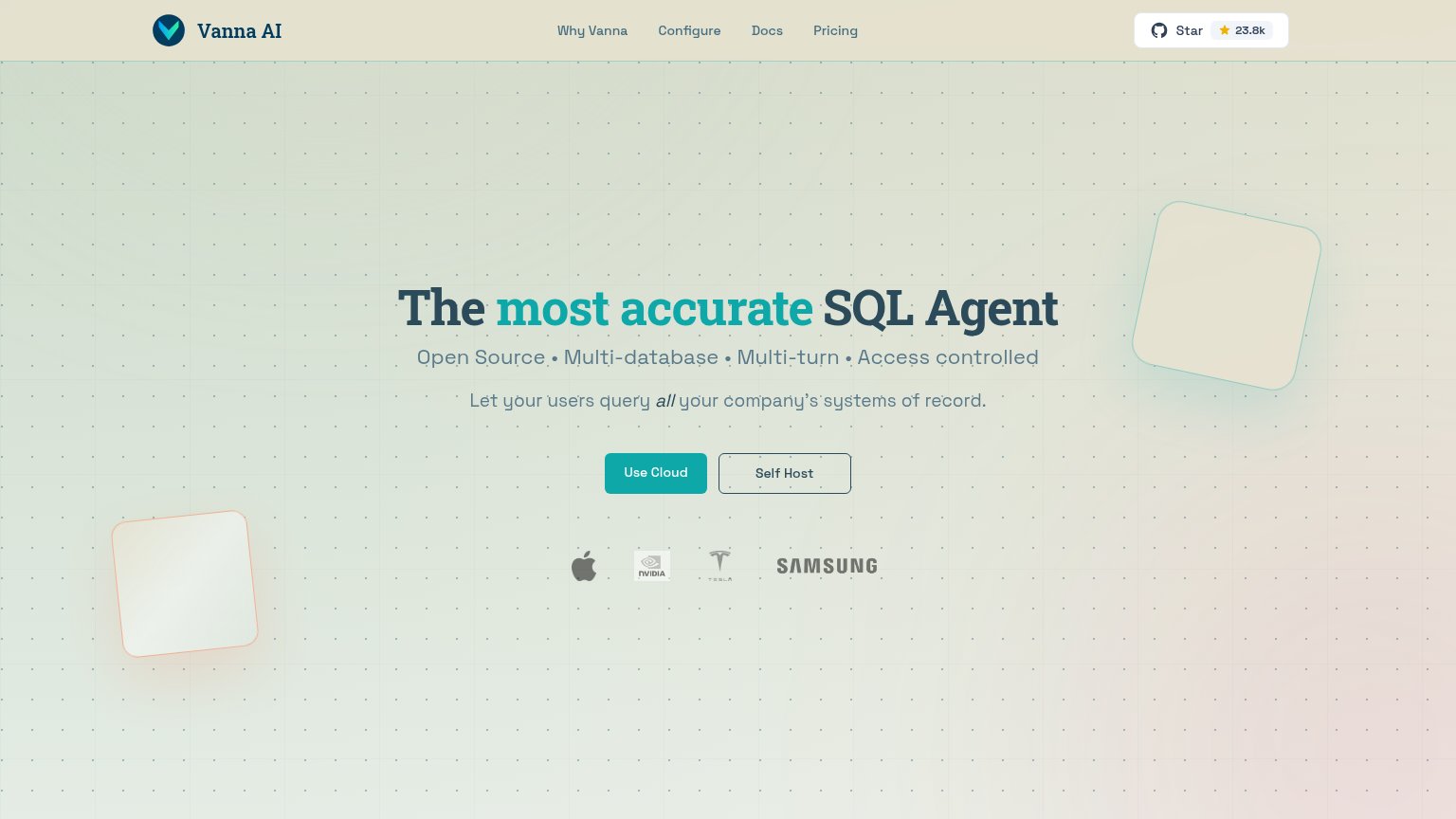
| GitHub "Star 23.8k" badge in the navigation | |
| "SOC 2, GDPR, HIPAA COMPLIANCE-READY" proof chip above the CTA | |
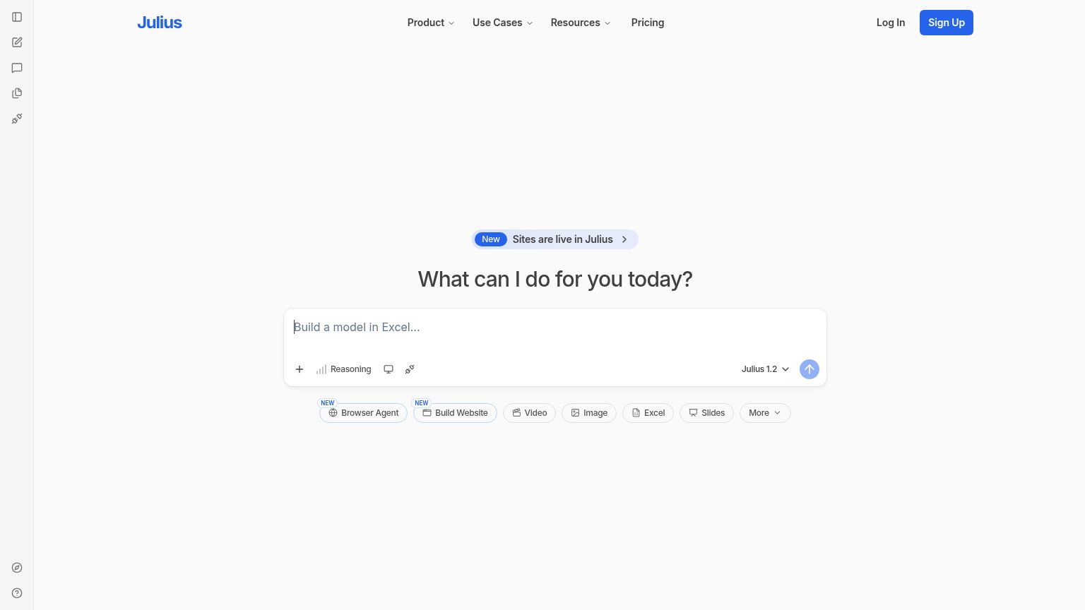
| Live prompt interface with model selector "Julius 1.2" and capability chips (Browser Agent, Build Website, Video, Image, | |
| "TRUSTED BY" logo wall (Verizon, Chanel, J.Crew, Workday, Domino's, Eaton) |
Mobile web
52FairThe phone experience as a first-class citizen.
 12
- Seed round banner — Sticky promo bar with "LEARN MORE >>" takes the top slice of the fold and routes taps away from conversion.
- Dashboard demo table — Desktop-density data table (six columns, tiny labels) crammed into the phone column; text like "CSM: Sarah Chen" is squint-small.
Value props
68FairTitle, subtitle, hero — do they sell the product's true value?
Olive’s headline sells
Build fast, secure BI tools with AI.
Working
- Demo shows prompt-to-dashboard flow
- Names real anxieties: fast, secure
- Realistic data makes it credible
Could improve
- No subhead to add specifics
- "Fast" never quantified
- No proof point for "secure"
Information hierarchy
72FairDoes the design help or inhibit what the page is trying to say?
1234- Duplicate CTA pair — "Book a demo" and "Try it Olive" sit side by side at near-equal weight, repeating the nav pair and splitting the one decision into four buttons.
- Nav CTA duplicates — "Book a demo" and "Try Olive" in the header pre-empt the mid-page CTAs, so the same choice is asked twice before the demo even lands.
- Seed round banner — The top bar's "LEARN MORE >>" link is the first interactive element visitors see and routes attention to funding news, not the product.
- Truncated dashboard panel — The demo dashboard's key-issues text clips mid-sentence at the card edge, weakening the proof moment the fold is built around.
CTA
72FairCopy, size, verb, cost-feel — does the primary CTA earn the click?
Problems
- labels differ: 'Try Olive' vs 'Try it Olive'
- no payoff or 'free' signal in copy
- mock prompt box isn't clickable
- icon-only arrow adds no promise