
Your landing page’s weakest score is Trust.
How Nitrode ranks
67Growth scoreupdated
category scores
category scoresShowHide
Score over time
Trust
44PoorProof that the product is real, competent, and safe to try.
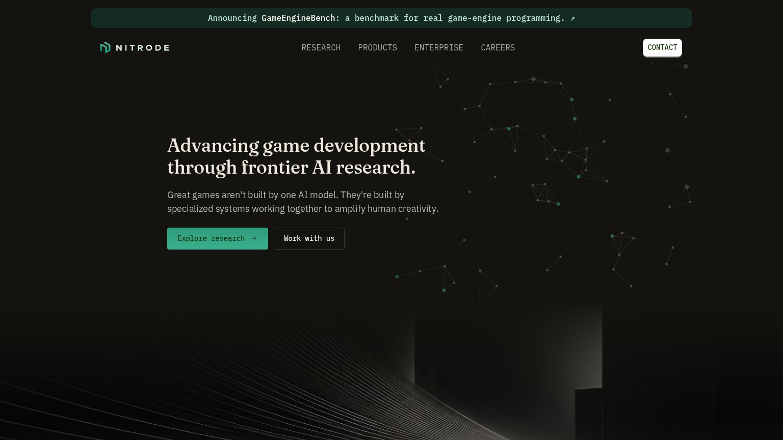
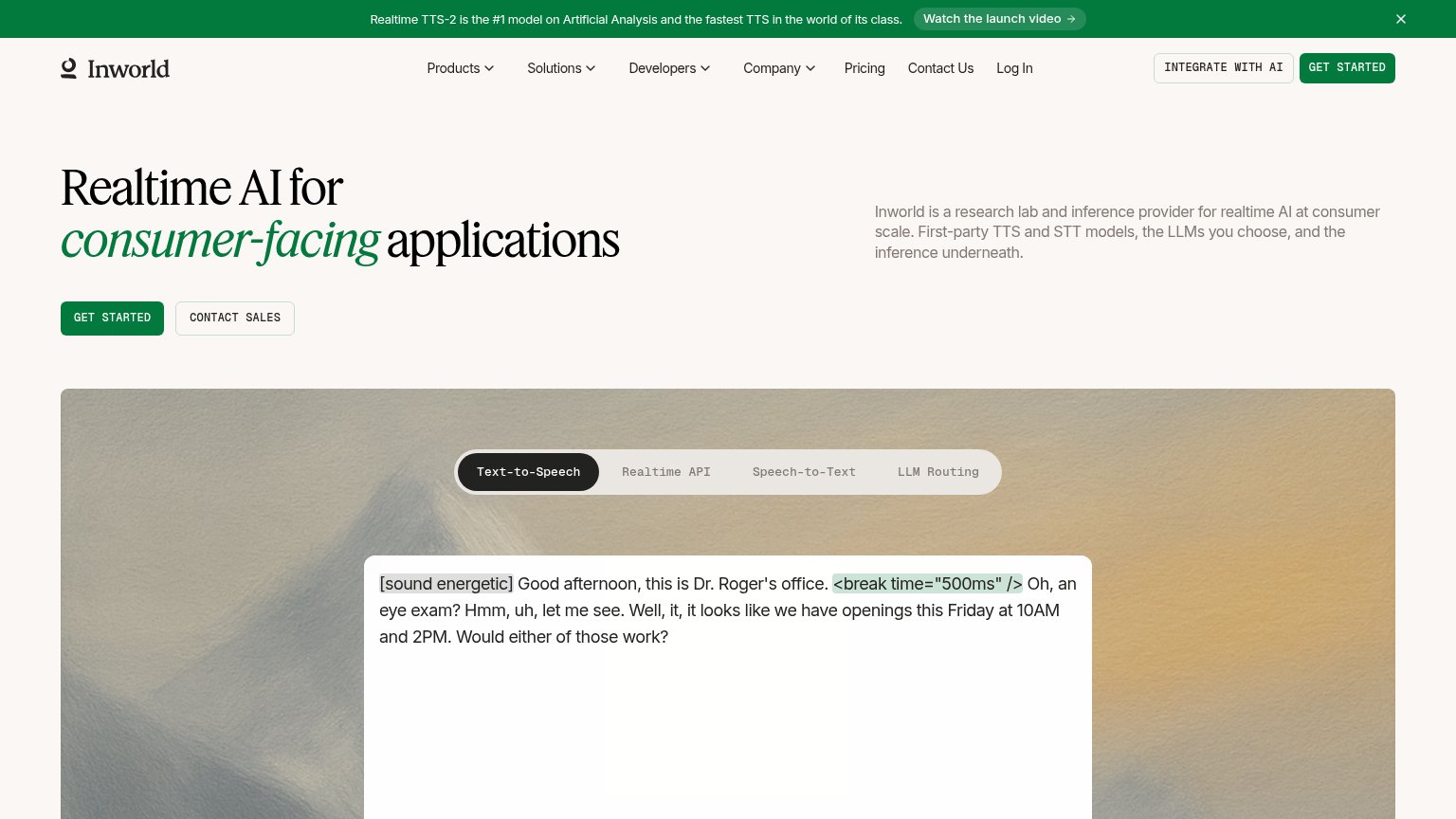
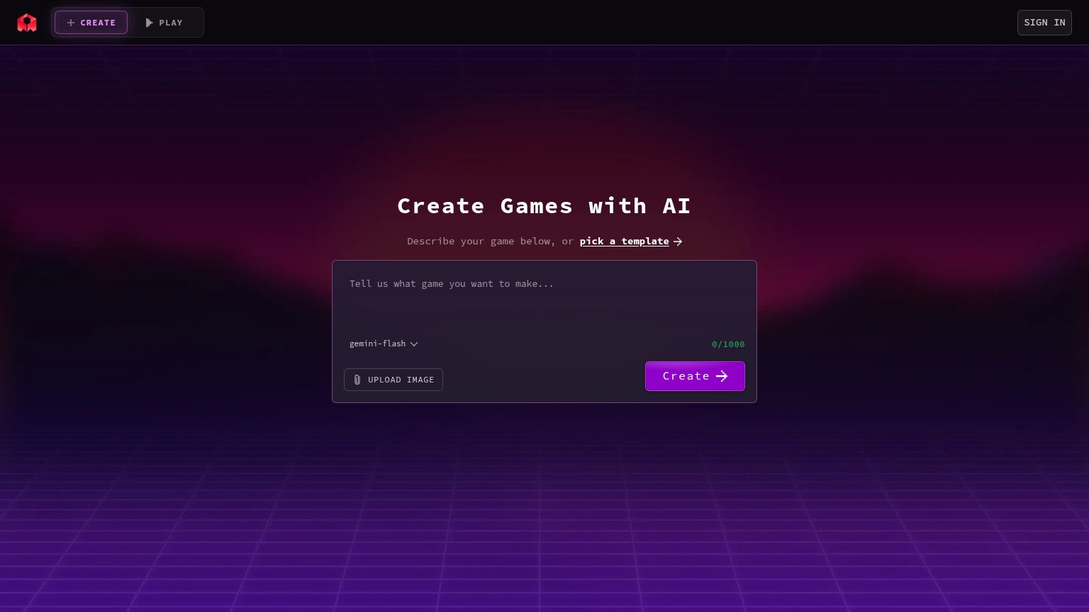
| Trust read | |
|---|---|
| Nitrode | Announcing GameEngineBench: a benchmark for real game-engine programming. |
| Live product prompt UI with 'gemini-flash' model selector and '0/1000' character counter | |
| implicit context Roblox (Cube / generative AI for creation) may benefit from pre-existing familiarity among its target audience. | |
| Announcement bar: "Realtime TTS-2 is the #1 model on Artificial Analysis and the fastest TTS in the world of its class." | |
| Announcement banner: "LUCY 2.5 IS LIVE - THE VIDEO MODEL POWERING LIVE AI" |
Value props
58FairTitle, subtitle, hero — do they sell the product's true value?
Nitrode’s headline vague
Advancing game development through frontier AI research.
Great games aren't built by one AI model. They're built by specialized systems working together to amplify human creativity.
Working
- Clear domain: game dev + AI research
- Distinct POV: systems over single models
- GameEngineBench banner adds specificity
Could improve
- No concrete outcome or deliverable named
- "Amplify human creativity" is generic
- Hero art decorates, demonstrates nothing
CTA
76FairCopy, size, verb, cost-feel — does the primary CTA earn the click?
Problems
- 'Explore' is vague, low-payoff verb
- three CTAs compete on the fold
- nav CONTACT pill splits attention
Information hierarchy
78FairDoes the design help or inhibit what the page is trying to say?
123- White CONTACT pill — Highest-contrast element in the header outshouts the green primary CTA and pulls the eye off the scan path.
- Announcement banner — Full-width outbound banner sits above everything and offers an exit before the value prop is read.
- Work with us button — Outlined button at near-equal weight beside Explore research splits the single action into two.
Mobile web
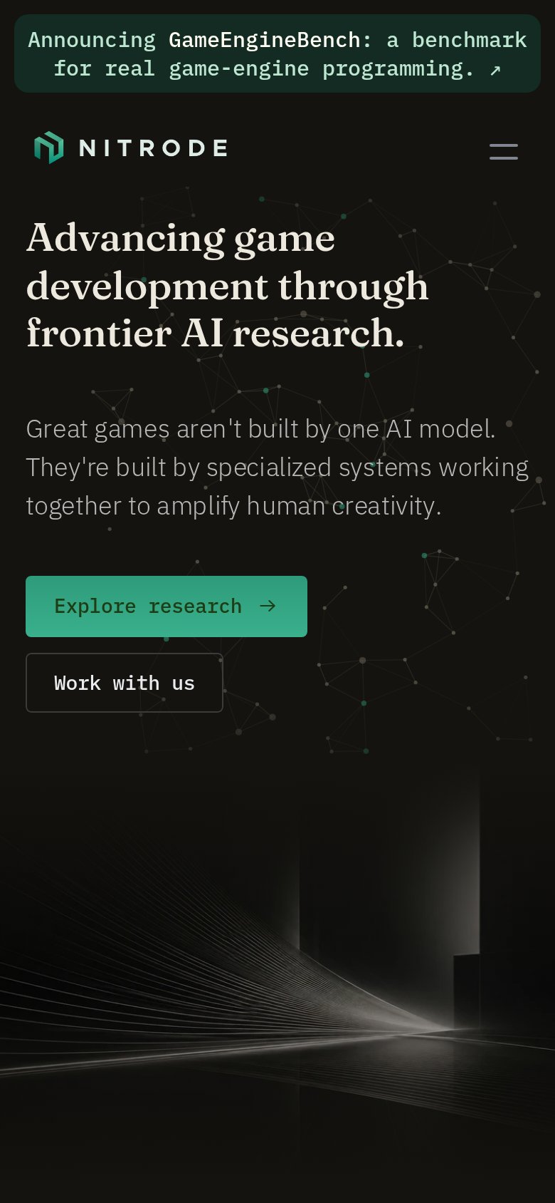
80StrongThe phone experience as a first-class citizen.
 12
- Announcement banner — Wraps to two lines and eats fold height before the logo, pushing the CTAs to the bottom edge.
- Work with us button — Noticeably narrower than the primary above it, making the stacked pair look misaligned.