
Your landing page’s weakest score is Trust.
How Mecha Health ranks
- 1.
Qure.ai71
- 2.
Aidoc68
- 3.
Mecha Health64
- 4.
Rad AI63
- 5.
Harrison.ai61
- 6.
Oxipit60
64Growth scoreupdated
category scores
category scoresShowHide
Score over time
Trust
38PoorProof that the product is real, competent, and safe to try.
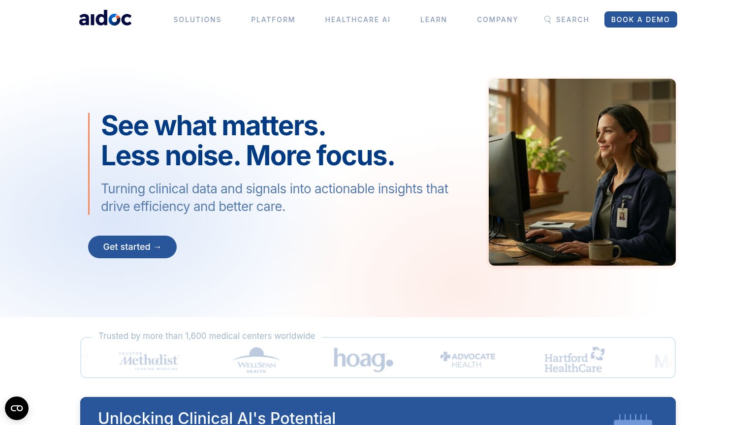
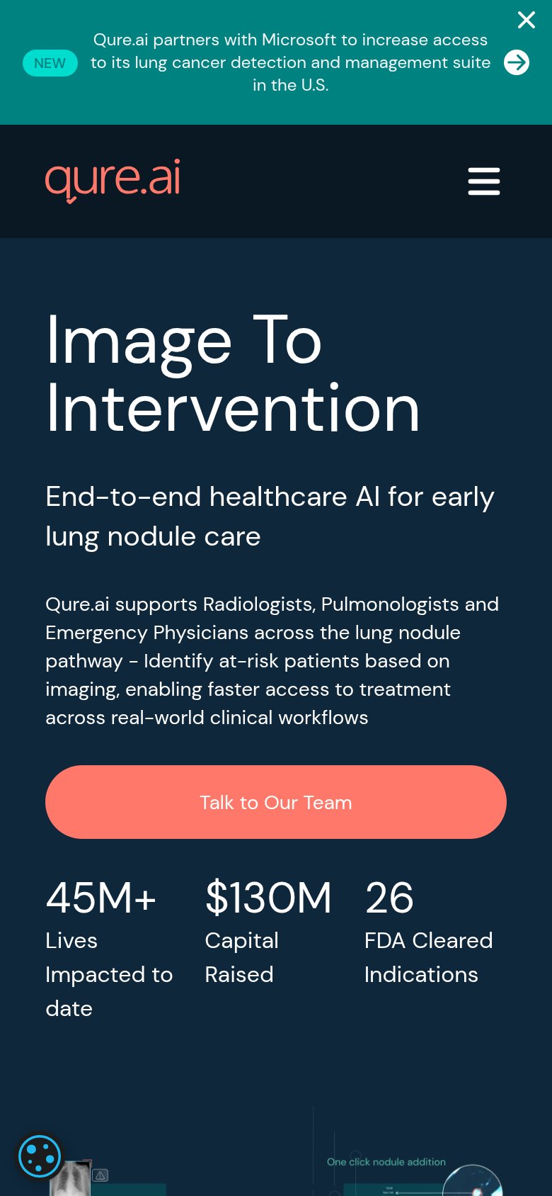
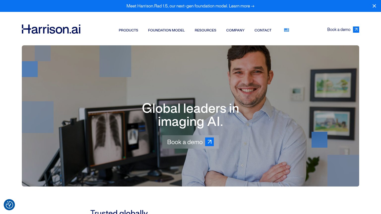
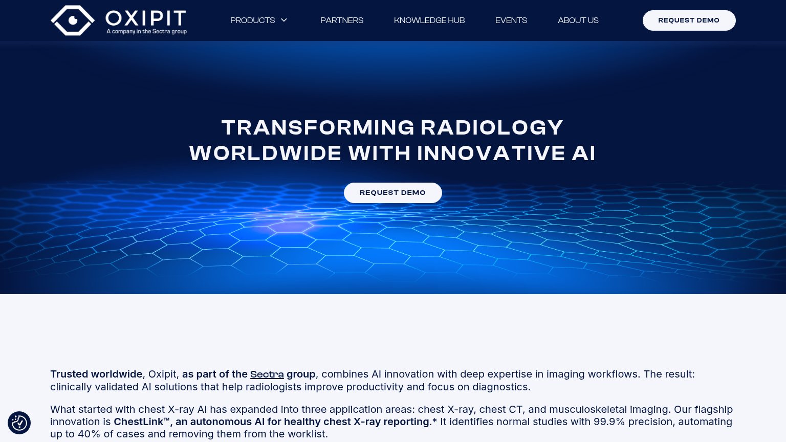
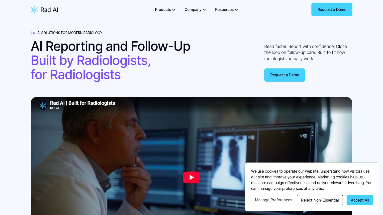
| Trust read | |
|---|---|
| Mecha Health | No visible trust signal identified. |
| Video embed titled "Rad AI | Built for Radiologists" | |
| Announcement bar: "Meet Harrison.Rad 1.5, our next-gen foundation model." | |
| "Trusted by more than 1,600 medical centers worldwide" logo strip with Houston Methodist, WellSpan Health, Hoag, Advocat | |
| "26 FDA Cleared Indications" stat in the mobile stat bar | |
| ChestLink™, an autonomous AI for healthy chest X-ray reporting… identifies normal studies with 99.9% precision, automati |
CTA
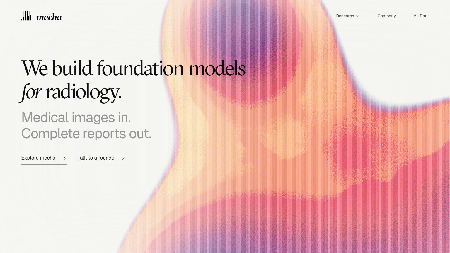
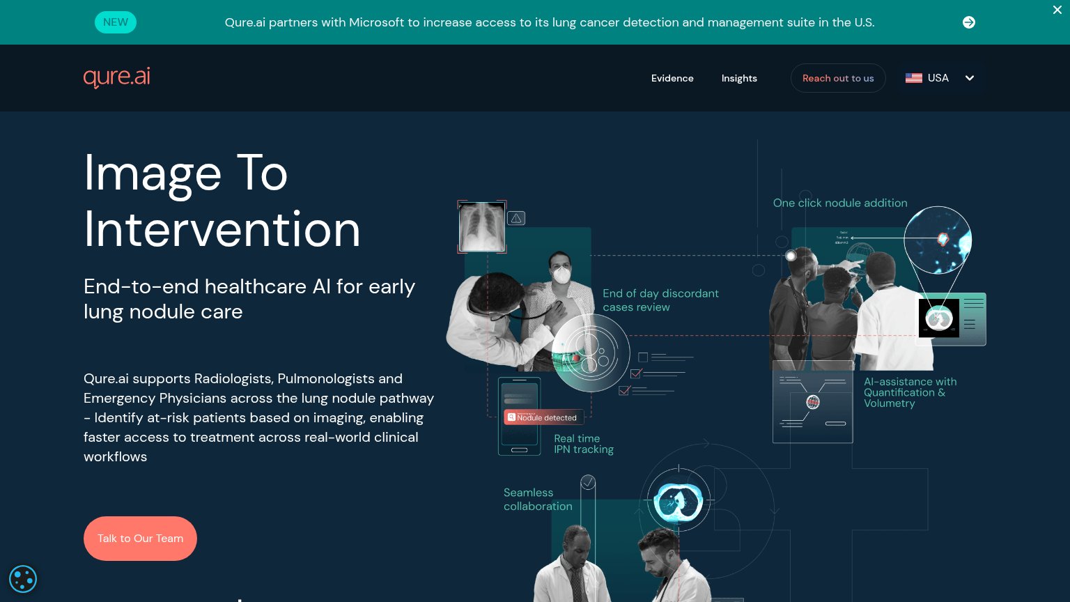
58FairCopy, size, verb, cost-feel — does the primary CTA earn the click?
Problems
- styled as text link, no button weight
- no visual hierarchy vs secondary CTA
- 'Explore' is low-intent, vague payoff
- arrow-only affordance, easy to miss
Mobile web
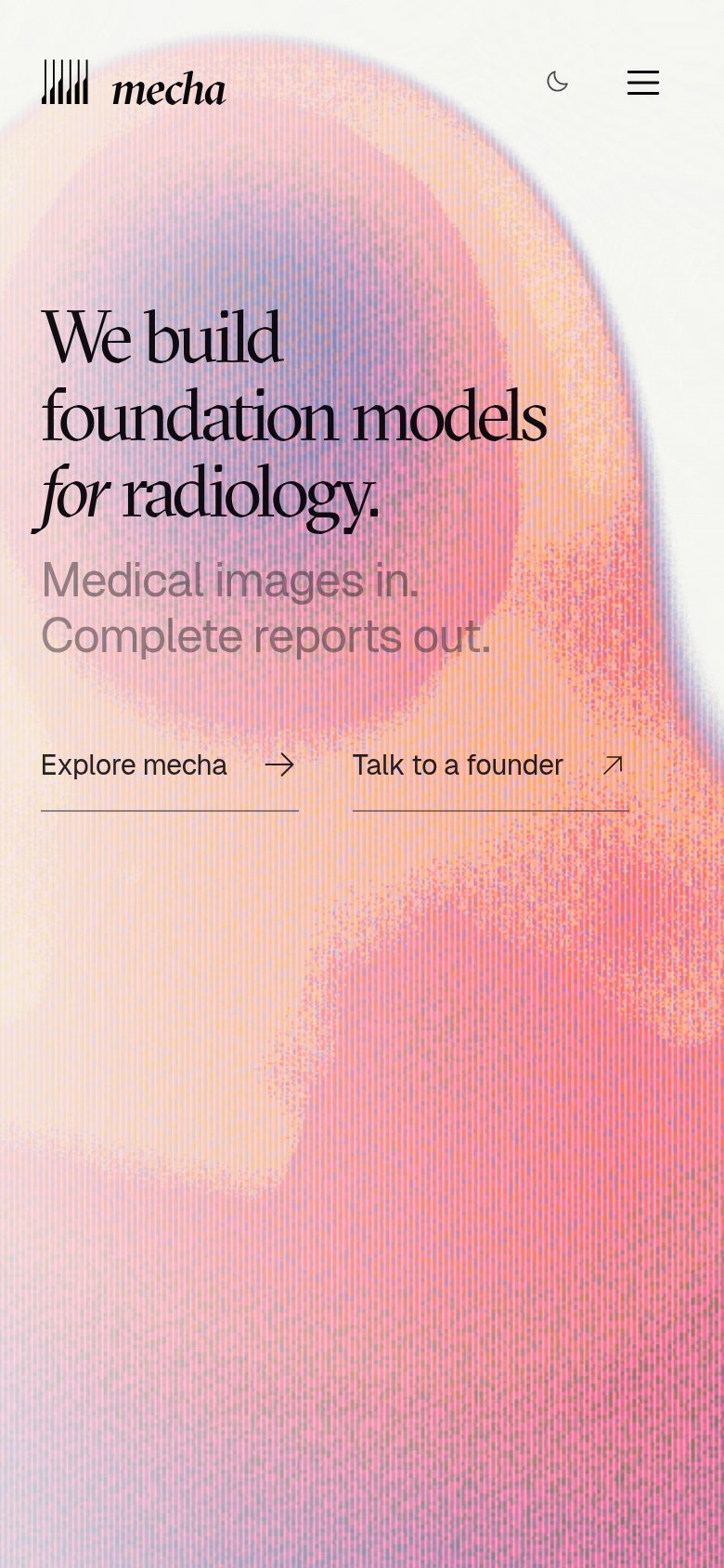
72FairThe phone experience as a first-class citizen.
 12
- Text-link CTA pair — Two equal-weight underlined text links replace a tappable primary button, leaving no clear thumb target.
- Grey subhead text — "Medical images in. Complete reports out." is low-contrast grey over the pink gradient and hard to read.
Information hierarchy
76FairDoes the design help or inhibit what the page is trying to say?
12- Twin underlined CTA links — "Explore mecha" and "Talk to a founder" share identical weight, so no primary action reads first.
- Subhead over gradient — Light gray "Medical images in." loses contrast where it crosses the pale gradient edge, especially on mobile.
Value props
76FairTitle, subtitle, hero — do they sell the product's true value?
Mecha Health’s headline sells
We build foundation models for radiology.
Medical images in. Complete reports out.
Working
- Subhead states input-output value in 8 words
- Names the exact vertical: radiology
- No buzzword abstraction anywhere
Could improve
- No proof points or numbers in the fold
- Hero art decorates, never shows a report
- Headline is company-first, not user-first