
Your landing page’s weakest score is Mobile web.
How Instinct Space ranks
- 1.
Instinct Space53
53Growth scoreupdated
category scores
category scoresShowHide
Score over time
Mobile web
42PoorThe phone experience as a first-class citizen.
 1
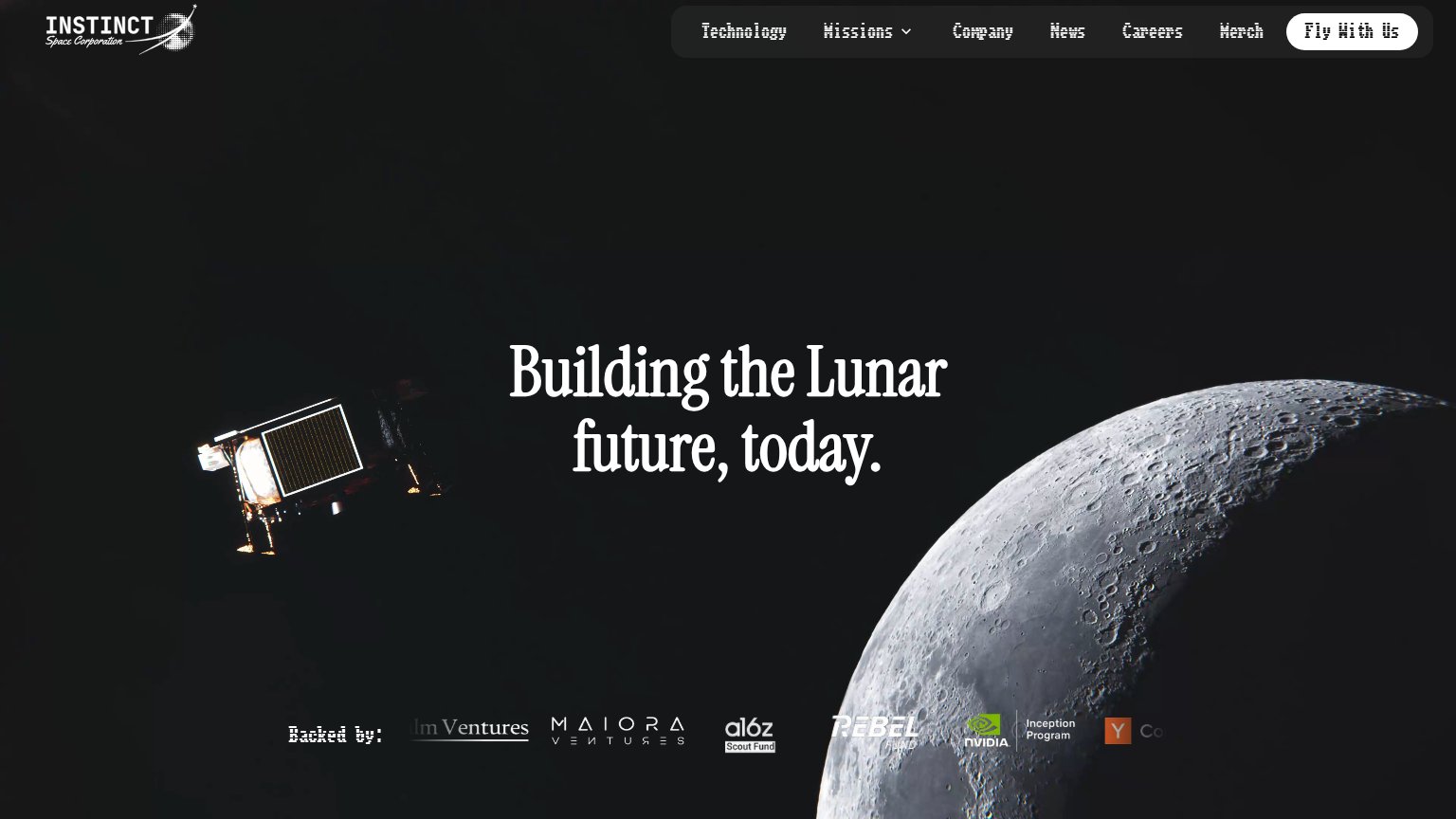
- Headline over lander — White serif type collides with the bright spacecraft image, making 'future, today.' nearly unreadable.
Value props
48PoorTitle, subtitle, hero — do they sell the product's true value?
Instinct Space’s headline vague
Building the Lunar future, today.
Working
- Hero photo shows real lander hardware
- Investor logos add credibility
- Clean, confident brand tone
Could improve
- No subhead explaining the offering
- Tagline could fit any space company
- Zero numbers, dates, or outcomes
CTA
52FairCopy, size, verb, cost-feel — does the primary CTA earn the click?
Problems
- absent from mobile fold
- nav-sized, no hero CTA
- no clear action verb or payoff
- "Us" centers company, not visitor
Trust
58FairProof that the product is real, competent, and safe to try.
| Trust read | |
|---|---|
| Instinct Space | "Backed by:" investor logo strip (a16z Scout Fund, NVIDIA Inception Program, Y Combinator, Maiora Ventures, Rebel Fund) |
Information hierarchy
64FairDoes the design help or inhibit what the page is trying to say?
123- Six-item nav bar — Technology, Missions, Company, News, Careers, and Merch all sit at equal weight, outnumbering the lone CTA six to one.
- Backed-by logo strip — Investor logos are cropped and clipped at the fold edge (dm Ventures, YC cut off), reading as broken rather than credible.
- Headline over lander — On mobile the same headline collides with the bright lander photo, making 'future, today' nearly illegible against the glare.
Competitors
Couldn’t identify competitors
429 {"type":"error","request_id":"req_uwwaczc3voqjdon7dxw3riiu3biofzjvzfsykgvxzxuv4cekxlva","error":{"type":"rate_limit_error","message":"Rate limit exceeded: tpd (InputTokens)"}}