
Your landing page’s weakest score is Trust.
How Exin Therapeutics ranks
- 1.
Verge Genomics72
- 2.
Exin Therapeutics41
41Growth scoreupdated
category scores
category scoresShowHide
Trust
32PoorProof that the product is real, competent, and safe to try.

| Trust read | |
|---|---|
| Exin Therapeutics | No visible trust signal identified. |
| "JUN 16 — Introducing vBx: Breakthrough Model for Precision Neurology" news banner |
CTA
42PoorCopy, size, verb, cost-feel — does the primary CTA earn the click?
Problems
- no CTA anywhere in the fold
- only nav links and scroll chevron
- headline promises with no next step
Value props
42PoorTitle, subtitle, hero — do they sell the product's true value?
Exin Therapeutics’s headline vague
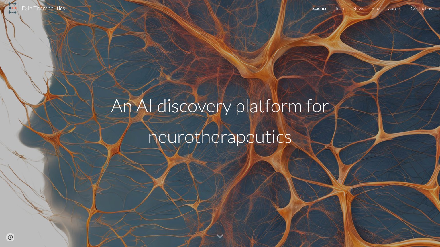
An AI discovery platform for neurotherapeutics
Working
- Names the AI + neuro category instantly
- Clean, single-message hero
- Imagery fits the neuroscience theme
Could improve
- No outcome or differentiator stated
- Missing subhead with specifics
- Ugly line break on mobile
Mobile web
42PoorThe phone experience as a first-class citizen.
 123
- Wrapped headline word — "neurotherapeutics" breaks mid-word, leaving a stranded "s" on its own line — the headline scales down poorly.
- Headline over light background — White headline text sits on the pale left half of the image, killing contrast and legibility.
- Oversized info badge — Large Google Sites info button dominates the bottom-left corner, drawing the eye with no user value.
Information hierarchy
48PoorDoes the design help or inhibit what the page is trying to say?
 123
- Headline over busy texture — Thin white type sits directly on high-contrast neural imagery with light patches eroding legibility on the left.
- Six-link nav row — Every clickable element in the fold is an exit path of equal weight with no visual priority.
- Faint nav contrast — Gray nav labels on the dark neural background are barely legible, especially 'Careers' and 'Contact us'.
Competitors
inferred from product, audience, and value prop#1Verge Genomicsvergegenomics.com72
#2Exin Therapeutics41