
Your landing page’s weakest score is Trust.
How Delineate ranks
67Growth scoreupdated
category scores
category scoresShowHide
Score over time
Trust
48PoorProof that the product is real, competent, and safe to try.
| Trust read | |
|---|---|
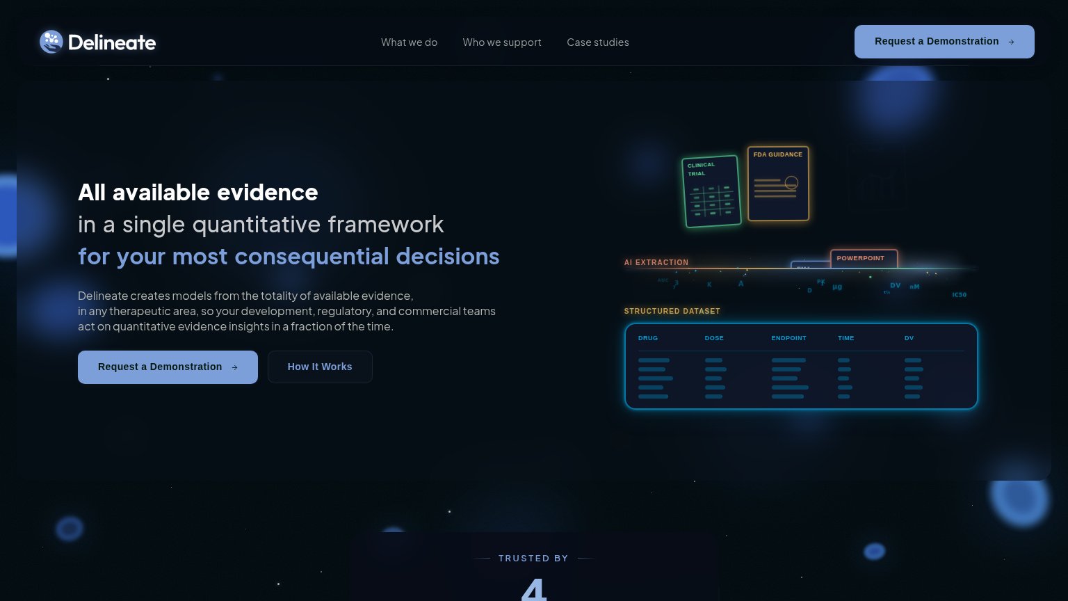
| Delineate | "TRUSTED BY 4" social-proof section header at the bottom of the desktop fold |
| "Certara Accelerates Drug Discovery and Development with NVIDIA BioNeMo Agent Toolkit" news card | |
| "Proud to Work with" section heading visible at the mobile fold edge | |
| "PulmoSIM Therapeutics Secures Foundational U.S. Patent Allowance for PT001" announcement banner | |
| Mobile banner: "Simulations Plus has entered into an agreement to be acquired by Altaris, LLC, a healthcare-focused inve |
CTA
66FairCopy, size, verb, cost-feel — does the primary CTA earn the click?
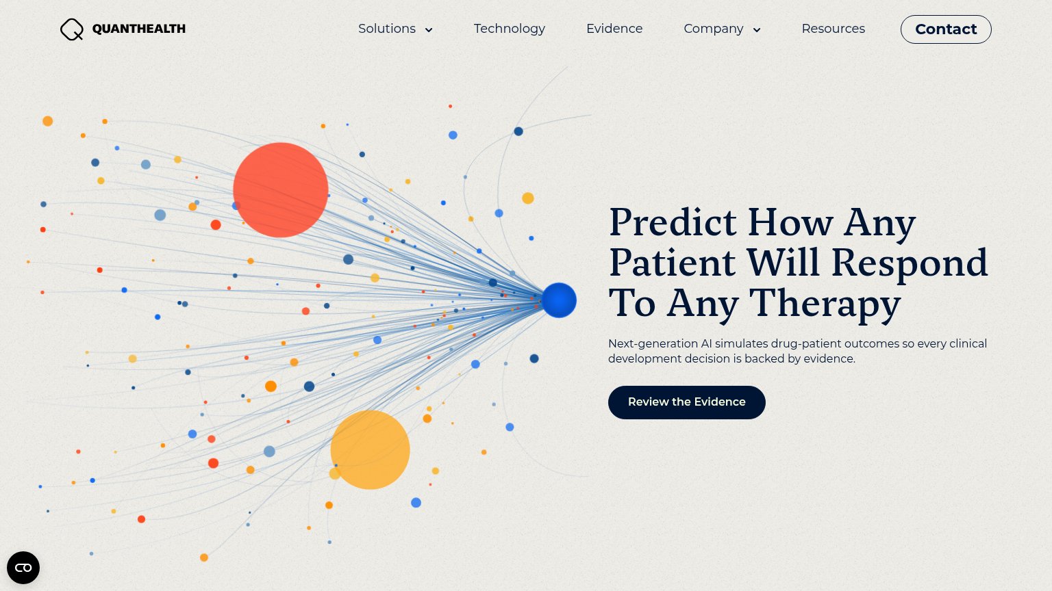
Problems
- high-cost sales-meeting framing
- 'Demonstration' is needlessly formal
- wraps to two lines on mobile
Mobile web
72FairThe phone experience as a first-class citizen.
 123
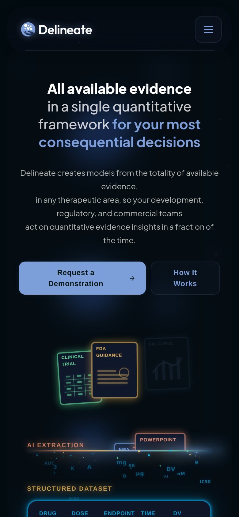
- Subheadline hard breaks — Desktop line breaks leave ragged centered fragments ('evidence,' alone) across six lines of body copy.
- Two-line demo CTA — Primary CTA wraps to two lines and shares the row with 'How It Works' instead of going full-bleed.
- Five-line hero headline — Desktop-length headline wraps into five lines, pushing the CTA deep into the viewport.
Value props
74FairTitle, subtitle, hero — do they sell the product's true value?
Delineate’s headline sells
All available evidence in a single quantitative framework for your most consequential decisions
Delineate creates models from the totality of available evidence, in any therapeutic area, so your development, regulatory, and commercial teams act on quantitative evidence insights in a fraction of the time.
Working
- Headline names the real job: unified evidence framework
- Hero shows the pipeline: docs → AI extraction → dataset
- Subhead names the exact buyer teams
Could improve
- No numbers anywhere — "fraction of the time" is vague
- No proof point above the fold on desktop
- Outcome stakes (approvals, dose decisions) unnamed
Information hierarchy
76FairDoes the design help or inhibit what the page is trying to say?
123- Duplicate header demo CTA — Styled at the same blue weight as the hero button, splitting the primary action across two equal targets.
- How It Works button — Bordered box at similar size to the primary CTA competes for the click instead of reading subordinate.
- Faint AI extraction row — The pipeline's middle step renders in low-contrast scattered glyphs, so the illustration's story breaks between documents and dataset.