
Your landing page’s weakest score is Trust.
How Dartboard ranks
72Growth scoreupdated
category scores
category scoresShowHide
Trust
62FairProof that the product is real, competent, and safe to try.
| Trust read | |
|---|---|
| Dartboard | "BACKED BY Y COMBINATOR" badge above the headline |
| Stylized "Monthly Business Report" product mock with feature callouts ("Comment on the report", "Share with your colleag |
CTA
66FairCopy, size, verb, cost-feel — does the primary CTA earn the click?
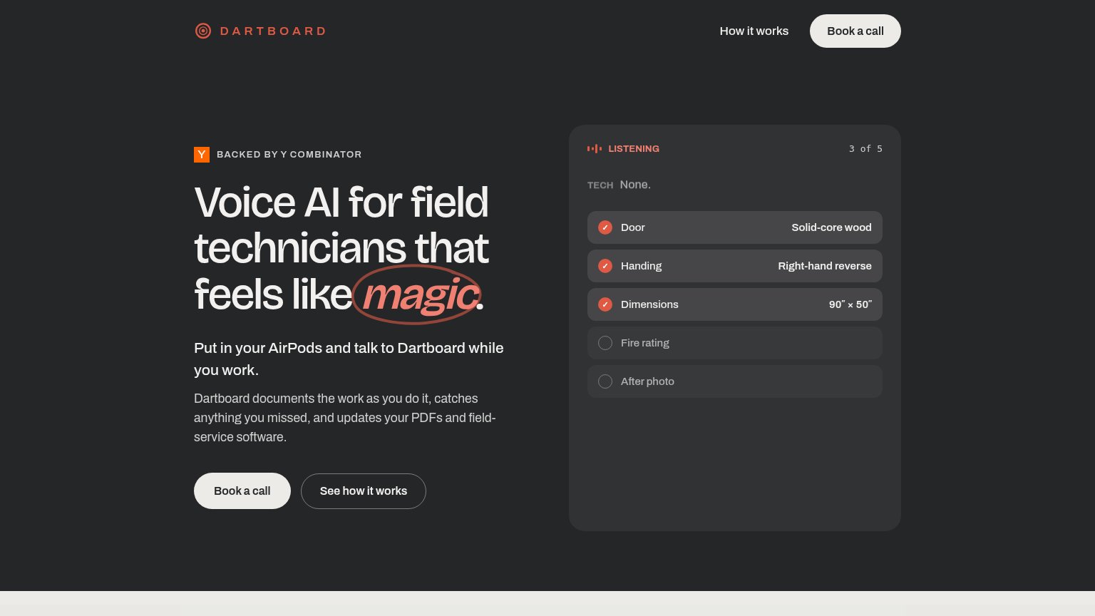

Problems
- call feels costly, committal
- no self-serve or demo path
- doesn't echo 'magic' promise
Mobile web
68FairThe phone experience as a first-class citizen.
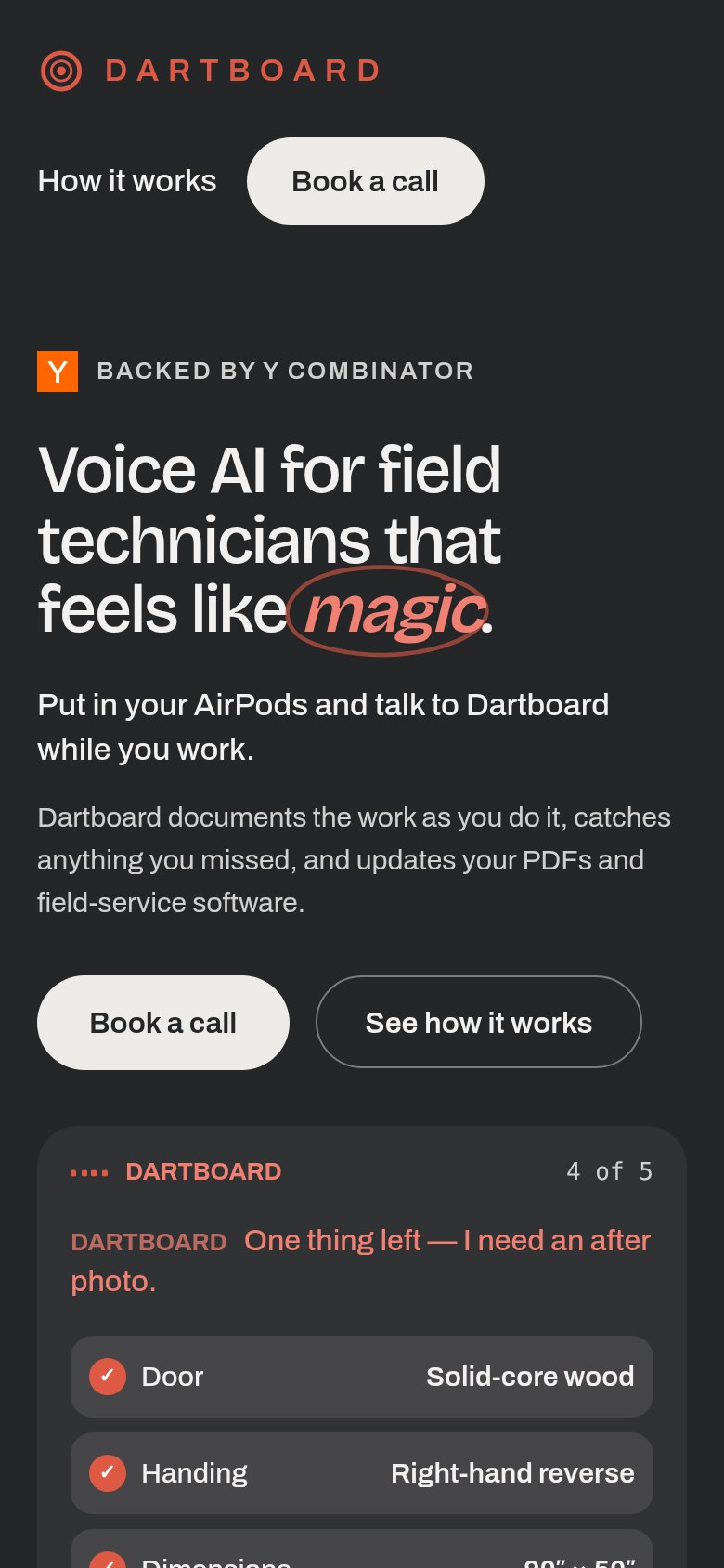 1234
- Uncollapsed nav row — Full desktop nav links sit as a second header row instead of a hamburger, eating vertical space above the hero.
- Hero headline block — The desktop headline scales down only slightly, wrapping into three tall lines that push both CTAs deep into the fold.
- Book a call button — Primary CTA keeps desktop proportions at roughly half column width instead of going full-bleed for the thumb.
- Duplicate header CTA — A second 'Book a call' pill in the header competes with the hero CTA and adds to header height.
Value props
78FairTitle, subtitle, hero — do they sell the product's true value?
Dartboard’s headline sells
Voice AI for field technicians that feels like magic.
Put in your AirPods and talk to Dartboard while you work.
Working
- Names exact user: field technicians
- AirPods line makes usage concrete
- Hero demo shows product doing the job
Could improve
- 'Magic' is the lone abstraction
- No numbers or time-saved proof
- Paperwork payoff buried in third line
Information hierarchy
86StrongDoes the design help or inhibit what the page is trying to say?
12- Hero Book a call — Off-white pill with no accent color duplicates the nav button at equal weight, so neither reads as the one primary action.
- See how it works — Same size and shape as the primary CTA beside it; outline-only styling helps, but it duplicates the nav's 'How it works' link.