
Your landing page’s weakest score is Value props.
How Altrina ranks
- 1.
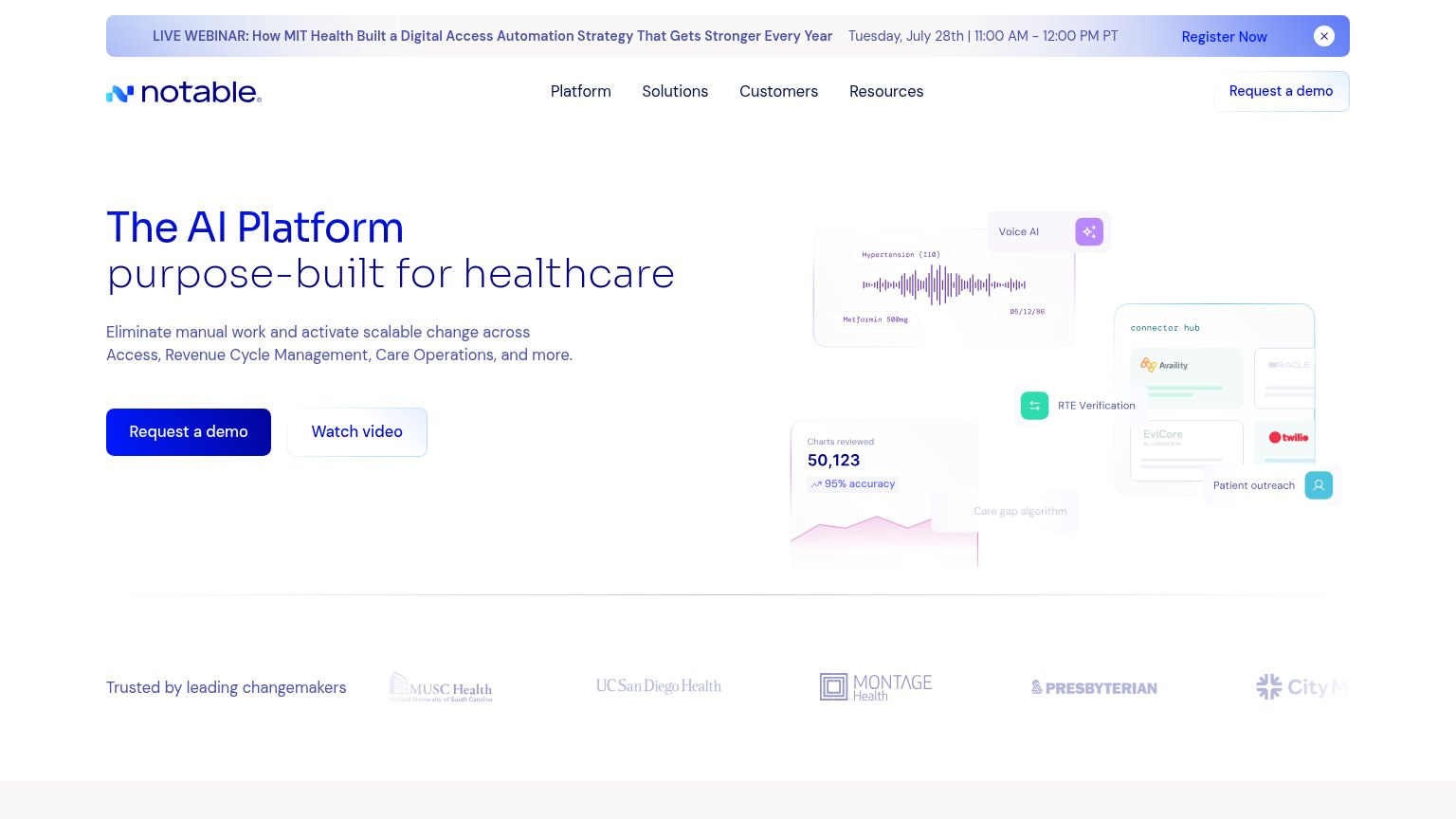
Notable76
- 2.
Tennr63
- 3.
Altrina59
59Growth scoreupdated
category scores
category scoresShowHide
Score over time
Value props
55FairTitle, subtitle, hero — do they sell the product's true value?
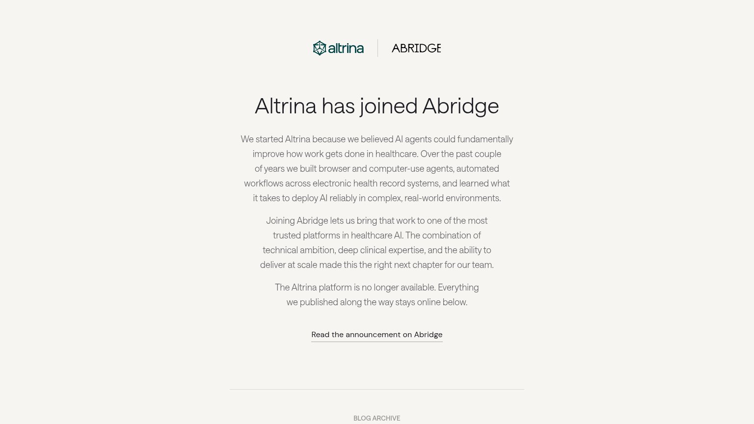
Altrina’s headline vague
Altrina has joined Abridge
Working
- Names concrete work: EHR workflow agents
- Honest about platform shutdown
- Clear single CTA to the announcement
Could improve
- No subhead; payoff buried in paragraph 2
- Zero numbers or proof points
- No visual showing what Altrina built
CTA
58FairCopy, size, verb, cost-feel — does the primary CTA earn the click?
Problems
- Text link, not a button
- 5 words — too long
- Tiny footprint vs headline
Trust
58FairProof that the product is real, competent, and safe to try.
| Trust read | |
|---|---|
| Altrina | Co-branded header "altrina | ABRIDGE" with headline "Altrina has joined Abridge" |
| "Trusted by leading changemakers" logo strip with MUSC Health, UC San Diego Health, Montage Health, and Presbyterian | |
| No visible trust signal identified. |
Mobile web
58FairThe phone experience as a first-class citizen.
 123
- Announcement text link — Sole CTA is an underlined text link clipped at the viewport edge, not a tappable full-width button.
- Three-paragraph body block — Desktop-length narrative copy stacks eleven-plus lines and pushes the only action to the fold's bottom edge.
- Abridge logo cropped — The 'ABRIDGE' wordmark is clipped at the right edge, signaling an unchecked mobile layout.
Information hierarchy
68FairDoes the design help or inhibit what the page is trying to say?
123- Announcement body copy — Three same-weight paragraphs form a text wall between the headline and the sole action, slowing scan to the link.
- Read announcement link — The primary CTA is a small underlined text link with no button styling, easy to miss below the paragraphs.
- Dual logo lockup — The Abridge wordmark is clipped at the right edge, undercutting the acquisition message the header exists to deliver.