
Your landing page’s weakest score is Value props.
How Zaplar ranks
63Growth scoreupdated
category scores
category scoresShowHide
Score over time
Value props
52FairTitle, subtitle, hero — do they sell the product's true value?
Zaplar’s headline undersells
Built for exceptional hoteliers
Zaplar replaces PMS, POS, and every tool in between.
Working
- Subhead states the real consolidation claim
- Audience named clearly: hoteliers
- Real product screen shown, plus YC badge
Could improve
- Headline says nothing about the product
- No numbers or concrete outcomes
- Hero UI too small and dark to read
Trust
58FairProof that the product is real, competent, and safe to try.

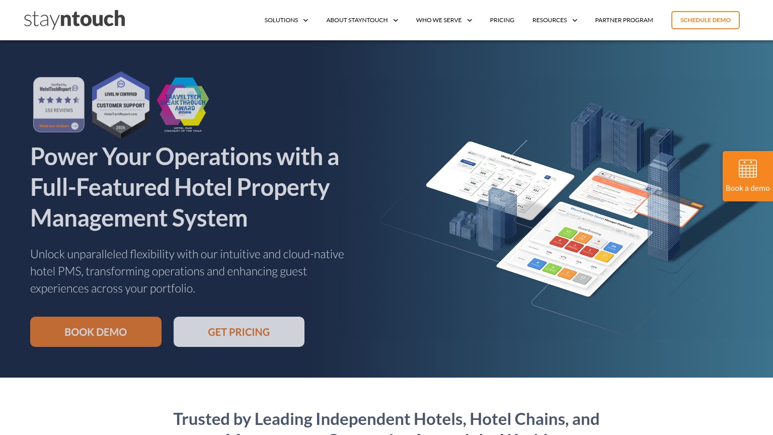

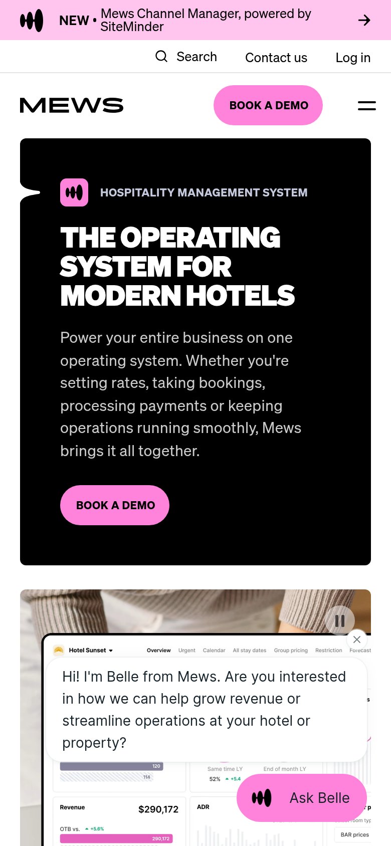
| Trust read | |
|---|---|
| Zaplar | Y Combinator badge above the headline |
| Product dashboard UI showing "Hotel Sunset" metrics: RevPAR $118, Occupancy 55%, Revenue $290,172 | |
| implicit context Cloudbeds may benefit from pre-existing familiarity among its target audience. | |
| Customer logo bar: citizenM, Numa, Valk Exclusief, Limehome, Mollie's, SMARTments, nestor, easyHotel | |
| HotelTechReport badge showing star rating with "153 REVIEWS" | |
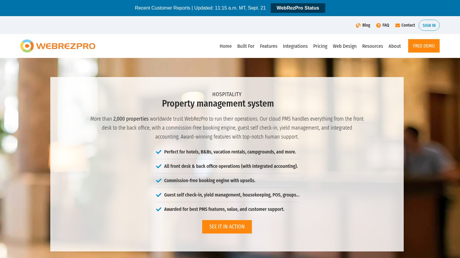
| "More than 2,000 properties worldwide trust WebRezPro to run their operations." |
Mobile web
58FairThe phone experience as a first-class citizen.
 1234
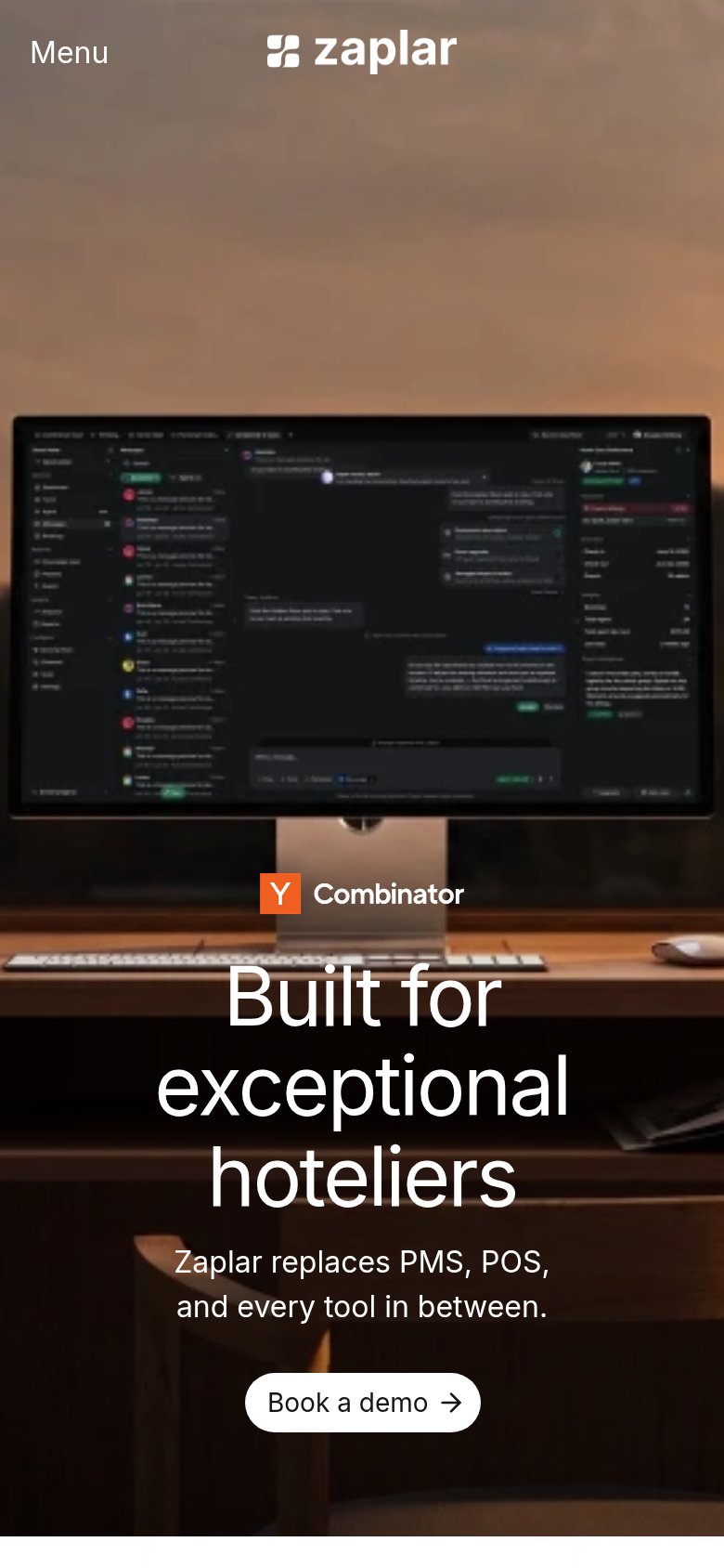
- Primary CTA below fold — The 'Book a demo' button sits at the very bottom of a long scroll — visitors must pass the full-height monitor image before reaching it.
- Oversized headline wrap — 'Built for exceptional hoteliers' scales down too little and wraps into three towering lines that dominate a third of the viewport.
- Illegible product screenshot — The desktop-app monitor render fills the middle of the fold with unreadable micro-text that communicates nothing at phone size.
- Narrow demo button — 'Book a demo' is a desktop-proportioned pill floating in the column instead of a full-bleed, thumb-friendly bar.
CTA
68FairCopy, size, verb, cost-feel — does the primary CTA earn the click?

Problems
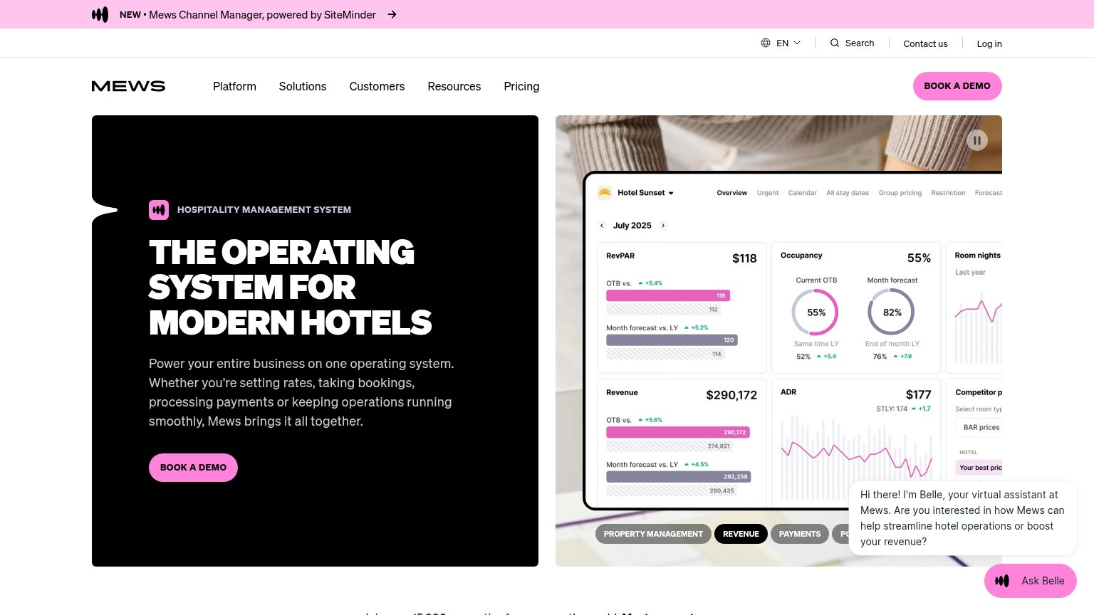
- high-commitment sales-call feel
- no low-intent alternative path
- small hero button on desktop
Information hierarchy
78FairDoes the design help or inhibit what the page is trying to say?
123- Product screenshot on monitor — The UI on the monitor is too small and dim to read at desktop scale, so the fold's largest focal point communicates nothing.
- Headline near fold edge — "Built for exceptional hoteliers" and its CTA sit at the very bottom of the viewport, forcing a scan past 600px of imagery before the message lands.
- Nav links Home–Contact — Four generic nav links (including a redundant "Home") are the only exits competing with the single demo action; each one leaks attention.