
Your landing page’s weakest score is Value props.
How Wondering ranks
74Growth scoreupdated
category scores
category scoresShowHide
Value props
64FairTitle, subtitle, hero — do they sell the product's true value?
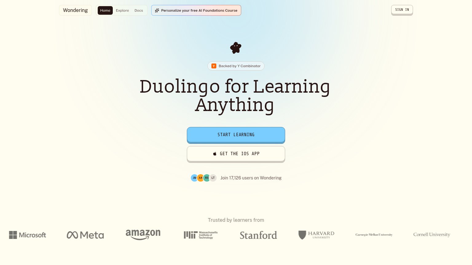
Wondering’s headline vague
Duolingo for Learning Anything
Working
- Duolingo analogy conveys format instantly
- "17,126 users" is a real, specific number
- Learner logos (MIT, Stanford) add credibility
Could improve
- No subhead explaining how it works
- "Anything" is boundless, not specific
- Hero mascot decorates, doesn't demonstrate
Trust
68FairProof that the product is real, competent, and safe to try.
| Trust read | |
|---|---|
| Wondering | "Join 17,126 users on Wondering" count beside the primary CTA |
| No visible trust signal identified. |
CTA
78FairCopy, size, verb, cost-feel — does the primary CTA earn the click?
Problems
- no 'free' despite free course banner
- outcome after click is unstated
Mobile web
78FairThe phone experience as a first-class citizen.
 12
- Clipped promo banner — Ticker text is cut off mid-word ("ze Wondering's free AI...") and repeats, reading as broken and eating top-of-fold space.
- Get the iOS app — Secondary button matches the primary CTA's size and shape, diluting the tap decision on "START LEARNING".
Information hierarchy
82StrongDoes the design help or inhibit what the page is trying to say?
123- GET THE IOS APP — Styled at near-equal size and weight to START LEARNING, splitting the fold's one action into two.
- AI Foundations pill — Pink-highlighted header CTA competes for the first click before the hero is even read.
- Sign In button — Boxed, shadowed treatment gives a returning-user control the same visual rank as a CTA.